10 Ways to Visualize your data

You’ve been avidly collecting data. You’ve figured out how to process it all and set up your formulas… but how do you transform those into powerful KPI dashboards and genuinely valuable data visualizations that bring your insights to life?

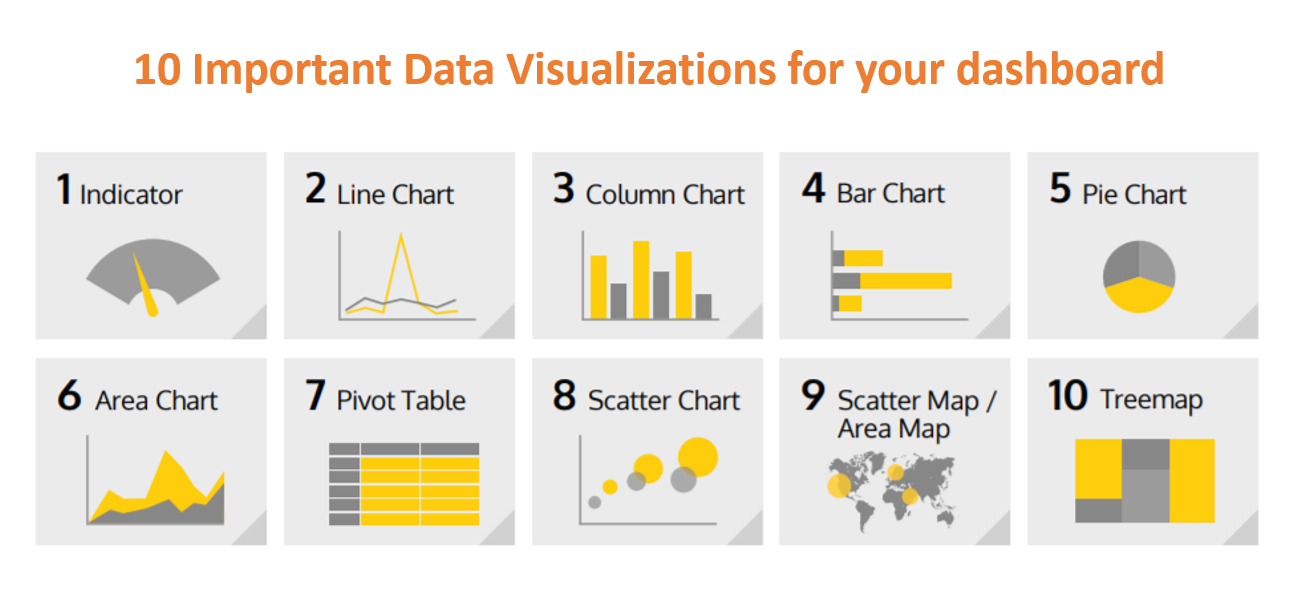
There’s an array of data visualization types, and which you choose for your data depends on what measurement you are trying to emphasize and what information you are trying to reveal. If you want to know when you should use a column chart versus a line chart – and yes, there’s a big difference – then this is the guide for you.

Indicators

What is Indicator?

An indicator data visualization is a vivid way to present changes that you’re tracking in your data. Typically, this uses something like a gauge or a ticker to show which direction the numbers are heading in.

What does it visualize?

This allows you to display one or two numeric values. You can also add additional titles and a color-coded indicator icon, such as a green “up” arrow or a red “down” arrow to represent the value, and changes in this value, in the clearest way possible.

What does it measure?

Indicators are clear, simple ways to demonstrate how your organization is doing on a particular metric, and whether you’re heading in the right direction.

What Sources of Data Does It Use?

You can feed in just about any form of numerical data source, so long as you can continually refresh
these numbers, so that the movement of the ticker / gauge / color coding is accurate.

Example:

Above you can see a “gauge” indicator showing how revenue figures are progressing towards the target, and a “numeric” value indicator showing the annual increase to average admission cost

Line Chart

What is Line Chart?

Line charts plot data points on a graph and then join them up with a single line that zigzags from each point to the next.

What does it visualize?

These are super simple and very popular, because they give you an immediate idea of how a trend emerged over time. You can see when peaks and troughs hit, whether the overall values are going up or down, and when there’s a sharp spike or drop in numbers.

What does it measure?

There are many different business cases that work well with line charts. Pretty much anything that compares data, or shows changes, over time is well suited to this type of visualization.

Again, it’s all about visualizing a trend. You can also compare changes over the same period of time for more than one group or category very easily, by adding a “break by” category.

What Sources of Data Does It Use?

Again, anything that gives solid, discrete numbers, organized by time. So, you could use sales figures
from your CRM, pull in tables of data showing total numbers of new sign-ups, record showing income
per month. Info from SQL databases is particularly easy to translate into line charts.

Example

This line chart shows sales revenue over the past year. For more granular detail, could then add a “break by” category to analyze expenditures of different business units, also over the past year.

Column Charts

What is Column Chart?

A column chart graphically represents data by displaying vertical bars next to each other, lined up on the horizontal axis.

Each bar represents a different category, and the height of the bar correlates with numbers on the values axis, on the left hand side.

What does it visualize?

Column charts give you an immediate way to compare values for related data sets side by side, highlighting trends in a swift, visual way.

They can include multiple values on both the X and Y axis, as well as a breakdown by categories displayed on the Y axis.

What does it measure?

Like a line chart, column charts are often used to show trends over time, for example sales figures from month to month or year to year.

However, they’re also useful for comparing different things side by side, e.g. how well two different products are selling in the same month.

What Sources of Data Does It Use?

Column charts are straightforward visualizations and can draw on data from just about any data source,
so long as it’s consistent and presented numerically.

Example

This column chart shows total page views and sessions spent on a website by online visitors on consecutive months

If you want to emphasize overlapping trends over time, you can also combine column charts with line charts, as in this chart that compares total revenue with units sold, month by month.

Bar Chart

What is Bar Chart?

A bar chart is essentially a column chart on its side: values are presented on the horizontal axis and the categories are on vertical axis, on the left.

What does it visualize?

Bar charts are more commonly used to compare different values, items and categories of data. From a purely practical perspective, they’re also used over column charts when the names of the categories are too long to comfortably read on their side! They are not usually used to show trends over time.

What does it measure?

Like column charts, bar charts are frequently used to compare the total number of items within a category, for example total sales or the number of respondents that selected a particular answer.

However, they’re also handy for visualizing sub-categories using color coding.

What Sources of Data Does It Use?

Data used to compile bar charts could come from Google Analytics, your CRM, sales figures or any other
kind of database that stores data numerically.

Example

The bar chart above represents the spread of customers per age group, but it also gives a quick, visual representation of which products each type of customer is most likely to buy, too.

Pie Charts

What is Pie Chart?

Pie charts show values as a “slice” of a whole circle (the whole pie). Numerical Values are translated into a percentage of 360 degrees, represented by the arc length, and each slice is color coded accordingly

What does it visualize?

Pie charts show what percentage of the whole is made up of each category. That means they deal with total numbers, and trends in overall responses, rather than changes over time.

That means it’s a good idea to use a pie chart when displaying proportional data and/or percentages. Remember that the point is to represents the size relationship between the parts and the entire entity, so these parts need to add up to a meaningful whole

What does it measure?

It makes sense to use a pie chart when you want to get a rapid, overall idea of the spread of data – for example, market share or responses to a survey – rather than when you’re concerned about the precise figures they represent.

What Sources of Data Does It Use?

Survey and questionnaire responses, data from social media sources or Google analytics, total sales
figures and so on will all work. Keep it fairly simple though – if you have more than 6 categories, your
pie chart won’t give you much information at a glance, especially if there’s no clear “winning” answer.

Example

In the example above, you can tell in a millisecond which marketing channels bring in the most leads, thanks to the pie chart structure.

Area Chart

What is Area Chart?

An area chart is similar to a line chart in that it plots figures graphically using lines to join each point – but it’s more dynamic and visual, giving an idea of comparative mass.

The area under the jagged points formed by the line is filled in with color, so that it looks kind of like a mountain range.

What does it visualize?

Area charts are used to demonstrate a time-series relationship. Unlike line charts, though, because they also represent volume in a highly visual way.

The information is shown along two axes and each “area” is depicted using different color or shade to make it easier to interpret.

What does it measure?

Area charts are great for showing absolute or relative (“stacked”) values – as in, showing trends as you do in a line chart, but comparing a few different trends at once.

They’re particularly effective if there’s a broad disparity between some of these trends, as it makes the comparison starker, too.

What Sources of Data Does It Use?

Any data that works for line charts should work for area charts, too: SQL data tables, sales figures from
your CRM, financial data and so on – but you must be able to organize the information by day / month /
year, etc. to demonstrate change over time.

Example

Using an area chart, you can easily compare sales figures for different products by quarter, and track trends in total sales volume over time.

Pivot Table

What is Pivot Table?

A pivot table brings together, simplifies and summarizes information stored in other tables and spreadsheets, stripping this down to the most pertinent insights.

They are also used to create unweighted cross tabulations fast.

What does it visualize?

Pivot tables are one of the most simple and useful ways to visualize data. That’s because they allow you to quickly summarize and analyze large amounts of data, and to use additional features such as color formatting and data bars to enhance the visual aspects

What does it measure?

Pivot tables are more about simplifying tables than changing it into a graphical representation. That means they are helpful for displaying data with several subcategories in easily digestible ways.

What Sources of Data Does It Use?

Existing databases, tables and spreadsheets, including Excel. A good example is a company’s
asset management.

Scatter Plot

What is Scatter Plot?

Scatter charts are a more unusual way to visualize data than the examples above. These are mathematical diagrams or plots that rely on Cartesian co-ordinates.

If you’re using one color in the graph, this means you can display two values for two variables relating to a data set, but you can also use two colors to incorporate an additional variable.

What does it visualize?

In this type of graph, the circles on the chart represent the categories being compared (demonstrated by circle color), and the numeric volume of the data (indicated by the circle size).

What does it measure?

Scatter charts are great in scenarios where you want to display both distribution and the relationship between two variables.

What Sources of Data Does It Use?

CRM, sales and lead data that comes with granular information on buyers – age, gender, location and
so on – are particularly useful for this kind of graph.

Scatter Map / Area Map

What is Scatter map?

A scatter map allows viewers to visualize geographical data across a region by displaying this as data points on a map.

What does it visualize?

Scatter maps / area maps work a little like scatter graphs, in that the size and color of the circle illustrates quantities and types of data.

However, it goes a step further by also showing where this activity is concentrated, geographically speaking.

What does it measure?

You can incorporate up to two sets of numeric data, using circle color and size to represent the value of your data on the map.

What Sources of Data Does It Use?

The more precise information you can enter about geographic location, the better. For example, entering
the country and city, or latitude and longitude information, alongside the data you want to map will help
you create a very accurate scatter or area map.

Example

Above is an example scatter map that gives a breakdown of the number of website visitors a company has by location. The larger the circle, the higher the number of visitors from that city on the map.

Tree-map

What is Treemap?

A treemap is a multi-dimensional widget that displays hierarchical data in the format of clustered rectangles, which are all nested inside each other.

What does it visualize?

Data that comes under the same broad heading is grouped by color, and within each section, the size of the rectangles relate to the data volume or share.

What does it measure?

These types of chart can be used in all kinds of different scenarios where you want to incorporate more granular insights than other visualizations will allow.

For example, you might want to use it instead of a column chart, to give a sense of trends in the popularity of a certain product, but also include and compare many categories and sub-categories.

What Sources of Data Does It Use?

You can bring in data from CRMs, Google Analytics and AdWords, social media, spreadsheets, etc. Bear
in mind, though, that like a pie chart, you’re looking at the percentage make-up of each category more than changes over time.

Example

In the example above, you gain an overview of how different marketing campaigns breakdown by region.

So this were the 10 important visualizations you should be knowing. From the next articles we will study each of them in detail.

Happy Learning ! 🙌🚀🚀

Ever wondered about the 7 Pillars of Power BI!

In the previous blog we did the introduction to Power BI and discussed architecture design behind Power BI. In this article we are going to discuss about some of the most important things which are required to start your Power BI journey effectively.

There are 7 steps that you have to remember while working with Power BI. I will call this 7 steps to follow as “The 7 Pillars of Power BI”.

So here is the diagram representing the 7 Pillars of Power BI.

The 7 pillars are as follows:

  1. Extract
  2. Transform
  3. Modeling
  4. Calculations
  5. Visual
  6. Distribution
  7. Automation

Let’s discuss each of them now

Extract: This is the step where we get the information from the data set performed in Power BI Desktop. You can talk to any data source with ha highly simplified Power BI interface. Power BI can connect to any data source to bring meaningful insights to the end-user. It is simple to import any custom file into Power BI. Connecting data from multiple data sources can be achieved by anyone new to Power BI.

Transform: It is the second pillar where we can clean and treat the data. This is performed in Power Query Editor which is the part of Power BI Desktop Environment. After Data Loading, it should undergo pre-processing according to the requirements. This process is called Data shaping or Data Transformation. It involved various steps like renaming tables and columns, changing the data type, modifying rows and columns, appending, merging, etc.

Modeling: Third Pillar where we can create relationships between the data tables and is done using Power BI Desktop. Here we enhance the data to get more accurate insights and analytics. This is achieved by creating relationships and hierarchies between various data tables for better analysis.

Calculations: This is the Fourth Pillar where we can create various measures using DAX language analysis. DAX is also known as “Data Analysis Expressions”. It is achieved by creating several measures and calculated columns. Even M Language is used for various purposes, especially for Data and Time operations.

Visuals: This is the Fifth Pillar where we can create the storytelling and present the information and insights through various visualizations using Power BI. Visualizations is the heart of Power BI. We can play with a variety of visualizations, right from in-built visualizations to custom visualizations. Power BI is the Pechora of visual tools and custom visuals. Business users acquire good analytical insights without writing a single line of code.

Distributions: This is the Sixth Pillar where we share the reports created to end-users, stakeholders, and customers through Power BI cloud platforms. To achieve this distribution Power BI service where you can make changes in the report and share reports with anyone.

Automation: This is the Seventh Pillar where we update the dataset automatically, this is being performed on Power BI cloud platforms. Automating the data and further refreshing the data takes place in this automation process of Power BI, this is achieved using Power BI Service.

So here are the most important 7 pillars or 7 steps you have to keep in mind while performing any Power BI project.

From the next blog, we will start the Power BI Installation and Setup followed by the main concepts of Power BI.

Happy Learning!! 🙌🙌🚀

All About Power BI Architecture Design

In the previous article we had a detailed introduction to what actually Power BI is and how it is used. In this section we are going to discuss a new topic and an important one to kick-start the Power BI journey. Here, we will discuss Power BI Architecture, its components and the Power BI Service architecture. So let’s start.

Power BI Architecture

Power BI architecture consist of 4 major sections that starts right from Data Sourcing to the creation of reports and dashboards. If we observe various technologies and processes are working together to get the desired outcome with correct accuracy. This is the reason Power BI is among the market leader when it is about Reporting and Dash boarding tools.

Power BI Architecture

Sourcing of Data: Power BI can extract data from various data connectors. It can be servers, Excel Sheets, CSV files, other databases and many more. You can even extract live data or a streaming data in Power BI. The extracted data is directly imported in Power BI within few seconds and is compressed up to 1 GB. After sourcing of data you can perform Data Transformation operations.

Transforming the data: As we know the Golden Rule of Data Analytics that before analyzing or visualizing the data we have to clean the data to get the accurate insights. So in this step Data Cleaning and Pre-processing takes place. After transforming data, the data is loaded into data warehouse and further analysis takes place.

Creating Reports or Visualizations: After data transformation process, different data reports and data visualizations are made based on the business requirements. A particular report has various visualizations of the data with different filters, graphs, charts, diagrams, etc.

Creating Dashboards: Planning and arranging all elements of Power BI report makes a Power BI Dashboard. Dashboards are created after publishing the reports in Power BI service.

Components of Power BI Architecture

Various components included in Power BI Architecture are as follows:

1) Power Query: This component provided by Power BI is used to access, search and transform data from various data sources.
2) Power Pivot: It provides tools to model data from internal memory data source for analytics.
3) Power View: These components have various tools to represent data through various visuals which are used for visual analysis.
4) Power Map: It has abilities to represent spatial data in form of maps. The important advantage of Power BI is that we can use maps in different customized ways.
5) Power BI Desktop: Power BI Desktop is the heart of entire Power BI platform. Its development tool for Power View, Power Query, and Power Pivot. You can import various data sources and perform visualization tasks.
6) Power Q&A: Using the Power Q&A option, you can search for your data and find insights by entering queries in natural language format. It can understand your questions asked and answers it with relevant insights in form of various visualizations.
7) Power BI Service: The Power BI Service helps in sharing the workbooks and data views with other users. Even data re-freshing can take place after regular intervals.
8) Power BI Mobile Apps: Business stakeholders can view and interact with the reports and dashboards published on a cloud service through mobile using Power BI Mobile Apps.

Working of Power BI Architecture

The Power BI architecture is mainly divided into two parts:

  1. On-cloud
  2. On-premises

The below diagram is also called as Power BI Data Flow diagram that may help you to clearly understand the flow of data from On-premises to On-cloud server applications.

Power BI Gateway Diagram

On-premises

All the reports published in Power BI Report Server are distributed to the end users only. Power Publisher enables to publish Power BI reports to Power BI Report Server. Report Server and Publisher tools by Power BI helps to create datasets, paginated reports, etc.

On-cloud

In this Data flow diagram, Power BI gateway acts as a bridge in transferring data from on-premises data sources to on-cloud servers. The clouds consist of various stuffs such as datasets, reports, dashboards, embedded, etc.

Power BI Service Architecture

It is mainly based on two clusters they are mainly:

  1. The Front-end Cluster
  2. The Back-end Cluster

The Front-end Cluster

The front-end cluster behaves as a medium between the clients and the on-cloud servers. After the initial connection and authentication the client can interact with various datasets available.

The Back-end Cluster

The back-end cluster manages datasets, visualizations, data connections, reports, and other services in Power BI. These Components are mainly responsible for authorizing, routing, authentication and load balancing.

Here, we have completed the architecture part behind the Power BI and in the next article we will study about some of the “7 Important Rules” that we need to remember to become pro in Power BI.

I hope you liked and understood the write-up. Meet you all soon in the next blog. Stay tuned and Happy Learning !! 🚀🚀👋

Let’s get the basics of Python done !!

In our previous blog we saw basics ad some theoretical knowledge of Python. In this blog let’s get some more basics clear.

Python Keywords

Keywords are the reserved words in python. We can’t use a keyword as a variable name, function name or any other identifier. Keywords are case sensitive.

# Get all keywords of python 3.6

import keyword

print(keyword.kwlist)

print("\nTotal number of keywords: ", len(keyword.kwlist))

Identifiers

Identifier is the name given to the entities like class, function, variables, etc. in python. It helps differentiating one entity from another.

Rules for writing identifier:

  1. Identifier can be combination of letters in lowercase (a to z) or uppercase (A to Z) or digits (0 to 9) or an underscore (_).
  2. An identifier cannot start with a digit. 1variable is invalid, but variable1 is perfectly fine.
  3. Keywords cannot be used as identifiers.
abc12 = 12;
global = 1

Python Comments

Comments are lines that exists in computer programs that are ignored by compilers and interpreters.

Including comments in programs makes code more readable for humans as it provides some information or explanation about what each part of a program is doing.

In general, it is a good idea to write comments while you are writing or updating a program as it is easy to forget you though process later on, and comments written later may be less useful in the long term.

In python, we use hash(#) symbol to start writing a comment.

#Print Hello, word to console
print("Hello World")

Multi Line Comments

If we have comments that extend multiple lines, one way of doing it is to use hash (#) in the beginning of each line.

#This is long comment
#and it extends
#Multiple lines

Another way of doing this is to use triple quotes, either ”’ or “””

"""This is also a 
perfect example of
multi-line comment"""

Python Indentation

  1. Most of the programming language like C,C++,Java use braces { } to define a block of code. Python uses indentation.
  2. A code block (body of a function, loop, etc.) starts with indentation and ends with the first unintended line. The amount of indentation is up to you, but it must be consistent throughout the block.
  3. Generally four whitespaces are used for indentation and is preferred over tabs.
for i in range(10): 
    print(i)

Indentation can be ignored in line continuation. But it’s a good idea to always indent. It makes the code more readable.

if True:
    print("Machine Learing")
    c = "AAIC"
if True: print("Machine Learing"); c = "AAIX"

Statements

Instructions that a Python interpreter can execute are called statements.

a = 1 #single statement

Multi-Line Statement

In python, end of a statement is marked by a newline character. But we can make a statement extend ove multiple lines with the line continuation character ().

a = 1 + 2 + 3 + \
    4 + 5 + 6 + \
    7 + 8
print (a)


a = 10; b = 20; c =30 #put multiple statements in a single line using ;


#another way is to use paranthesis
a = (1 + 2 + 3 + 
    4 + 5 + 6 +
    7 + 8)
print (a)

So with this we have covered some little basics part of the Python. In the next article we are going to study about Data types and variables.

So stay tuned!!!

Everything about print() in python

print() function:

Python print() function is used to print something on the screen. For printing we need to use print() function. Strings are the collection of character inside “double quotes” or ‘single quotes’.

If we observe then print is not a statement it is a function. It is an in-built python function.

sep: It is a key word that is used to seperate string and insert some values or some default space. Let’s see some examples

Rather than using \n or \t, we can also use symbols like comma (,) or plus (+) sign.

To display a variable’s value along with a predefined string, all you need to do is add a comma in between the two. Here the position of the predefined string and the variable does not matter.

Similar to a format argument where your print function acts as a template, you have a percentage (%) sign that you can use to print the values of the variables.

Like format argument, this also has a concept of placeholders. However, unlike the format function where you pass in just the index numbers, in this, you also need to specify the datatype the placeholder should expect.

%d is used as a placeholder for numeric or decimal values. %s is used as a placeholder for strings.

Formatting:

A good way to format objects into your string for print statement is with the string. Here two method are used.

1)Format Method

Syntax:

‘String here { } then also here { }’. format(‘something1’,’something2)

2)f-string (formatted string literals)


Also read:

CODE FOR PRACTICE:

print("Hello World")

print('Hello World')

#type() of print
type(print)

print('Python','tutorial','of','data crux')

print('Python','tutorial','of','data crux',sep='\n') #\n will put each word in a new line

print('Python','tutorial','of','data crux',sep=',')

print('Python','tutorial','of','data crux',sep='\n\n')

print('Python','tutorial','of','data crux',sep='+')

a = 3
b = "Datacux"
print(a,"is an integer while",b,"is a string.")

print("{0} is an integer while {1} is a string.".format(a,b))

print("%d is an integer while %s is a string."%(a,b))

print(f'{a} is an integer while {b} is a string')

TEST YOUR KNOWLEDGE !

0%

What is %s used for?

Correct! Wrong!

%s is always used to represent string. If you use integer with %s then it will perform typecasting.

How many are there in formatting?

Correct! Wrong!

There are two methods of formatting using format() method and formatting string.

Can we use other symbol in seperator sep() as well?

Correct! Wrong!

Yes!!!

print() function quiz

Is Statistics important for Data Science?

Introduction

Statistics is the science of conducting studies to collect, organize, summarize, analyze and draw a conclusion out of the data. It is nothing but learning from data.

The field of math Statistics mainly deals with collective information, interpreting those information from data set and drawing conclusion from the it. It can be used in various fields.

For example, when we observe any cricket matches there are various terms used like batting average, bowling economy, strike rate, etc. Also we can observe many graphs and data visualizations. This things are the part of statistics. Here information is analyzed and various results are shown accordingly.

We can talk about statistics all the time but do we know the science behind it?

Here by using various methods various large cricket organizations compare players, teams and rank them accordingly. So if we learn the science behind it we can create our ranking, compare different thing and debate with hard facts.

Stats is very important in the field of analytics, Data Science, artificial intelligence ai, machine learning models, deep neural networks (deep learning). It is a used to process complex problems in the real world so that data professionals like data analyst and data scientist can analyze data and retrieve meaningful insights from data.

In simple words, stats can be used to derive meaningful insights from data by performing mathematical computations on it.

The field of statistics is divided into two parts Descriptive statistics and Inferential statistics. And data has two types quantitative data and qualitative data and it can be either labelled data or unlabeled data.

Some important terms used

Population: In statistics, a population is the entire pool from which statistical sample is drawn.  For example: Consider all students in a college. All students in the college are considered as population. Population can be contrasted with samples.

Samples: Sample is subset of the population. Sample is derived from population. It is representative of population. It refers to set of observation drawn from population.

It is necessary to use samples for research because it is impractical to study the whole population. For example, we want to know the average heights of boys in college.

So we can’t consider population as there can lots of boys and measuring height and calculating height is not reliable. So for such cases samples are taken. As sample is representative of population. Certain amount of boys are selected as a sample and average is computed.

Variable: A characteristic of each element of population or a sample is called as variable.

Also read: Essential Mathematics to master Data Science

Some of the important topics which we will be discussing in further articles are:

Basics statistics:

  • Terms related to statistics.
  • Random variables
  • Population and sample concept.
  • Measures of central tendency
  • Measures of variability
  • Sampling Techniques
  • Measures of Dispersion
  • Gaussian / Normal Distribution

Intermediate Statistics

  • Standard Normal Distribution
  • z-score
  • Probability Density function (pdf)
  • Cumulative distribution function (cdf)
  • Hypothesis testing
  • Plotting graphs
  • Kernel Density Estimation
  • Central limit theorem
  • Skewness of data
  • Covariance
  • Pearson correlation coefficient
  • Spearman Rank Correlation

Advanced Statistics

  • Q-Q Plot
  • Chebyshev’s inequality
  • Discrete and continuous distribution
  • Bernoulli and Binomial distribution
  • Log Normal Distribution
  • Power Law distribution
  • Box – cox transform
  • Poisson Distribution
  • z-stats
  • t-stats
  • Type 1 and Type 2 error
  • chi-square test
  • Annova testing
  • F-stats
  • A/B testing

Looking at the topics we can interpret that topics are tough but it depends on level of understanding and determination to learn. It’s not any rocket science and can be easily done.

It’s pretty much important that you know statistics because it’s going to be the pre-requisite for you further Data Science journey. So let’s kickstart our journey of statistics here.

The best way to learn anything is to understand it properly and interpret it by implementing it. As we learn from our mistakes so it’s better to keep learning unless you don’t understand it properly.

Before jumping into deep data science I will like to repeat that learning “Statistics” is must.

Let’s go 🚀🚀