Are you seeking to propel your data analytics career to new heights? In the fast-paced world of data analytics, networking can be your secret weapon. Whether you’re a seasoned professional or just starting out, cultivating meaningful connections in the industry can unlock doors to exciting opportunities, fresh perspectives, and invaluable collaborations. Let’s delve into some proven strategies to navigate the data analytics landscape like a pro.
🔍 So, how can you network effectively in this dynamic field? Here are some tried-and-tested tips to help you navigate the data analytics landscape like a pro:
Join Relevant Professional Groups and Associations: Look for organizations, both online and offline, that are dedicated to data analytics. Joining these groups can provide opportunities to meet professionals in the field, attend events, and access resources.
Attend Industry Events and Conferences: Participate in data analytics conferences, workshops, seminars, and networking events. These gatherings offer excellent opportunities to connect with professionals, learn about the latest trends, and exchange ideas.
Utilize Online Platforms: Join online platforms such as LinkedIn, GitHub, and data analytics forums or communities. Engage in discussions, share your insights, and connect with professionals in the field. LinkedIn, in particular, can be a powerful tool for networking and showcasing your skills and experience.
Build a Strong Online Presence: Create and maintain a professional online presence by regularly updating your LinkedIn profile, sharing relevant articles or projects, and contributing to discussions on data analytics topics.
Attend Workshops and Training Programs: Participate in workshops, webinars, and training programs related to data analytics. These events not only help you enhance your skills but also provide opportunities to network with industry experts and fellow professionals.
Volunteer for Industry Projects: Offer your skills and expertise by volunteering for industry projects, hackathons, or open-source initiatives. This allows you to collaborate with other professionals, gain valuable experience, and expand your network.
Informational Interviews: Reach out to professionals in the data analytics field for informational interviews. Ask them about their career paths, experiences, and advice for aspiring professionals. Building genuine relationships through informational interviews can lead to valuable connections and opportunities.
Stay Active on Social Media: Follow influencers, companies, and organizations in the data analytics industry on social media platforms. Engage with their content by liking, commenting, and sharing to establish connections and demonstrate your interest in the field.
Be Proactive and Genuine: When networking, focus on building genuine relationships rather than solely seeking personal gain. Be proactive in reaching out to professionals, express interest in their work, and offer value where you can.
Follow Up: After networking events or interactions, follow up with the individuals you connected with. Send a personalized message expressing your appreciation for the conversation and expressing your interest in staying in touch.
By following these tips and consistently engaging with professionals in the data analytics industry, you can build a strong network that supports your career growth and development.
Remember, networking isn’t just about exchanging business cards or adding connections on LinkedIn—it’s about fostering genuine relationships, sharing knowledge, and supporting each other’s growth journeys. 🌱💼 So, let’s connect, collaborate, and elevate the data analytics community together! 💬
Tableau, a leading data visualization tool, relies on a robust data model to efficiently query connected database tables. Understanding the intricacies of Tableau’s data model is fundamental for harnessing its full potential. In this comprehensive guide, we will delve deep into Tableau’s data model, covering the logical and physical layers, their interactions, and practical examples.
The Heart of Tableau: The Data Model
Every data source you create in Tableau is underpinned by a data model—a critical framework that instructs Tableau on how to interact with your database tables. Let’s explore this concept thoroughly.
The foundation of the data model is built upon the tables you add to the canvas in the Data Source page. This structure can range from a simple, single table to a complex network of interconnected tables via relationships, joins, and unions.
Tableau Desktop’s Data Model comprises two distinct layers:
The Logical Layer
The Physical Layer
Both layers can work in harmony, but a clear understanding of your source data is essential before deciding which layer to employ.
However the logical layer is generally more forgiving than the physical layer. When you first connect to any data within Tableau, you start with Logical Layer.
If you want to add additional data, you will have to decide between the logical and physical layer.
Logical Layer: A Dynamic Web of Relationships
The initial view you encounter on the data source page canvas is the logical layer of your data source. This logical layer leverages Tableau’s data model to establish connections, often referred to as “noodles,” between two or more data tables. These connections are dynamic and adaptable, only retrieving data when specific fields from these tables are actively utilized.
Furthermore, these relationships have the versatility to accommodate data at varying levels of detail, including the ability to handle many-to-many relationships. Think of this layer as the canvas where relationships come to life, much like an artist’s canvas on the Data Source page.
Example: Consider a scenario where you have a sales table and a customer table. In the logical layer, you can create a dynamic relationship between them using a shared “customer ID” field.
Logical layer represents the canvas for creating relationships between tables.
Physical Layer: Building Structure with Joins and Unions
Within the physical layer, you have the capability to establish joins and/or unions with your data. However, it’s important to note that the physical layer differs from the dynamic and flexible nature of the logical layer. It is most effectively employed when dealing with data that exists at a uniform level of detail, making it suitable for creating one-to-one joins.
In this layer, each logical table must incorporate at least one physical table. To view or implement joins and unions within the physical layer, simply double-click on a logical table.
It’s crucial to exercise caution when utilizing the physical layer for data with varying levels of detail, as this may lead to unintended data duplication.
Example: Imagine you have multiple data tables representing different product categories. The physical layer enables you to join them, creating a unified product catalog.
Physical layer represents the canvas for creating unions & joins between tables.
Remember: The Physical layer joins tables together, while the Logical layer keeps tables separate, but defines relationships between them.
Note: Prior to Tableau 2020.2, Tableau had only the physical layer.
The Dance of the Layers: How They Interact
Since Tableau version 2020.2, the logical layer takes precedence when opening a data source. Adding tables from the left (physical tables) automatically places them in the physical layer, generating corresponding logical tables.
To switch to the physical layer and perform joins, simply double-click on a logical table. It’s worth noting that physical tables joined in this manner will display a small Venn diagram in the resulting logical table.
In your visualization view, the number of logical tables impacts what you see. If you have only one logical table (possibly comprised of joined physical tables), you will see those physical tables in your view. However, when multiple logical tables are present, indicative of relationships, all logical tables will be visible in your view.
Difference between Logical Layer and Physical Layer
Now that we’ve explored both layers in depth, let’s summarize their key characteristics in a tabular format for quick reference:
Logical Layer
Physical Layer
1) Relationships canvas in the data source page.
1) Joins/Union canvas in the data source page.
2) Highly dynamic and flexible
2) Less flexible, best for same-level data
3) Supports complex relationships, including many-to-many
3) Typically one-to-one joins
4) Tables that you drag here are called logical tables.
4) Tables that you drag here are called physical tables.
5) Logical tables can be related to other logical tables.
5) Physical tables can be joined or unioned to other physical tables.
6) Logical tables are like containers for physical tables. Accessed directly from the canvas
6) Double click a logical table to see its physical tables.
7) Level of details is at the row level of the logical table.
7) Level of details is at the row level of merged physical tables.
8) Logical tables remain distinct (normalized), not merged in the data source.
8) Physical tables are merged into a single, flat table that defines the logical table.
9) Adaptable to different data detail levels
9) Suited for data at the same level of detail
10) Potential for complex relationships
10) Risk of data duplication with varying details
This tabular overview highlights the distinct characteristics of each layer, aiding in your understanding and selection of the most suitable layer for your specific data modeling needs in Tableau.
To become a Tableau maestro, you must navigate the intricacies of Tableau’s data model, with its logical and physical layers. The logical layer excels at dynamic relationships, while the physical layer brings structure to your data. Understanding their interactions is the key to unleashing the full potential of Tableau for data analysis and visualization. So, roll up your sleeves, explore these layers, and let your data-driven insights shine brilliantly in Tableau!
Tableau, a powerful data visualization tool, offers a comprehensive suite of features to help you turn raw data into insightful visuals. One crucial aspect of Tableau’s functionality is the Data Source Page. In this blog, we’ll walk you through the different elements of this page, making it easy for beginners to understand. By the end, you’ll be equipped to efficiently connect to your data, manipulate it, and prepare it for visualization.
Tableau’s Data Source page looks like this after you connect data to Tableau.
The Connection Pane:
The Connection Pane is your gateway to connecting Tableau to various data sources. Here, you can establish connections to databases, spreadsheets, and other data files. This pane allows you to set up the initial link to your data, providing Tableau with the information it needs to access and retrieve your data.
Canvas: Logical and Physical Layer:
Tableau’s Canvas is where you shape your data for analysis. It’s divided into two layers: the Logical Layer and the Physical Layer. The Logical Layer defines how Tableau interprets your data. For example, it lets you specify the relationships between tables and create calculated fields. The Physical Layer, on the other hand, represents the actual data structure. You can rename columns, hide them, or create joins here. These layers work together to help you mold your data effectively.
Read More:
Connection Type: Live vs. Extract:
Tableau offers two primary connection types: Live and Extract. Live connections allow you to work directly with your data source in real-time. Any changes made to the data source reflect immediately in your Tableau visualization. Extract connections, on the other hand, involve creating a snapshot of your data. This can improve performance and allow for offline access to your data. The choice between them depends on your specific needs and data source characteristics.
Read More:
Filters (Data Source Level):
Filters at the data source level are like gates that control what data enters your analysis. By applying filters here, you can reduce the amount of data Tableau needs to process, improving performance. These filters can be based on various criteria, such as date ranges, categories, or custom calculations.
Read More:
Data Grid:
The Data Grid is where you can view and interact with your data in a tabular format. It displays the data from your selected data source. You can sort, filter, and even make basic data transformations here. It’s a handy tool for inspecting your data before you start building visualizations.
Metadata Grid:
The Metadata Grid provides essential information about your data source. It includes details about tables, columns, data types, and more. Understanding your metadata is crucial when you’re working with complex data sources or when you need to create calculated fields or perform advanced data manipulations.
Read More:
Navigating Tableau’s Data Source Page is an essential skill for anyone looking to create meaningful visualizations and gain insights from their data. Understanding how to connect, shape, and filter your data source is the foundation of successful data analysis in Tableau. Whether you’re working with live connections or data extracts, the Data Source Page equips you with the tools you need to bring your data to life in your visualizations. With practice, you’ll become proficient in using these features, unlocking the full potential of Tableau’s data analysis capabilities
Before delving deep into the world of Tableau, we must first recognize the fundamental ingredient required for this analytical journey: data. Data manifests in diverse forms and sizes, spanning various formats, from the familiar MS Excel spreadsheets to extensive databases and even the cloud-based repositories. It’s an omnipresent entity in our digital landscape.
The significance of data cannot be overstated, as it plays a pivotal role in shaping business decisions and strategies. This brings us to Tableau, a powerful tool that empowers organizations to harness the potential of their data.
Within Tableau Desktop, a wealth of options awaits for establishing connections with data sources. In this article, we will concentrate on unraveling the process of bringing data into Tableau for comprehensive analysis. So, let’s embark on this journey to unlock the insights hidden within your data.
Starting with Tableau
When you launch Tableau Desktop, following is the screen which you will see there
Certainly, let’s tour the Tableau environment with detailed examples for each option:
Connect: – Connect to your data
Imagine you’re an analyst at a retail company, and you want to analyze your sales data using Tableau. When you choose the “Connect” option, you’re presented with a wide range of data source options. You can connect to your company’s SQL database to access sales records, import an Excel spreadsheet containing product details, or even pull data from a cloud-based platform like Amazon Web Services (AWS). This flexibility allows you to seamlessly access and work with your data, regardless of where it’s stored.
Open: – Open your most recently used workbooks
Open recently opened workbooks: Picture this scenario – you’ve been using Tableau to create various reports and dashboards. When you click on “Open,” you’ll see a list of your most recently used workbooks right on the start page. Let’s say you’ve been working on a sales performance dashboard for the last few weeks. You can simply click on the dashboard thumbnail to continue your work, ensuring that you pick up right where you left off.
Pin workbooks: Sometimes, there are specific workbooks that you frequently refer to, regardless of when you last opened them. For instance, you’ve pinned a workbook containing your company’s annual sales summary. This means that even if you’ve been working on other projects recently, that important annual report is always accessible right from the start page. You can easily remove pinned workbooks when they’re no longer needed.
Explore Accelerators: Accelerator workbooks are like Tableau’s templates or examples that showcase what’s possible with the tool. Suppose you’re new to Tableau, and you want to see how others have visualized sales data. You can explore accelerator workbooks to gain inspiration and learn best practices. This is particularly useful for those who are just starting their Tableau journey.
Discover:- Discover and explore content produced by the Tableau community
Imagine you’re a data enthusiast eager to expand your Tableau skills. Choosing “Discover” takes you to a wealth of resources within the Tableau community. You can explore popular views and visualizations created by experts on Tableau Public. For instance, you might come across a captivating data visualization about global CO2 emissions. You can read blog posts and news about Tableau’s latest updates and features, ensuring you stay up-to-date with the tool’s capabilities. Additionally, you’ll find a treasure trove of training videos and tutorials that help you get started or advance your Tableau proficiency.
In summary, Tableau’s start page offers a user-friendly gateway to connect to your data sources, conveniently access your recent workbooks, and explore a vibrant community of Tableau users, making it an ideal environment for data analysis and exploration.
Connecting Data in Tableau
In the ever-evolving landscape of data analytics, Tableau stands out as a frontrunner, offering a robust platform to transform raw data into actionable insights. Central to this capability is Tableau’s extensive array of data connection options, which empower users to access and analyze data from a multitude of sources. Lets delve into the diverse tableau data connection variety, shedding light on how these options can be harnessed to supercharge your data analytics endeavors.
Tableau Data Connection Essentials
Tableau recognizes that data comes in myriad forms, and the ability to seamlessly connect to different data sources is paramount. Here are some of the key Tableau data connection options:
1. Microsoft Excel: A staple in the world of spreadsheets, Excel files are a common data source. Tableau’s integration with Excel makes importing and visualizing data from these files effortless.
2. Databases: Whether it’s SQL Server, MySQL, Oracle, or other relational databases, Tableau offers robust connectors that allow users to extract data with ease. This ensures that organizations can tap into their structured data repositories effortlessly.
3. Cloud Services: In today’s data-driven world, cloud platforms like AWS, Google Cloud, and Azure have gained immense popularity. Tableau has native connectors for these platforms, simplifying the process of accessing and analyzing data stored in the cloud.
4. Web Data Connectors (WDCs): For data residing on the web, Tableau provides WDCs, which enable users to extract data from websites and online services directly into their Tableau environment. This feature proves invaluable when dealing with data from online sources.
5. Big Data Integration: In the era of big data, Tableau doesn’t lag behind. It seamlessly integrates with platforms like Hadoop, enabling users to process and visualize large datasets for deeper insights.
6. Custom API Connections: For unique or specialized data sources, Tableau provides the flexibility to create custom API connections, opening up a world of possibilities for data integration.
There are wide variety of data which you can connect to Tableau. If you go on to the Connect pane you can see that the pane is divided into 4 sections
Search for Data
The search for data option allows you to connect to a data source that has been published on to the Tableau Server or Tableau Online platform.
To a File
Here are some of the file options which are been provided to you for the direct connection purpose. You just have to browse and you can simply connect your data.
To a server
Over here you can connect your data from variety of sources including different databases, ODBC drivers, JDBC databases, cloud services, big data technologies, API’s, etc.
There is one more option at the end which is More… When you click on More option you can view variety of data connectors which are available in Tableau. They include 72 Installed Connectors and 30 Additional connectors. So overall there are 102 connectors available in Tableau Desktop.
Why the Variety Matters
The rich tableau data connection variety matters because it ensures that no matter where your data resides, you can bring it into Tableau for analysis. This flexibility empowers organizations to break down data silos, fostering a comprehensive view of their operations. With the right data at your fingertips, you can make data-driven decisions with confidence.
Tableau’s extensive data connection options set it apart as a leading tool for data analytics. The ability to effortlessly connect to various data sources, whether they are traditional databases, cloud repositories, web data, or big data platforms, equips users with the tools they need to extract actionable insights from their data.
Steps to connect Excel or CSV files in Tableau
Connecting an Excel file or a text file to Tableau Desktop is a straightforward process. Here are the steps to do it:
Step 1: Launch Tableau Desktop.
Open Tableau Desktop on your computer.
Step 3: Choose the Data Source
In the “Connect” pane that appears on the left, select the type of file you want to connect to. If you’re connecting to an Excel file, select “Microsoft Excel.” If it’s a text file, select “Text File.”
Step 4: Locate and Select the File
Use the file browser window that appears to navigate to the location of your Excel or text file. Select the file you want to connect to, and then click “Open” or “Connect,” depending on the file type.
Step 5: Review and Modify Data
Once you’ve connected to the file, you’ll see a preview of your data in the “Data Source” tab. Review the data to ensure it’s what you want to work with. You can also make modifications, such as renaming fields, changing data types, or filtering data if needed.
Step 7: Start Building Visualizations
You’re now ready to start building visualizations with your Excel or text file data. Use Tableau’s drag-and-drop interface to create charts, graphs, and reports that provide insights from your data.
Your data source is ready to be used for visualizations using Tableau.
That’s it! You’ve successfully connected an Excel or text file to Tableau Desktop and can now analyze and visualize your data using Tableau’s powerful features
In conclusion, data is the lifeblood of modern analytics, and Tableau is the key to unlocking its potential. With an array of data connection options, Tableau empowers organizations to access, analyze, and visualize data from various sources, be it Excel spreadsheets, databases, cloud services, or web data. Whether you’re a seasoned analyst or just starting your Tableau journey, the diverse tableau data connection options ensure that your data is your greatest asset. So, connect, explore, and harness the power of data with Tableau, and watch as your insights come to life.
I trust you found this article informative and gained valuable insights into the process of connecting data in Tableau. Stay tuned for more insightful content in the future!
Until next time, happy learning and cheers to your data-driven journey!
SQL is a powerful language used for managing and manipulating data in databases. One of the most important features of SQL is the ability to join tables, which allows you to combine data from multiple tables into a single result set. In this blog post, we will explore the uses of joins in SQL, the different types of joins, and the syntax and examples of each type.
Uses of Joins
Joins are used in SQL to retrieve data from multiple tables that are related to each other. For example, if you have a database that stores information about employees, departments, and projects, you might have separate tables for each of these entities. To get a complete picture of the data, you would need to join these tables together. Joins allow you to:
Combine data from two or more tables into a single result set
Retrieve data that is stored in related tables
Perform complex data analysis by combining data from multiple tables
Optimize database performance by reducing the number of queries needed to retrieve data
Conditions for Applying Joins
These conditions are necessary to ensure that the data retrieved from the joined tables is accurate and meaningful. Here are the main conditions for applying joins in SQL:
Common columns: There must be at least one column that is common between the two tables being joined. This is necessary to establish the relationship between the tables and determine which rows should be combined.
Data types: The common columns in the joined tables must have the same data type. For example, if the common column in one table is an integer, the corresponding column in the other table must also be an integer.
Compatible data: The data in the common columns must be compatible. For example, if one table uses a different unit of measurement than the other table, the values in the common column may need to be converted before the join can be applied.
Null values: Null values in the common columns can cause issues when applying joins. To avoid this, you may need to use functions like COALESCE or IFNULL to replace null values with a default value.
Join type: The type of join used must be appropriate for the data you are trying to retrieve. For example, if you want to retrieve only the rows that have matching values in both tables, you would use an INNER JOIN.
Table aliases: When joining multiple tables, it is a good practice to use table aliases to simplify the query and avoid naming conflicts.
Performance considerations: Depending on the size of the tables being joined, the query may take a long time to execute. To improve performance, you can use indexing on the common columns or limit the number of rows being retrieved.
By ensuring that these conditions are met, you can apply joins in SQL to combine data from multiple tables and retrieve the exact information you need.
Types of Joins
Joining tables allows you to retrieve data that is stored in different tables and merge it into a single result set. There are several types of joins that you can use in SQL, including:
Inner Join: An inner join returns only the rows that have matching values in both tables. In other words, it returns the intersection of the two tables.
Left Join: A left join returns all the rows from the left table and the matching rows from the right table. If there are no matching rows in the right table, the result set will contain null values.
Right Join: A right join returns all the rows from the right table and the matching rows from the left table. If there are no matching rows in the left table, the result set will contain null values.
Full Outer Join: A full outer join returns all the rows from both tables, including the rows that have no matching values in the other table. If there are no matching rows in one of the tables, the result set will contain null values.
There are two more types of join cross join and self join which we will observe in next article.
Syntax for Joins in SQL
In SQL, a join combines rows from two or more tables based on a related column between them. The syntax for applying joins in SQL can vary depending on the type of join being used.
Here is a general syntax for applying joins:
SELECT column1, column2, ...
FROM table1
[INNER/LEFT/RIGHT/FULL OUTER] JOIN table2
ON table1.column = table2.column;
SELECT: specifies the columns you want to retrieve from the result set FROM: specifies the first table from which to retrieve data [INNER/LEFT/RIGHT/FULL OUTER] JOIN: specifies the type of join to use table2: specifies the second table to join ON: specifies the condition that determines which rows to join
Example
To further illustrate the different types of joins, let us consider the following tables:
Employee Table:
Inner Join Example:
Let’s say we want to retrieve the names of all employees in the Sales department. We can use an inner join as follows:
SELECT employee_name
FROM employee
INNER JOIN department
ON employee.department_id = department.department_id
WHERE department.department_name = 'Sales';
This query will return the following result:
Left Join Example:
Now let’s say we want to retrieve the names of all employees and their associated projects. We can use a left join as follows:
SELECT employee_name, project_name
FROM employee
LEFT JOIN project
ON employee.employee_id = project.employee_id;
This query will return the following result:
Right Join Example
Now let’s say we want to retrieve the names of all projects and their associated employees. We can use a right join as follows:
SELECT employee_name, project_name
FROM project
RIGHT JOIN employee
ON project.employee_id = employee.employee_id;
This query will return the following result:
Full Outer Join Example
Finally, let’s say we want to retrieve all the employees and their associated projects, including those without any projects assigned. We can use a full outer join as follows:
SELECT employee_name, project_name
FROM employee
FULL OUTER JOIN project
ON employee.employee_id = project.employee_id;
This query will return the following result:
Conclusion
In conclusion, joins are an essential part of SQL, as they allow you to combine data from multiple tables into a single result set. The different types of joins provide flexibility in retrieving data that meets your specific needs. It is important to understand the syntax and use cases for each type of join to efficiently and accurately retrieve the data you require.
Additionally, it is crucial to understand the relationships between tables, such as primary and foreign keys, to ensure that the joins you perform are accurate and meaningful. Practice and experimentation with SQL joins can help you develop a deeper understanding of their functionality and improve your ability to write effective SQL queries.
In conclusion, SQL joins are an essential tool for anyone working with relational databases. By using joins, you can combine data from multiple tables, enabling you to retrieve the exact information you need. There are several types of joins available in SQL, each with its own syntax and specific use cases. By mastering the various types of joins, you can effectively retrieve and analyze data, making you a more effective SQL user.
Database Management Systems (DBMS) are an essential part of modern computing, and they play a critical role in managing large amounts of data for businesses, organizations, and individuals. However, understanding the basic concepts and terminologies used in DBMS can be challenging, especially for those who are new to this field.
In this blog, we will explore some of the most important terminologies used in DBMS, including tables, fields, records, primary keys, foreign keys, indexes, queries, normalization, and transactions. We will provide clear explanations of each of these concepts and how they relate to one another, as well as practical examples to help you better understand how they work in real-world scenarios.
Whether you are a student, a professional, or just someone who wants to learn more about DBMS, this blog will provide you with a solid foundation of knowledge that will help you to better understand how databases work and how they can be used to manage and analyze large amounts of data. So, let’s dive in and explore this..!
Key Terminologies in DBMS
Database: A database is a collection of data that is organized in a particular way so that it can be easily accessed, managed, and updated. It is a structured way of storing, retrieving, and managing data. A database can contain one or more tables, each of which contains related data.
Table: A table is a collection of related data organized in rows and columns. It is the basic unit of storage in a relational database. Each column represents a specific attribute or field of the data, while each row represents a unique record or instance of that data. Tables can be linked together using primary and foreign keys to establish relationships between them.
Field: A field is a specific piece of information within a table. It is also known as a column or attribute. Each field has a unique name and data type, such as text, numeric, date, or boolean. Fields can be used to store a wide range of data, from simple text to complex data structures.
Record: A record is a complete set of data for a specific entity or item within a table. It is also known as a row or tuple. Each record contains values for all the fields in the table. For example, in a customer table, each record would represent a single customer and would include information such as their name, address, and phone number.
Primary key: A primary key is a unique identifier for each record in a table. It ensures that each record can be uniquely identified and is used to link records in different tables. A primary key can be a single field or a combination of fields. For example, in a customer table, the primary key could be a unique customer ID field.
Foreign key: A foreign key is a field in one table that refers to the primary key in another table. It is used to establish relationships between tables. For example, in an orders table, the customer ID field would be a foreign key that refers to the primary key in the customer table.
Index: An index is a data structure that improves the speed of data retrieval operations. It is created on one or more fields in a table. An index allows the database to quickly locate records based on the values in the indexed fields. Without an index, the database would need to scan the entire table to find the records, which can be slow and inefficient.
Query: A query is a request for data from a database. It is used to retrieve, update, or delete data. A query can be simple, such as retrieving all records from a table, or complex, such as retrieving records that meet specific criteria or that are related across multiple tables.
Normalization: Normalization is the process of organizing data in a database to reduce redundancy and improve data integrity. It involves breaking down tables into smaller, more specialized tables and establishing relationships between them. Normalization helps to ensure that each piece of data is stored in only one place, which reduces the risk of inconsistencies or errors.
Transaction: A transaction is a sequence of database operations that are executed as a single unit of work. It ensures that all operations are completed or none of them are executed. Transactions are used to maintain the integrity of the database by ensuring that all changes are committed or rolled back as a group. For example, a transaction could include updating multiple records in different tables to ensure that the changes are made consistently.
Conclusion
In conclusion, understanding the basic terminologies used in DBMS is crucial for anyone who wants to work with databases. We hope that this blog has provided you with a clear understanding of the concepts of tables, fields, records, primary keys, foreign keys, indexes, queries, normalization, and transactions. By understanding these basic concepts, you can better manage and analyze large amounts of data and make informed decisions based on your data.
Remember, DBMS is a complex subject that requires practice and experience to master. However, with the knowledge gained from this blog, you can start to explore more advanced topics and learn how to use DBMS to solve real-world problems. If you have any questions or need further clarification on any of the concepts covered in this blog, don’t hesitate to do your own research or seek help from experts in the field.
Thank you for taking the time to read this blog, and we hope that it has been helpful in improving your understanding of DBMS terminologies.
When writing SQL queries, it’s important to understand the order in which the various clauses are executed. This is known as the order of execution, and it can have a significant impact on the performance and results of your queries. In this blog post, we’ll explore the typical order of execution for a SELECT statement in SQL.
Order of execution
This are the points in sequence for Order of Execution in SQL.
FROM clause: The FROM clause specifies the table or tables that the query will retrieve data from. This clause is executed first, and it identifies the underlying data source for the query.
JOIN clause: If there are any JOIN clauses in the query, they are executed after the FROM clause. Joining tables is a way to combine data from multiple tables, and it can be an expensive operation if the tables are large or if there are many joins. Joining tables should be done only when necessary.
WHERE clause: The WHERE clause is executed after the JOIN clause, and it is used to filter rows based on specified conditions. This is an important clause because it can significantly reduce the amount of data that needs to be processed by subsequent clauses.
GROUP BY clause: If there is a GROUP BY clause in the query, it is executed after the WHERE clause. The GROUP BY clause is used to group the data into sets based on the specified columns. This is typically used with aggregate functions such as SUM, AVG, COUNT, MAX, and MIN.
HAVING clause: The HAVING clause is executed after the GROUP BY clause, and it is used to filter groups based on specified conditions. This clause is similar to the WHERE clause, but it operates on groups instead of individual rows.
SELECT clause: The SELECT clause is executed after all of the previous clauses, and it selects the columns to be returned in the query result. This is where you specify the data that you want to retrieve from the query.
ORDER BY clause: Finally, if there is an ORDER BY clause in the query, it is executed last. The ORDER BY clause is used to sort the query result based on the specified columns and sort order.
Optimizing Order of Execution
Although the typical order of execution listed above is a good guideline for understanding how a SQL query is processed, it’s important to note that some database management systems may optimize the order of execution based on the specific query and data being accessed.
For example, some database management systems may push some of the filter conditions from the WHERE clause into the JOIN clause to reduce the amount of data that needs to be processed. Other systems may execute the SELECT clause before the GROUP BY clause to optimize the use of indexes.
To optimize the order of execution for a specific query, you can use the EXPLAIN command in SQL to see the execution plan for the query. The execution plan shows how the database management system will execute the query, and it can help you identify any potential performance issues.
Practical Example
Let us work with the Super Store Dataset and use the Orders worksheet. The dataset will look something like this.
Dataset will have around 9,994 records altogether.
Now let’s consider this SQL Query
SELECT Category, SUM(Sales) AS [Total Sales]
FROM Orders
WHERE year([Order Date]) = 2016
GROUP BY Category
HAVING SUM(Sales) > 10000
ORDER BY SUM(Sales) DESC;
In the above query we have all the components of Order of Execution leaving Joins which we will observe in our later content.
According to above query –
FROM Clause will be executed first from all the commands as it will reterive the data from the dataset. Followed by this we have a WHERE clause condition where SQL has to observe the data where the order data is in the year 2016. Once WHERE clause is executed next it will go to GROUP BY clause where it will group all the categories based on the WHERE condition.
After successful execution of GROUP BY, next clause will be HAVING clause which is used with the aggregating data, hence it will be used to apply condition to the aggregation SUM(Sales). After this it will reterive all the records which SQL has searched through the order of execution.
So next command which will be executed is SELECT clause. Atlast if we want to arrange the data in a particular order, we can use ORDER BY clause with either ascending order or the descending order.
After execution of the above query the output which we will get is shown below,
Conclusion
In conclusion, understanding the order of execution in SQL is important for optimizing the performance and results of your queries. By following the typical order of execution and optimizing it as needed, you can ensure that your queries are efficient and effective in retrieving the data you need.
We will meet with more such content in our future blogs. Till then stay tuned.
In SQL, a key is a column or a group of columns in a table that is used to identify each row in the table. Keys are essential components of a relational database management system (RDBMS) as they help to ensure the integrity and consistency of the data stored in the database.
Uses of Keys in DBMS
There are many uses of Keys in DBMS some of them are listed below,
Uniquely identifying rows: Keys are used to identify each row in a table in a unique manner, which helps to prevent duplicate records and to ensure the accuracy and consistency of the data in the table.
Establishing relationships between tables: Keys are used to establish relationships between tables in a relational database. The primary key of one table can be used as a foreign key in another table to link the two tables together.
Enforcing data integrity: Keys are used to enforce data integrity in a table by ensuring that each row in the table is uniquely identified and that the data in the table is accurate and consistent.
Improving query performance: Keys can improve the performance of queries by allowing the database to quickly locate and retrieve the data that is needed.
Keys are an essential component of SQL that are used to ensure the integrity and consistency of the data stored in a database. They are used to identify rows, establish relationships between tables, enforce data integrity, and improve query performance.
Different Types of Keys
There are different types of keys which are used in SQL some of them are as follows
Primary Key
Foreign Key
Candidate Key
Unique Key
Composite Key
Alternate Key
Primary key: A primary key is a column or group of columns in a table that uniquely identifies each row in that table. The primary key is used to enforce the integrity of the data in the table and to prevent duplicate records.
For example, in a table of employees, the employee ID column may be designated as the primary key.
Foreign key: A foreign key is a column or group of columns in one table that refers to the primary key of another table. The foreign key is used to establish a relationship between two tables, and to ensure that the data in the two tables is consistent.
For example, in a table of orders, the customer ID column may be a foreign key that refers to the customer ID primary key in a table of customers.
Candidate key: A candidate key is a column or group of columns in a table that could potentially be used as the primary key. A table can have multiple candidate keys, but only one primary key.
For example, in a table of students, both the student ID column and the email address column could be candidate keys.
Unique key: A unique key is a column or group of columns in a table that has a unique value for each row in the table, but is not designated as the primary key. A table can have multiple unique keys.
For example, in a table of employees, the employee email address column may be designated as a unique key.
Composite key: A composite key is a combination of two or more columns in a table that together uniquely identify each row in the table.
For example, in a table of orders, a composite key might be the combination of the order ID and the order date columns.
Alternate Key: An alternate key is a candidate key that is not chosen as the primary key of a table. It is a unique identifier for each row in the table, just like the primary key, but it is not used for referential integrity or to establish relationships with other tables. Instead, it can be used for indexing or querying purposes.
For example, in table of employees, “Email” column could be designated as an alternate key, which means that it is not the primary key but can still be used to uniquely identify each row in the table.
Among all the keys above two main keys which are used most of the time are going to be Primary Key and Foreign key
Primary Key and Foreign Key Scenario based Understanding
A primary key and a foreign key are two important types of keys in a database management system (DBMS) that help to establish relationships between tables.
A primary key is a column or a set of columns in a table that uniquely identifies each row in that table. The primary key is used to enforce the integrity of the data in the table and to prevent duplicate records. For example, in a table of students, the student ID column can be designated as the primary key since each student has a unique ID number.
Here is an example of a table of students with the student ID column as the primary key:
Student ID
First Name
Last Name
Subject
001
John
Doe
Computer Science
002
Jane
Smith
English
003
Bob
Johnson
History
A foreign key is a column or a set of columns in a table that refers to the primary key of another table. The foreign key is used to establish a relationship between two tables and to ensure that the data in the two tables is consistent. For example, let’s assume that we have a table of courses with a primary key of course ID. We can create a foreign key in the table of students to establish a relationship between the two tables. In this case, the foreign key would be the course ID column in the table of students that refers to the course ID primary key in the table of courses.
Here is an example of a table of courses with the course ID column as the primary key:
Course ID
Course Name
Instructor
001
Introduction to SQL
Smith
002
English Poem – Mother
Johnson
003
World War II
Brown
Now, we can create a foreign key in the table of students to establish a relationship with the table of courses. Here is an example of the modified table of students with the course ID column as the foreign key:
Student ID
First Name
Last Name
Subject
Course ID
001
John
Doe
Computer Science
001
002
Jane
Smith
English
002
003
Bob
Johnson
History
003
In this example, the course ID column in the table of students refers to the primary key of the table of courses, which ensures that the data is consistent between the two tables.
Let’s take one more example
Let’s say you have a table called “Customers” in a database. Each record in the table represents a different customer, and you want to ensure that each customer has a unique identifier. You could create a column called “CustomerID” and designate it as the primary key for the table.
Then, when you add a new customer record to the table, you would assign a unique value to the “CustomerID” column for that record. This makes it easy to retrieve or modify individual customer records based on their unique identifier.
Also you have a second table called “Orders” that contains information about customer orders. Each order is associated with a specific customer from the “Customers” table. To establish this relationship between the two tables, you could create a column called “CustomerID” in the “Orders” table and designate it as a foreign key.
This means that the “CustomerID” column in the “Orders” table references the “CustomerID” column in the “Customers” table. When you add a new order record to the “Orders” table, you would specify the “CustomerID” value for the customer who placed the order.
Then, you can use this foreign key relationship to join the two tables together and retrieve information about specific customers and their orders.
I hope now you have understood this concepts well !! 🤔💭
Difference between Primary Key and Foreign Key
Knowing the difference between the Primary Key and Foreign Key is very important and crucial when you are learning SQL.
This are some of the points you should remember.
Conclusion
In conclusion, keys are a fundamental concept in SQL and are essential for creating relationships between tables in a database. There are different types of keys, such as primary keys, foreign keys, and composite keys, each serving a specific purpose in ensuring data integrity and maintaining data consistency.
Primary keys uniquely identify each row in a table, and foreign keys establish relationships between tables. Composite keys combine multiple columns to create a unique identifier for a row.
It’s important to carefully choose and define keys when designing a database, as they play a crucial role in ensuring the accuracy and reliability of the data. Understanding keys and their use cases will help you build efficient and robust database structures that can handle complex data relationships and queries.
I hope you have understood the key concepts of the blog.
SQL (Structured Query Language) is a programming language used to manage and manipulate relational databases. It is used to perform tasks such as retrieving, inserting, updating, and deleting data from a database.
Relational databases store data in tables, which are composed of columns and rows. Columns represent the attributes or characteristics of the data, while rows represent individual records. SQL is used to interact with these tables by querying, modifying, and updating the data.
Different Types of SQL Commands
SQL commands can be categorized into four main types: Data Manipulation Language (DML), Data Definition Language (DDL), Data Control Language (DCL), and Transaction Control Language (TCL).
Data Manipulation Language (DML)
DML commands are used to manipulate data stored in a database. The most common DML commands are:
INSERT: This command is used to insert new data into a table. You can specify the values to be inserted, or you can insert data from another table.
UPDATE: This command is used to modify existing data in a table. You can specify which rows to update and what values to change.
DELETE: This command is used to delete data from a table. You can specify which rows to delete, or you can delete all the rows in a table.
Data Definition Language (DDL)
DDL commands are used to define the structure of a database. The most common DDL commands are:
CREATE: This command is used to create a new table, view, or other database object. You specify the columns, data types, and other properties of the object being created.
ALTER: This command is used to modify the structure of a table or other database object. You can add, modify, or delete columns, change data types, and perform other modifications.
DROP: This command is used to delete a table or other database object. Once a table or object is dropped, it cannot be recovered.
Data Query Language (DQL)
DQL commands are used to retrieve data from one or more tables in a database. The most common DQL command is:
SELECT: This command is used to retrieve data from one or more tables. It can be used with various clauses to filter and sort the data, and it can also be used to perform calculations and join multiple tables together.
Data Control Language (DCL)
DCL commands are used to control access to data in a database. The most common DCL commands are:
GRANT: This command is used to grant permissions to a user or role. You can specify which actions the user or role is allowed to perform on a particular table or object.
REVOKE: This command is used to revoke permissions from a user or role. You can remove the permissions that were previously granted.
Transaction Control Language (TCL)
TCL commands are used to control transactions in a database. Transactions are sequences of SQL statements that are executed as a single unit of work. The most common TCL commands are:
COMMIT: This command is used to permanently save changes made in a transaction. Once a transaction is committed, the changes cannot be rolled back.
SAVEPOINT: A savepoint is a marker within a transaction that allows you to roll back part of the transaction while leaving the rest of the changes intact.
ROLLBACK: This command is used to undo changes made in a transaction. If there is an error or problem with the transaction, you can use the ROLLBACK command to undo the changes and return the database to its previous state.
In addition to these basic SQL commands, there are also many advanced SQL commands and functions that can be used to perform complex operations on data in a database. Some examples include JOIN, UNION, GROUP BY, and HAVING.
I hope you liked this content, in the next content we shall discuss each category of commands in detail with different examples.
I hope you agree with it. Although all data is important somehow that does not necessarily mean that we need all the data available to improve businesses. In order for data to be valuable to your business. It should help you with the following points
Address certain business needs
Solve biggest problem of a business.
Achieveing your strategic goals.
To be able to determine a good strategy, you first need to understand your business objectives. So here are some usecases through which data can be used in industry.
Data Driven Decisions through data
Using data to make better informed, fact-based decisions refers to the process of collecting, analyzing, and interpreting data to inform business decisions. The goal is to make decisions that are based on data and facts, rather than intuition, assumptions, or guesses.
By collecting and analyzing data, organizations can gain insights into customer behavior, market trends, operational efficiency, and other factors that are relevant to their business. This information can then be used to inform decisions about product development, marketing strategies, customer service, and other areas of the business.
For example, data analysis can help a company understand which products are selling well and which are not, which marketing channels are most effective, and which customer segments are most valuable. This information can then be used to make informed decisions about which products to focus on, where to allocate marketing resources, and how to best serve customers.
In addition to increasing the accuracy of decisions, using data to make better informed, fact-based decisions can also help organizations make decisions more quickly and efficiently. Rather than relying on intuition or assumptions, decision-makers can use data to identify trends, patterns, and other important insights that can inform their decisions.
Better Understanding of correct market and customers
Data helps in understanding markets and customers by providing insights into their behavior, preferences, and patterns. This information can be gathered through various methods such as surveys, customer interactions, and digital tracking. By analyzing data, companies can identify trends, predict customer needs, and make informed decisions about product development, marketing, and sales strategies.
Additionally, data can also help companies measure the success of their initiatives and make improvements where necessary. In short, data provides a comprehensive view of markets and customers that is essential for making informed business decisions.
In business, data plays a crucial role in understanding markets and customers by providing valuable insights into their behavior, preferences, and patterns. This information is critical for making informed decisions that can lead to better customer experiences, increased customer loyalty, and overall business success.
Here are some ways in which data can help you understand your markets and customers:
Identifying customer needs and preferences: Data collected through customer interactions, surveys, and digital tracking can provide information on what customers want, need, and value in a product or service. This information can be used to develop products and services that meet customers’ needs and improve their overall experience.
Segmentation and targeting: Data analysis can help companies segment their customers based on various characteristics, such as demographics, behavior, and purchase history. This information can then be used to target specific customer groups with tailored messages and offers.
Measuring customer satisfaction: Data collected through customer feedback mechanisms, such as surveys and online reviews, can provide insights into how customers perceive a company’s products and services. This information can help companies identify areas for improvement and measure the success of their customer satisfaction initiatives.
Tracking customer behavior: Digital tracking tools, such as website analytics and mobile app analytics, can provide data on how customers interact with a company’s products and services. This information can be used to optimize the customer journey and improve overall customer experience.
Predictive analysis: Predictive analytics uses historical data and machine learning algorithms to identify patterns and make predictions about future customer behavior. This information can help companies anticipate customer needs and make informed decisions about product development, marketing, and sales strategies.
Data helps companies understand their markets and customers by providing a comprehensive view of their behavior, preferences, and patterns. This information is essential for making informed business decisions that can lead to better customer experiences and increased business success.
Smart Devices and Intelligent Products
Data can be used to offer smarter services and intelligent products by providing insights into customer behavior and preferences. This information can then be used to develop products and services that are more tailored to customer needs and improve their overall experience.
Here are some ways in which data can be used to offer smarter services and intelligent products:
Personalization: Data analysis can provide insights into individual customer preferences, allowing companies to personalize their products and services to meet the specific needs of each customer. This can result in a more satisfying customer experience and increased customer loyalty.
Predictive maintenance: Data from IoT devices and sensors can be used to predict when equipment will fail, allowing companies to schedule maintenance before a problem occurs. This can improve equipment reliability and reduce downtime.
Optimization: Data analysis can be used to optimize the performance of products and services, leading to improvements in efficiency, cost-effectiveness, and customer satisfaction.
Enhanced customer service: Data collected through customer interactions and feedback mechanisms can be used to identify common customer issues and improve the quality of customer service. Additionally, data can also be used to develop self-service options, such as online chatbots and knowledge bases, that can improve the customer experience.
Data plays a crucial role in offering smarter services and intelligent products. By providing insights into customer behavior and preferences, data can be used to develop products and services that are more tailored to customer needs and improve their overall experience.
Improving & Automating Business Processes
Data is used to improve and automate business processes by providing valuable insights into process efficiency and effectiveness. This information can then be used to identify areas for improvement and implement changes that can increase efficiency, reduce errors, and improve the overall customer experience.
Here are some ways in which data can be used to improve and automate business processes:
Process mapping: Data analysis can be used to map out business processes and identify bottlenecks, inefficiencies, and areas for improvement. This information can then be used to redesign processes for increased efficiency.
Workflow automation: Data can be used to automate repetitive tasks and reduce the risk of errors. This can lead to improved efficiency and reduced costs, allowing companies to allocate more resources to higher-value tasks.
Monitoring and tracking: Data collected through process monitoring and tracking tools can provide insights into process performance, allowing companies to identify areas for improvement and measure the success of their process improvement initiatives.
Process optimization: Data analysis can be used to optimize processes by identifying bottlenecks, inefficiencies, and areas for improvement. This information can then be used to make informed decisions about process redesign and improvement.
Predictive analytics: Predictive analytics uses historical data and machine learning algorithms to identify patterns and make predictions about future process outcomes. This information can be used to identify potential process failures before they occur, allowing companies to proactively address issues and reduce downtime.
We can say that over here data plays a important role in improving and automating business processes. By providing valuable insights into process efficiency and effectiveness, data can be used to identify areas for improvement and implement changes that can increase efficiency, reduce errors, and improve the overall customer experience.
Monetizing Data
Data monetization refers to the process of converting data into a revenue-generating asset. This involves collecting and analyzing data, and then using the insights gained from that analysis to create new revenue streams or improve existing ones.
Companies can monetize their data in several ways, including:
Selling data: Companies can sell their data to third-party organizations, such as market research firms, data brokers, and other businesses, who can then use it for their own purposes.
Data-driven products and services: Companies can use their data to create new products and services, such as personalized recommendations, targeted advertising, and predictive analytics, that can be sold to customers.
Advertising: Companies can use their data to improve the targeting and relevance of their advertising, leading to higher engagement and conversion rates, and increased revenue.
Licensing: Companies can license their data to other organizations, who can then use it to develop their own products and services.
Improving existing business processes: Companies can use their data to improve their existing business processes, such as supply chain management, customer service, and product development, leading to increased efficiency and cost savings.
Data monetization involves converting data into a valuable asset that can be used to create new revenue streams or improve existing ones. Companies can monetize their data in several ways, including selling data, creating data-driven products and services, using data for advertising, licensing data, and improving existing business processes.
Conclusion & Summary
In conclusion, data plays a crucial role in modern business. It can be used in several strategic ways to drive business success and improve customer experience. These five data use cases include:
Understanding markets and customers: By analyzing customer behavior and preferences, data can provide valuable insights into customer needs and preferences, allowing companies to tailor their products and services to meet customer needs.
Offering smarter services and intelligent products: Data analysis can provide insights into customer behavior and preferences, allowing companies to personalize their products and services and improve the overall customer experience.
Improving and automating business processes: Data can be used to improve and automate business processes by providing valuable insights into process efficiency and effectiveness. This information can then be used to identify areas for improvement and implement changes that can increase efficiency and reduce errors.
Data monetization: Data monetization involves converting data into a valuable asset that can be used to create new revenue streams or improve existing ones. Companies can monetize their data in several ways, including selling data, creating data-driven products and services, using data for advertising, licensing data, and improving existing business processes.
Making informed decisions: Data analysis can provide insights into customer behavior, market trends, and other factors that impact business success. This information can then be used to make informed decisions about product development, marketing, and sales strategies.
In conclusion, data is a valuable asset that can be leveraged in several strategic ways to drive business success and improve the customer experience. Companies that effectively harness the power of data are more likely to achieve their business goals and remain competitive in today’s fast-paced business environment.
I hope you liked this article. In the next article we will see how data can be useful to improve your decisions in effective manner.
Let’s assume you are a data analyst working for a company that has the following three sectors: Marketing, Sales and Finance. Now, let’s assume that each department maintains a separate database.
This could lead to a situation wherein each department has its own version of the facts. For a question such as ‘What is the total revenue of the last month?’, every department might have a different answer. This is because each department draws information from a different database.
This is where a data warehouse can prove to be useful. It can help with creating a single version of the truth and the facts. A data warehouse would thus be the central repository of data of the entire enterprise.
What is Data Warehouse?
A data warehouse is a system used for reporting and data analysis, and is considered a core component of business intelligence. It is a large, centralized repository of data from one or more sources, that is used to support the reporting and analysis of business data.
Data warehouses are designed to support the efficient querying and analysis of data, and typically include a range of tools and technologies for data integration, data management, and reporting. They are commonly used to support decision making in organizations by providing a single source of truth for data.
A data warehouse is like a big library, but instead of books, it stores information about things like sales, customer information, and inventory. Just like in a library, where you can go to find a book you need, in a data warehouse you can go to find information you need to make important decisions.
Like how much money a store made last month or how many blue teddy bears were sold last week. It’s like a big brain for a company to make sure they know what’s happening and make smart choices.
Properties & Characteristics of Data Warehouse
Data warehouses have several key properties that define their characteristics and capabilities:
Subject-oriented: Data in a data warehouse is organized around specific subjects, such as sales or inventory, rather than specific applications or transactions.
Integrated: Data in a data warehouse is integrated from a variety of different sources, such as transactional systems, external data, and legacy systems.
Time-variant: Data in a data warehouse is stored with a timestamp, allowing for the analysis of historical data over time.
Non-volatile: Once data is loaded into a data warehouse, it is not updated or deleted, allowing for accurate reporting and analysis of historical data.
Read-optimized: Data in a data warehouse is optimized for read-heavy workloads, such as reporting and analysis, rather than write-heavy workloads, such as transactional processing.
Schema-on-write: Data in a data warehouse is transformed and structured before it is loaded.
Scalable: Data warehouses are designed to handle large amounts of data and to support a large number of concurrent users.
Multi-dimensional: Data in a data warehouse is organized in a multi-dimensional structure, such as a star or snowflake schema, to support efficient querying and analysis.
Structure of Data Warehouse
Primary methods of designing a data warehouse is dimensional modelling. The two key elements of dimensional modelling include facts and dimensions, which are basically the different types of variables that are used in data warehouse. When this two elements are arranged in a particular manner it is called as “schema design”.
In a data warehouse, “facts” and “dimensions” are two types of data that are used to organize and analyze information.
Facts: They are the numerical data that are being analyzed, such as sales figures, revenue, or inventory levels. They are often stored in tables called “fact tables”.
Dimensions: They are the context in which the facts are being analyzed, such as time, location, or product category. They are also called as “metadata”. They are often stored in tables called “dimension tables”.
For example, a fact table might contain information about sales figures, while a dimension table might contain information about the products that were sold, the time the sales occurred, or the location of the store where the sales took place. Together, the facts and dimensions allow you to slice and dice the data in various ways, to answer different questions and gain insights from the data.
Components of Data Warehouse
The structure of a data warehouse typically includes several components:
Data sources: These are the various systems and databases that provide the data that will be loaded into the data warehouse. Data sources can include transactional systems, external data feeds, and legacy systems.
Staging area: This is an intermediate location where the data is temporarily stored after it is extracted from the data sources, but before it is transformed and loaded into the data warehouse. The staging area is used to perform initial data validation and cleaning, and to resolve any data quality issues.
Data integration: This is the process of integrating data from different sources, and resolving any inconsistencies or conflicts. It also includes data scrubbing, data validation and data cleansing.
Data transformation: This process involves transforming the data into a format that is consistent and can be loaded into the data warehouse. This includes things like data type conversion, data mapping, and data aggregation.
Data loading: This process involves loading the data into the data warehouse, and may also include indexing the data to make it more easily searchable and queryable.
Data mart: A Data mart is a subset of a Data warehouse, it is a small and focused data warehouse that is built to serve a specific business function or department.
Data warehouse schema: This is the structure of the data warehouse, which defines how the data is organized and how it can be queried and analyzed. Common data warehouse schemas include star and snowflake schemas.
Metadata: This is data about the data, such as definitions, descriptions, and relationships. Metadata is used to understand the data and to ensure that it is accurate and consistent.
Business Intelligence (BI) and Analytics Tools: These are the tools used to query, analyze and report on the data in the data warehouse. They can range from simple reporting tools to more advanced analytics and visualization platforms.
Key Points on Data Warehouse
A data warehouse is a large, centralized repository of data that is specifically designed for reporting and analysis.
Data is extracted from various sources, transformed to fit the data warehouse schema and then loaded into the data warehouse.
Data warehousing uses a process called ETL (Extract, Transform, Load) to move data from various sources into a central repository.
Data is transformed into a format that is easy to query and analyze before it is loaded into the data warehouse
Data warehouse typically includes several components such as Data sources, Staging area, Data integration, Data transformation, Data loading, Data mart, Data warehouse schema, Metadata and Business Intelligence (BI) and Analytics Tools.
Data warehouse enables organizations to store and analyze large amounts of data in a way that is efficient, accurate, and easily queryable.
Conclusion
In the next blog we will discuss about Extract, Transfrom & Load (ETL) and see how it is related to Data Warehouse. I hope you are excited about the same.
In Python, a list is a collection of items that are ordered and changeable. Lists are defined by square brackets [] and the items inside can be of any data type, such as integers, strings, or even other lists. Lists are commonly used to store and manipulate data in Python.
Here’s an example of a list:
fruits = ['apple', 'banana', 'orange']
Characteristics of Lists
In Python, lists have several characteristics that make them useful for different types of data manipulation and storage:
Ordered: Lists maintain the order of elements that are added to them, allowing you to access items by their index.
Changeable: Lists are mutable, meaning you can add, remove, and modify elements in a list.
Heterogeneous: Lists can contain elements of different data types, such as integers, strings, and other lists.
Indexing: Lists can be indexed, allowing you to access individual elements of a list by specifying their position in the list.
Slicing: Lists can be sliced, which means you can access a sub-list by specifying a start and end index.
Functions and methods: Lists have a variety of built-in functions and methods that can be used to perform operations on them, such as adding, removing, and sorting elements.
Iterable: Lists are iterable, so you can use them in for loops, list comprehension and other iterable context.
Pass by Reference: Lists are passed by reference and not by value, so any change made on list will reflect on the original copy of the list.
Indexing in Lists
In Python, lists are indexed, which means you can access individual elements of a list by specifying their position in the list. Indexing starts at 0, so the first element of a list is at index 0, the second element is at index 1, and so on.
You can access an element of a list using square brackets [ ] and the index of the element.
You can also use negative indexing to access elements from the end of the list. The last element of a list is at index -1, the second-to-last element is at index -2, and so on.
It’s important to note that if you try to access an index that does not exist in the list, you will get an “IndexError” Exception.
Updating Lists
In Python, lists are mutable, which means you can update the elements of a list after it has been created. There are several ways to update elements in a list:
Assignment: You can use indexing to change the value of an element in a list by assigning a new value to that index.
It’s important to note that when updating the list, you should be careful not to exceed the length of the list. When an index is not exist in the list, you will get an “IndexError” Exception.
Various List in-built functions
In Python, there are several built-in functions that can be used to perform operations on lists:
len(): The “len()” function returns the number of elements in a list.
max() and min(): The “max()” and “min()” functions return the maximum and minimum elements in a list, respectively. This only works for lists that contains elements that are comparable, otherwise it will raise an exception.
sorted(): The “sorted()” function returns a sorted copy of a list. It can take an optional argument “reverse=True” to sort the list in descending order.
pop(): The “pop()” method removes the element at the specified index, and returns the removed element. If no index is specified, it removes and returns the last element.
Lists are a built-in data type in Python and are used to store an ordered collection of items.
Lists are mutable, meaning they can be modified after they are created.
Lists can hold items of any data type, including other lists.
Lists can be indexed and sliced to access specific elements.
Lists have various built-in methods such as append(), insert(), remove(), pop(), and sort().
Lists can be concatenated and repeated using the + and * operators.
Lists can be nested to create multidimensional lists.
Lists can be used with loops and other control structures to perform various operations.
Lists can be used with list comprehension to create a new list based on an existing one.
Lists can be converted to other data types such as sets and tuples.
Top Common Questions related to lists
Q: How do I create a list in Python?
A: To create a list in Python, you can use square brackets [] and separate the items with commas. For example: my_list = [1, 2, 3, 4, 5]
Q: How do I access elements of a list in Python?
A: You can access elements of a list in Python by using indexing. The index of the first element is 0 and the index of the last element is -1. You can also use negative indexing to access elements from the end of the list. For example, my_list[0] will access the first element, my_list[-1] will access the last element.
Q: How do I add elements to a list in Python?
A: You can use the append() method to add elements to the end of a list, or the insert() method to add elements at a specific index. For example, my_list.append(6) will add the number 6 to the end of the list, my_list.insert(2, 7) will add the number 7 at the index 2.
Q: How do I remove elements from a list in Python?
A: You can use the remove() method to remove elements by value, or the pop() method to remove elements by index. For example, my_list.remove(6) will remove the first occurrence of the number 6 from the list, my_list.pop(2) will remove the element at index 2.
Q: How do I sort a list in Python?
A: You can use the sort() method to sort a list in ascending order. You can also pass the reverse=True argument to sort the list in descending order. For example, my_list.sort() will sort the list in ascending order, my_list.sort(reverse=True) will sort the list in descending order.
Q: How do I reverse a list in python?
A: You can use the reverse() method or slicing technique to reverse a list. For example, my_list.reverse() will reverse the list in place, my_list[::-1] will give you a new list which is reversed.
Q: How do I find the length of a list in Python?
A: You can use the len() function to find the length of a list. For example, len(my_list) will return the number of elements in the list.
Q: Can I use a for loop to iterate through a list in Python?
A: Yes, you can use a for loop to iterate through the elements of a list. For example:
for item in my_list:
    print(item)
Q: Can I nest lists in python?
A: Yes, you can nest lists in python. It means you can have a list which contains other lists as its elements.
Conclusion
In conclusion, Python lists are a powerful and versatile data structure that can be used in a variety of ways. They offer many built-in methods for adding, removing, and manipulating elements, as well as slicing and indexing capabilities. Whether you are working with simple lists of numbers or more complex data structures, Python lists can help you organize and process your data effectively. With a solid understanding of how to use them, you can take your Python programming skills to the next level.
You’ve been avidly collecting data. You’ve figured out how to process it all and set up your formulas… but how do you transform those into powerful KPI dashboards and genuinely valuable data visualizations that bring your insights to life?
There’s an array of data visualization types, and which you choose for your data depends on what measurement you are trying to emphasize and what information you are trying to reveal. If you want to know when you should use a column chart versus a line chart – and yes, there’s a big difference – then this is the guide for you.
Indicators
What is Indicator?
An indicator data visualization is a vivid way to present changes that you’re tracking in your data. Typically, this uses something like a gauge or a ticker to show which direction the numbers are heading in.
What does it visualize?
This allows you to display one or two numeric values. You can also add additional titles and a color-coded indicator icon, such as a green “up” arrow or a red “down” arrow to represent the value, and changes in this value, in the clearest way possible.
What does it measure?
Indicators are clear, simple ways to demonstrate how your organization is doing on a particular metric, and whether you’re heading in the right direction.
What Sources of Data Does It Use?
You can feed in just about any form of numerical data source, so long as you can continually refresh these numbers, so that the movement of the ticker / gauge / color coding is accurate.
Example:
Above you can see a “gauge” indicator showing how revenue figures are progressing towards the target, and a “numeric” value indicator showing the annual increase to average admission cost
Line Chart
What is Line Chart?
Line charts plot data points on a graph and then join them up with a single line that zigzags from each point to the next.
What does it visualize?
These are super simple and very popular, because they give you an immediate idea of how a trend emerged over time. You can see when peaks and troughs hit, whether the overall values are going up or down, and when there’s a sharp spike or drop in numbers.
What does it measure?
There are many different business cases that work well with line charts. Pretty much anything that compares data, or shows changes, over time is well suited to this type of visualization.
Again, it’s all about visualizing a trend. You can also compare changes over the same period of time for more than one group or category very easily, by adding a “break by” category.
What Sources of Data Does It Use?
Again, anything that gives solid, discrete numbers, organized by time. So, you could use sales figures from your CRM, pull in tables of data showing total numbers of new sign-ups, record showing income per month. Info from SQL databases is particularly easy to translate into line charts.
Example
This line chart shows sales revenue over the past year. For more granular detail, could then add a “break by” category to analyze expenditures of different business units, also over the past year.
Column Charts
What is Column Chart?
A column chart graphically represents data by displaying vertical bars next to each other, lined up on the horizontal axis.
Each bar represents a different category, and the height of the bar correlates with numbers on the values axis, on the left hand side.
What does it visualize?
Column charts give you an immediate way to compare values for related data sets side by side, highlighting trends in a swift, visual way.
They can include multiple values on both the X and Y axis, as well as a breakdown by categories displayed on the Y axis.
What does it measure?
Like a line chart, column charts are often used to show trends over time, for example sales figures from month to month or year to year.
However, they’re also useful for comparing different things side by side, e.g. how well two different products are selling in the same month.
What Sources of Data Does It Use?
Column charts are straightforward visualizations and can draw on data from just about any data source, so long as it’s consistent and presented numerically.
Example
This column chart shows total page views and sessions spent on a website by online visitors on consecutive months
If you want to emphasize overlapping trends over time, you can also combine column charts with line charts, as in this chart that compares total revenue with units sold, month by month.
Bar Chart
What is Bar Chart?
A bar chart is essentially a column chart on its side: values are presented on the horizontal axis and the categories are on vertical axis, on the left.
What does it visualize?
Bar charts are more commonly used to compare different values, items and categories of data. From a purely practical perspective, they’re also used over column charts when the names of the categories are too long to comfortably read on their side! They are not usually used to show trends over time.
What does it measure?
Like column charts, bar charts are frequently used to compare the total number of items within a category, for example total sales or the number of respondents that selected a particular answer.
However, they’re also handy for visualizing sub-categories using color coding.
What Sources of Data Does It Use?
Data used to compile bar charts could come from Google Analytics, your CRM, sales figures or any other kind of database that stores data numerically.
Example
The bar chart above represents the spread of customers per age group, but it also gives a quick, visual representation of which products each type of customer is most likely to buy, too.
Pie Charts
What is Pie Chart?
Pie charts show values as a “slice” of a whole circle (the whole pie). Numerical Values are translated into a percentage of 360 degrees, represented by the arc length, and each slice is color coded accordingly
What does it visualize?
Pie charts show what percentage of the whole is made up of each category. That means they deal with total numbers, and trends in overall responses, rather than changes over time.
That means it’s a good idea to use a pie chart when displaying proportional data and/or percentages. Remember that the point is to represents the size relationship between the parts and the entire entity, so these parts need to add up to a meaningful whole
What does it measure?
It makes sense to use a pie chart when you want to get a rapid, overall idea of the spread of data – for example, market share or responses to a survey – rather than when you’re concerned about the precise figures they represent.
What Sources of Data Does It Use?
Survey and questionnaire responses, data from social media sources or Google analytics, total sales figures and so on will all work. Keep it fairly simple though – if you have more than 6 categories, your pie chart won’t give you much information at a glance, especially if there’s no clear “winning” answer.
Example
In the example above, you can tell in a millisecond which marketing channels bring in the most leads, thanks to the pie chart structure.
Area Chart
What is Area Chart?
An area chart is similar to a line chart in that it plots figures graphically using lines to join each point – but it’s more dynamic and visual, giving an idea of comparative mass.
The area under the jagged points formed by the line is filled in with color, so that it looks kind of like a mountain range.
What does it visualize?
Area charts are used to demonstrate a time-series relationship. Unlike line charts, though, because they also represent volume in a highly visual way.
The information is shown along two axes and each “area” is depicted using different color or shade to make it easier to interpret.
What does it measure?
Area charts are great for showing absolute or relative (“stacked”) values – as in, showing trends as you do in a line chart, but comparing a few different trends at once.
They’re particularly effective if there’s a broad disparity between some of these trends, as it makes the comparison starker, too.
What Sources of Data Does It Use?
Any data that works for line charts should work for area charts, too: SQL data tables, sales figures from your CRM, financial data and so on – but you must be able to organize the information by day / month / year, etc. to demonstrate change over time.
Example
Using an area chart, you can easily compare sales figures for different products by quarter, and track trends in total sales volume over time.
Pivot Table
What is Pivot Table?
A pivot table brings together, simplifies and summarizes information stored in other tables and spreadsheets, stripping this down to the most pertinent insights.
They are also used to create unweighted cross tabulations fast.
What does it visualize?
Pivot tables are one of the most simple and useful ways to visualize data. That’s because they allow you to quickly summarize and analyze large amounts of data, and to use additional features such as color formatting and data bars to enhance the visual aspects
What does it measure?
Pivot tables are more about simplifying tables than changing it into a graphical representation. That means they are helpful for displaying data with several subcategories in easily digestible ways.
What Sources of Data Does It Use?
Existing databases, tables and spreadsheets, including Excel. A good example is a company’s asset management.
Scatter Plot
What is Scatter Plot?
Scatter charts are a more unusual way to visualize data than the examples above. These are mathematical diagrams or plots that rely on Cartesian co-ordinates.
If you’re using one color in the graph, this means you can display two values for two variables relating to a data set, but you can also use two colors to incorporate an additional variable.
What does it visualize?
In this type of graph, the circles on the chart represent the categories being compared (demonstrated by circle color), and the numeric volume of the data (indicated by the circle size).
What does it measure?
Scatter charts are great in scenarios where you want to display both distribution and the relationship between two variables.
What Sources of Data Does It Use?
CRM, sales and lead data that comes with granular information on buyers – age, gender, location and so on – are particularly useful for this kind of graph.
Scatter Map / Area Map
What is Scatter map?
A scatter map allows viewers to visualize geographical data across a region by displaying this as data points on a map.
What does it visualize?
Scatter maps / area maps work a little like scatter graphs, in that the size and color of the circle illustrates quantities and types of data.
However, it goes a step further by also showing where this activity is concentrated, geographically speaking.
What does it measure?
You can incorporate up to two sets of numeric data, using circle color and size to represent the value of your data on the map.
What Sources of Data Does It Use?
The more precise information you can enter about geographic location, the better. For example, entering the country and city, or latitude and longitude information, alongside the data you want to map will help you create a very accurate scatter or area map.
Example
Above is an example scatter map that gives a breakdown of the number of website visitors a company has by location. The larger the circle, the higher the number of visitors from that city on the map.
Tree-map
What is Treemap?
A treemap is a multi-dimensional widget that displays hierarchical data in the format of clustered rectangles, which are all nested inside each other.
What does it visualize?
Data that comes under the same broad heading is grouped by color, and within each section, the size of the rectangles relate to the data volume or share.
What does it measure?
These types of chart can be used in all kinds of different scenarios where you want to incorporate more granular insights than other visualizations will allow.
For example, you might want to use it instead of a column chart, to give a sense of trends in the popularity of a certain product, but also include and compare many categories and sub-categories.
What Sources of Data Does It Use?
You can bring in data from CRMs, Google Analytics and AdWords, social media, spreadsheets, etc. Bear in mind, though, that like a pie chart, you’re looking at the percentage make-up of each category more than changes over time.
Example
In the example above, you gain an overview of how different marketing campaigns breakdown by region.
So this were the 10 important visualizations you should be knowing. From the next articles we will study each of them in detail.
In the previous blog we did the introduction to Power BI and discussed architecture design behind Power BI. In this article we are going to discuss about some of the most important things which are required to start your Power BI journey effectively.
There are 7 steps that you have to remember while working with Power BI. I will call this 7 steps to follow as “The 7 Pillars of Power BI”.
So here is the diagram representing the 7 Pillars of Power BI.
The 7 pillars are as follows:
Extract
Transform
Modeling
Calculations
Visual
Distribution
Automation
Let’s discuss each of them now
Extract: This is the step where we get the information from the data set performed in Power BI Desktop. You can talk to any data source with ha highly simplified Power BI interface. Power BI can connect to any data source to bring meaningful insights to the end-user. It is simple to import any custom file into Power BI. Connecting data from multiple data sources can be achieved by anyone new to Power BI.
Transform: It is the second pillar where we can clean and treat the data. This is performed in Power Query Editor which is the part of Power BI Desktop Environment. After Data Loading, it should undergo pre-processing according to the requirements. This process is called Data shaping or Data Transformation. It involved various steps like renaming tables and columns, changing the data type, modifying rows and columns, appending, merging, etc.
Modeling: Third Pillar where we can create relationships between the data tables and is done using Power BI Desktop. Here we enhance the data to get more accurate insights and analytics. This is achieved by creating relationships and hierarchies between various data tables for better analysis.
Calculations: This is the Fourth Pillar where we can create various measures using DAX language analysis. DAX is also known as “Data Analysis Expressions”. It is achieved by creating several measures and calculated columns. Even M Language is used for various purposes, especially for Data and Time operations.
Visuals: This is the Fifth Pillar where we can create the storytelling and present the information and insights through various visualizations using Power BI. Visualizations is the heart of Power BI. We can play with a variety of visualizations, right from in-built visualizations to custom visualizations. Power BI is the Pechora of visual tools and custom visuals. Business users acquire good analytical insights without writing a single line of code.
Distributions: This is the Sixth Pillar where we share the reports created to end-users, stakeholders, and customers through Power BI cloud platforms. To achieve this distribution Power BI service where you can make changes in the report and share reports with anyone.
Automation: This is the Seventh Pillar where we update the dataset automatically, this is being performed on Power BI cloud platforms. Automating the data and further refreshing the data takes place in this automation process of Power BI, this is achieved using Power BI Service.
So here are the most important 7 pillars or 7 steps you have to keep in mind while performing any Power BI project.
From the next blog, we will start the Power BI Installation and Setup followed by the main concepts of Power BI.
In the previous article we had a detailed introduction to what actually Power BI is and how it is used. In this section we are going to discuss a new topic and an important one to kick-start the Power BI journey. Here, we will discuss Power BI Architecture, its components and the Power BI Service architecture. So let’s start.
Power BI Architecture
Power BI architecture consist of 4 major sections that starts right from Data Sourcing to the creation of reports and dashboards. If we observe various technologies and processes are working together to get the desired outcome with correct accuracy. This is the reason Power BI is among the market leader when it is about Reporting and Dash boarding tools.
Power BI Architecture
Sourcing of Data: Power BI can extract data from various data connectors. It can be servers, Excel Sheets, CSV files, other databases and many more. You can even extract live data or a streaming data in Power BI. The extracted data is directly imported in Power BI within few seconds and is compressed up to 1 GB. After sourcing of data you can perform Data Transformation operations.
Transforming the data: As we know the Golden Rule of Data Analytics that before analyzing or visualizing the data we have to clean the data to get the accurate insights. So in this step Data Cleaning and Pre-processing takes place. After transforming data, the data is loaded into data warehouse and further analysis takes place.
Creating Reports or Visualizations: After data transformation process, different data reports and data visualizations are made based on the business requirements. A particular report has various visualizations of the data with different filters, graphs, charts, diagrams, etc.
Creating Dashboards: Planning and arranging all elements of Power BI report makes a Power BI Dashboard. Dashboards are created after publishing the reports in Power BI service.
Components of Power BI Architecture
Various components included in Power BI Architecture are as follows:
1) Power Query: This component provided by Power BI is used to access, search and transform data from various data sources. 2) Power Pivot: It provides tools to model data from internal memory data source for analytics. 3) Power View: These components have various tools to represent data through various visuals which are used for visual analysis. 4) Power Map: It has abilities to represent spatial data in form of maps. The important advantage of Power BI is that we can use maps in different customized ways. 5) Power BI Desktop: Power BI Desktop is the heart of entire Power BI platform. Its development tool for Power View, Power Query, and Power Pivot. You can import various data sources and perform visualization tasks. 6) Power Q&A: Using the Power Q&A option, you can search for your data and find insights by entering queries in natural language format. It can understand your questions asked and answers it with relevant insights in form of various visualizations. 7) Power BI Service: The Power BI Service helps in sharing the workbooks and data views with other users. Even data re-freshing can take place after regular intervals. 8) Power BI Mobile Apps: Business stakeholders can view and interact with the reports and dashboards published on a cloud service through mobile using Power BI Mobile Apps.
Working of Power BI Architecture
The Power BI architecture is mainly divided into two parts:
On-cloud
On-premises
The below diagram is also called as Power BI Data Flow diagram that may help you to clearly understand the flow of data from On-premises to On-cloud server applications.
Power BI Gateway Diagram
On-premises
All the reports published in Power BI Report Server are distributed to the end users only. Power Publisher enables to publish Power BI reports to Power BI Report Server. Report Server and Publisher tools by Power BI helps to create datasets, paginated reports, etc.
On-cloud
In this Data flow diagram, Power BI gateway acts as a bridge in transferring data from on-premises data sources to on-cloud servers. The clouds consist of various stuffs such as datasets, reports, dashboards, embedded, etc.
Power BI Service Architecture
It is mainly based on two clusters they are mainly:
The Front-end Cluster
The Back-end Cluster
The Front-end Cluster
The front-end cluster behaves as a medium between the clients and the on-cloud servers. After the initial connection and authentication the client can interact with various datasets available.
The Back-end Cluster
The back-end cluster manages datasets, visualizations, data connections, reports, and other services in Power BI. These Components are mainly responsible for authorizing, routing, authentication and load balancing.
Here, we have completed the architecture part behind the Power BI and in the next article we will study about some of the “7 Important Rules” that we need to remember to become pro in Power BI.
I hope you liked and understood the write-up. Meet you all soon in the next blog. Stay tuned and Happy Learning !! 🚀🚀👋
Let’s start with Machine Learning. So the first Machine Learning Algorithm which we are going to observe is Linear Regression. Linear Regression is one of the important and easiest Machine Learning algorithm. Here we are going to see each and every topic related to Linear Regression in detail. So let’s start our journey for Linear Regression.
The name Linear Regression itself tells us that it belongs to Regression algorithm from Supervised Learning. It has the origin from statistics, where it is used to study the relationship between the input and output numerical variables. Linear Regression is used to show the linear relationship between the independent variable (predictor) i.e. on X-axis and the dependent variable (output) i.e. on y-axis. In other words, (y) can be calculated from a linear combination of the input variable (x).
If there is a single dependent variable it is called as Simple or Univariate Linear Regression. If there are more than one (multiple) dependent variable it is called as Multiple or Multivariate Linear Regression.
Before getting into Mathematics part of Linear Regression. Let’s understand with an easy example.
Experience in Years
0
2
4
5
6
Salary
2,00,000
4,00,000
8,00,000
10,00,000
12,00,000
Can we find out the salary of a person with 3 years of experience?
Yes, we can definetly find out the salary. So if we plot the graph for the above data we get something like this.
Fig 1: After Plotting Graph
Now if we draw a straight line from the data points we can compute the results as below.
If a raise a line from years of experience on x-axis till Salary on y-axis we get the results that the salary for the professional with 3 years of experience is approximately 65,00,000.
from sklearn.linear_model import LinearRegression
#Representing LinearRegression as lr (creating LinearRegression object)
lr = LinearRegression()
#Fit the model using lr.fit()
lr.fit( X_train_lm , y_train_lm
It’s not a doubt that data is really very powerful, when you can actually understand what it’s telling you. It’s not easy to get clear insights by looking at numbers, stats and raw data.
You need data to be presented in a logical, easy to understand manner so that you can get proper information. That’s where the “Data Visualization” comes into picture.
Data Visualization is used plenty number of times in analytics industry and indeed good data visualizations gives a proper impact on your insights as well.
In this article we are going to learn about how data visualization is effective and see much more related stuffs about it.
What is Data Visualization?
Data Visualization allows you to understand your data in a better way which is easy to understand. It is all about representing your data in a visual manner through various types of charts, maps. diagrams, etc. It can help to give proper significance to your data.
How Data Visualization work?
Data is usually in raw format. Just by watching numbers you won’t understand anything. But a proper visual format will help people to extract meaning from that data and can be able to get quick information.
Data Visualizations allows you to expose patterns, trends, and correlations that may otherwise go undetected, too.
Best Practices for Data Visualizations
While determining how you will visualize your data, some of the best practices you have to keep in your mind are –
Choose the visual which fits best for your data and it’s purpose.
Ensure your visual is easily understandable and viewable.
Make proper context arrangement with your visual so that everyone can understand.
Keep it as simple and straightforward.
Give proper insights through your visuals.
Questions to ask before deciding any visual for your data
Many times we don’t know which visual is to selected for what purpose. So this are some of the questions one can ask before selecting the proper visualization for their data.
Do you want to compare values?
When you want to compare the values of various columns of your data set you can use comparison chart visualizations. The can easily show the high and low trend in the data values.
Some of the visualization chart you can choose are –
Column
Line
Mekko
Bar
Scatter
Pie
Do want to represent the composition of something in the data?
Many visuals can show up how a individual category make up the whole of something. For example, total sales done by sales representative.
Some of the charts favoring this category are –
Stacked Bar
Stacked Column
Area
Waterfall
Mekko
Pie
Do you want to understand how your data is distributed?
Distribution charts can represent the distribution among the data and the range of information in your values.
Some of this charts are –
Scatter Plot
Line
Column
Bar
When you want to know the trends in your data set?
If you want to represent the time series data or want to know the information about a specific time period you can use the following charts.
Line
Dual – Axis Line
Column
When you want to better understand the relationship between the value sets?
Relationship charts are suited to show how one variable related to other multiple variables. You can show positive relationship or negative relationship on another variable.
You can use the following charts to find the relationship between variables –
Scatter plot
Bubble chart
Line chart
In the next article we will understand the dive deep into the theoretical part of each of the visualization and then into code.
Till now we have learnt about the introduction and saw the importance of Business and Data Analytics. Also we saw how we can select a proper BI tool and various factors of it.
This article marks an inflection point where we will learn how to solve business problems using data analysis. Analytics problem solving involved multiple steps like data cleaning, preparation, modelling, model evaluation etc. The structure used for solving an analytics problem is called as CRISP-DM framework which is known as Cross Industry Standard Process for Data Mining.
As a data analytics professional, you will face many challenges ranging from understanding various business problems to choosing the best technique to solve it. To avoid getting lost, data professionals have developed a robust process to solve virtually any analytics problem in any industry using CRISP-DM framework.
The flow of the framework is shown in below figure –
It involves a series of steps which are quite interesting
Business understanding
Data understanding
Data Preparation
Data Modelling
Model Evaluation
Model Deployment
Lets try to understand each step in a proper manner.
Business Understanding
We now have a framework to solve about various problems, but where do we exactly start? Do we directly go on data? Or do we ask some fundamental questions to understand the problem better?
Imagine you are in going to picnic and your car stop suddenly. You have your toolbox and you want to repair your car. To do so, you need to know first what exactly have gone wrong.
For a data professional, understanding the business is its specific problem is the most important. If you understand the problem clearly you can convert it into a well defined analytics problem. If you understand that business problem, only then you can lay out the brilliant strategy to solve it.
If you don’t understand the business and and jump directly to solve it then your strategies may definitely go wrong.
To understand the business problems, one has to undertake the following steps :
Determine your business objectives clearly.
Determine the goal of data analysis.
Data Understanding
After business understanding the next important step is data understanding. When you get your hand on the data for the first time, you would want to know the structure of your data (number of files, rows, columns, etc.), understand how are they related to each other and whether something look weird like negative values, outliers, etc. This step is also crucial because when you undertsnad your data properly you can perform further steps more effectively.
Data understanding may include following steps :
The type of data sets that are available for analysis.
The information you can get from the datasets.
Exploring your data and understanding the depth.
Performing quality check on the data sets.
Data Preparation
Across various data analytics project, data analysts spend almost 50% to 80% of time on data cleaning and preparation, and therefore data preparation becomes one of the most crucial steps.
Data is vast and are in various files. Collecting all the required data from the files togther and selecting the required columns and rows based on business understanding is a major step in data preparation. After data collection we have to deal with missing values and outliers in the data. Outliers can heavily effect the data and if not treated it can also effect your insights. It is considered as the most important step because the model will be built on the data sets created by in this step.
So some steps which include in data preparation are :
Select relevant Data
Integrate Data
Clean Data
Construct Data : Derive new features
Format Data
Data Modelling
The Data Modelling is called as “Heart of Data Analysis”. One can think model as a magical box which takes relevant data as input and gives output you are interested in.
In Data Modelling, various Machine Learning and Deep Learning algorithms are used to make data models to answer your question.
We will study about Data Modelling further in our articles.
Model Evaluation and Deployment
In data analytics, evaluation is when you put everything you have done to litmus tests. If the results obtained from model evaluation is not satisfactory and you re-create the whole process. If the model performs well and gives you accurate results then your data modelling process is successful.
Evaluation is necessary to ensure that your model is robust and effective. Once your evaluation is successful you can further deploy your model on various platforms like cloud, local platforms, software’s, etc.
Conclusion
One of the interesting feature of CRISP-DM framework is that the whole process is iterative in nature. This completes the typical life cycle of a data analytics project.
Before we get to learn about the various nuances involved in data visualization, it is essential to appreciate why it is so important to ‘look’ at the data from the perspective of plots and graphs. To begin with, it is difficult for the human eye to decipher patterns from raw numbers only. Sometimes, even the statistical information summarized from the data may mislead you to wrong conclusions. Therefore, you should visualize the data often to understand how different features are behaving.
Let’s understand this using one of the very beautiful example.
The example we are going to observe is modified version of popular dataset called “Anscombe’s Quartet”. As explained in the linked article (Anscombe’s Quartet), the statistician Frances Anscombe constructed this example to counter the notion that “numerical calculations are exact, but graphs are rough.”
So we have sales data from four different cities of the retail store. We have data for 11 different months, from month of January to November. And for each of the city Mumbai, Bengaluru, Hyderabad and Kolkata, we have for each month what discounting they have used and the corresponding sales.
And we assist the dataset to understand the overall sales from the data.
Can we predict the overall sales and performances just by looking this values? This is rather a difficult task because large amount of data.
So let’s take some help of basic summary statistic to get the a bit idea about the data set.
We can see the average and the standard deviation for various branches. The standard deviation is used to observe the spread of the data.
We observe that the average and standard deviation for all the branches are commonly the same. So we can assume that the summary statistics is same for all the cities.
As you can see clearly, the average discount rate and sales, and their corresponding standard deviations, across each of the branches are exactly the same. Does this imply that all the branches have the same performance? The answer is No!!
Here the visualization comes into picture. With the help of visualization we can analyze the trends in the data.
Here is the visual showing the discount rate for four different cities. The visual shown is a scatter plot. X-axis shows the “Discount rate” and the Y-axis shows the “Unit of Sales”.
So looking at this four graphs we can clearly say that the performance are not at all same.
So for Mumbai you observe the trend that with discount rate unit sales is increasing but not that monotonically. There are some variations above and below.
For Bengaluru, except that one exception everything is going great and you can draw a straight line through it.
For Hyderabad, we have very interesting pattern. Up to the discount rate of 11% the sales are increasing and after that the sales are going down.
For Kolkata, the branch as not at all played with the discount so much. On most of the days the discount rate was only 8% and only one particular day the discount rate was high. There were not variations in the discount rate but the sales are different for different months.
So we observed that instead of getting same summary statistics the trends for each city were totally different. This is the power of data visualization.
Each of the branches had actually employed a different strategy to calculate its discount rate, and the sales numbers were also quite different across all of them. It is difficult to draw this type of insight and understand the difference between each of the branches using raw numbers alone; therefore, you should utilize an appropriate visualization technique to ‘look’ at the data.
Form next article we will dive deep into concepts of Data Visualizations. 🔥🔥🚀🚀
In our previous blog we saw basics ad some theoretical knowledge of Python. In this blog let’s get some more basics clear.
Python Keywords
Keywords are the reserved words in python. We can’t use a keyword as a variable name, function name or any other identifier. Keywords are case sensitive.
# Get all keywords of python 3.6

import keyword

print(keyword.kwlist)

print("\nTotal number of keywords: ", len(keyword.kwlist))
Identifiers
Identifier is the name given to the entities like class, function, variables, etc. in python. It helps differentiating one entity from another.
Rules for writing identifier:
Identifier can be combination of letters in lowercase (a to z) or uppercase (A to Z) or digits (0 to 9) or an underscore (_).
An identifier cannot start with a digit. 1variable is invalid, but variable1 is perfectly fine.
Keywords cannot be used as identifiers.
abc12 = 12;
global = 1
Python Comments
Comments are lines that exists in computer programs that are ignored by compilers and interpreters.
Including comments in programs makes code more readable for humans as it provides some information or explanation about what each part of a program is doing.
In general, it is a good idea to write comments while you are writing or updating a program as it is easy to forget you though process later on, and comments written later may be less useful in the long term.
In python, we use hash(#) symbol to start writing a comment.
#Print Hello, word to console
print("Hello World")
Multi Line Comments
If we have comments that extend multiple lines, one way of doing it is to use hash (#) in the beginning of each line.
#This is long comment
#and it extends
#Multiple lines
Another way of doing this is to use triple quotes, either ”’ or “””
"""This is also a
perfect example of
multi-line comment"""
Python Indentation
Most of the programming language like C,C++,Java use braces { } to define a block of code. Python uses indentation.
A code block (body of a function, loop, etc.) starts with indentation and ends with the first unintended line. The amount of indentation is up to you, but it must be consistent throughout the block.
Generally four whitespaces are used for indentation and is preferred over tabs.
for i in range(10):
    print(i)
Indentation can be ignored in line continuation. But it’s a good idea to always indent. It makes the code more readable.
if True:
    print("Machine Learing")
    c = "AAIC"
if True: print("Machine Learing"); c = "AAIX"
Statements
Instructions that a Python interpreter can execute are called statements.
a = 1 #single statement
Multi-Line Statement
In python, end of a statement is marked by a newline character. But we can make a statement extend ove multiple lines with the line continuation character ().
a = 1 + 2 + 3 + \
    4 + 5 + 6 + \
    7 + 8
print (a)
a = 10; b = 20; c =30 #put multiple statements in a single line using ;
#another way is to use paranthesis
a = (1 + 2 + 3 +
    4 + 5 + 6 +
    7 + 8)
print (a)
So with this we have covered some little basics part of the Python. In the next article we are going to study about Data types and variables.
The main objective of descriptive statistics is to understand the nature of the dataset. Five number summary is a part of descriptive statistics and consists of five values and all this five values will help us to describe the data.
The five number summary statatics are:
The minimum value (the lowest value)
20th percentile or Q1
50th percentile or Q2 or median
75th percentile or Q3
Maximum value (the highest value)
Understanding the concept
Let us understand the 5 number summary statistic using an example below.
If we have a distribution A data points,
A = {11, 23, 32, 26, 16, 19, 30, 14, 16, 10}
First we will arrange data points in ascending order and then calculate the summary.
A = {10, 11, 14, 16, 16, 19, 23, 26, 30, 32}
Minimum Value
In this we have to find the minimum value in the data set. The data point with the lowest value will be consider as Minimum Value.
Considering the above distribution A the minimum value is 10.
25th percentile (Q1)
The 25th percenile is also known as first or lower quartile. The 25th percentile is the value where 25% of data lies below that value.
50th Percentile (Median Q2)
The 50th percentile is also known as median and is denoted by Q2. The median cuts the data set exactly into two halves. 50% of data lies above the meidan and 50% of data lies below the median.
75th percentile (Q3)
75th percentile is also called as thirst or upper quartile. The 75th percentile is the value where 25% data lies above that value.
Maximum Value
In this we have to find the maximum value in the data set. The data point with the lowest value will be consider as Maximum Value.
Considering the above distribution A the maximum value is 32.
IQR
IQR is known as Inter Quartile Range. The IQR is one of the method to find outliers in the data. When we use IQR the whole dataset is divided into two parts.
The data beyond and below this can be treated as outliers.
Visualization
A box plot is one of the most important visualization in statistics. It is a standardized way of representing a particular distribution on basis of 5 Number summary. A box-plot is also known as Whisker plot. It is one of the most efficient way to detect the outlier in the datasets.
The visual shows us the box-plot on the two end we have minimum and maximum. On the box we have Q1, Q2 and Q3.
Outliers
In statistics, an outlier is a data point that differs significantly from other observations. An outlier can occur due to experimental errors. An outlier can be a serious issue in a data set. We will discuss about the outliers in detail in upcoming articles. In box plot the data points beyond particular minimum and maximum value can be considered as outliers.
Python Implementation
Conclusion
So here we have discuss about 5 number summary and how it is calculated. In the next article we will study about one of the most important topic that is Gaussian Distribution followed by Skewness.
In the field of statistics for both sample and population data, when you have a whole population you are 100% sure of the measures you are calculating. When you use sample data and compute statistic then a sample statistic is the approximation of population parameter. When you have 10 different samples which give you 10 different measures.
Measures of dispersion
The mean, median and mode are usually not by sufficient measure to reveal the shape of distribution of a data set. We also need a measure that can provide some information about the variation among data set values.
The measures that helps us to know the spread of data set is called are called as “Measures of dispersion”. The Measures of Central Tendency and Measures of dispersion taken together gives a better picture about the dataset.
Measures of dispersion are called Measures of variability. Variability also called as dispersion or spread refers how spread data is. It helps to compare data set with other data sets. It helps to determine the consistency. Once we get to know the variation of data, we can control the causes behind that particular variation.
Some measures of dispersion are :
Range
Variance
Standard deviation
Interquartile Range (IQR)
Note: In this blog we won’t be discussing IQR, as it has some other application which we will cover in detail
Range
The difference between the smallest and largest observation in sample is called as “Range”. In easy words, range is the difference between the two extreme values in the dataset.
Let say, if X(max) and X(min) are two extreme values then range will be,
Range = X(max) – X(min)
Example: The minimum and maximum BP are 113 and 170. Find range.
Range = X(max) – X(min)
= 170 – 113
= 57
So, range is 57.
Variance
Now let’s consider two different distributions A and B which has data sets as following
A = {2, 2, 4, 4} and B = {1, 1, 5, 5}
If we compute mean for both the distributions,
We can see that we have got the mean as 3 for both the distribution, but if we observe both the distributions there is difference in the data points. When observing distribution A we can say data points are close to each other there is not a large difference. On the other side when we observer distribution B we can observe that data points are far then each other there is a large difference. We can say that the distance is more that means there is more spread and this spread is called “Variance”.
Variance measures the dispersion of set of data points around their mean. Variance in statistics is a measure of how far each value in the data set from the mean.
The formula for variance is different for both Population and Sample Why squaring?
Dispersion cannot be negative. Dispersion is nothing but the distance hence it cannot be negative. If we don’t square we will get both negative and positive value which won’t cancel out. Instead, squaring amplifies the effect of large distances.
Let us consider first variance for population, it is given by formula
When we computed the mean we saw it was same but when we compute the variance we observed that both the variance are different. The variance of distribution A is 4 and that of distribution B is 1.
The reason behind the large and small value in variance is because of the distance between the data points.
When the distance between the data points is more which means dispersion or spread is more hence we get higher variance. When the distance between the data points is less which means dispersion or spread is less hence we get lower variance.
For sample variance, there is little change in the formula.
Why n-1 ?
As we now we take sample from population data. So sample data should surely make some inference about the population data. There are different inferences using sample data for population data.
Now let us consider that we have a population data of ages and we are plotting it on the graph and it increasing across the x-axis. Also we have the mean at the middle.
So if we randomly select sample in the population data, the sample mean and population mean is almost equal.
If we take a random sample then the distance between the mean of random sample and actual sample is huge. So sample mean <<<<< population mean and sample variance <<<< population variance. Here we are underestimating the true population variance.
Hence we take the n-1 during the calculation of variance using sample data. n-1 makes the distance shorter then that of using n. Therefore to reduce the distance we use ‘n – 1’ instead of ‘n’ while computing sample variance. This ‘n-1’ is called as Bessel’s correction.
Also while discussing further topics we will come across a term Degree of freedom = n – 1.
Importance of Variance
Variance can determine what a typical member of a data set looks like and how similar the points are.
If the variance is high it implies that there are very large dissimilarities among data points in data set.
If the variance is zero it implies that every member of data set is the same.
Standard deviation
As variance is measure of dispersion but sometime the figure obtained while computing variance is pretty large and hard to compare as unit of measurement is square.
Standard deviation (SD) is a very common measure of dispersion. SD also measures how spread out the values in data ste are around the mean.
More accurately it is a measure of average distance between the values of data and mean.
If data values are similar, then the SD will be low (close to zero).
If data values are of high variable, then the SD will be high (far from zero).
If SD is small, data has little spread (i.e. majority of points fall near the mean).
If SD = 0, there is no spread. This only happens when all data items are of same value.
The SD is significantly affected by outliers and skewed distributions.
Coefficient of variation
Standard deviation is the most common measure of variablity for a single data set Whereas the coefficient of variation is used to compare the SD of two or more dataset.
Example
If we observe, variance gives answer in square units and so in original units and hence SD is preferred and interpretable.
Correlation coefficient does not have unit of measurement. It is universal across data sets and perfect for comparisons.
If Correlation coefficient is same we can say that two data sets has same variability.
Python Implementation
Python code for finding range
import numpy as np
import statistics as st

data = np.array([4,6,9,3,7])
print(f"The range of the dataset is {max(data)-min(data)}")
The Output will give us the value of range i.e. 6
Python code for finding variance
import numpy as np
import statistics as st

data = np.array([3,8,6,10,12,9,11,10,12,7])
var = st.variance(data)

print(f"The variance of the data is {var}")
The Output will give us the value of variance i.e. 8.
Python code for finding Standard deviation
import numpy as np
import statistics as st

data = np.array([3,8,6,10,12,9,11,10,12,7])
sd= st.stdev(data)

print(f"The standard deviation of data points is {sd}")
The Output will give us the value of SD i.e. 2.8284271247461903
Conclusion
So here we have understood about Measures of variability. Measures of Central Tendency and Measures of Variability together are called Univariate Measures of analysis.
Measures which deals with only one variable is called as univariate measures.
In the next section, we are going to discuss about more interesting topic such as 5 number summary statistics and skewness.
In this group of articles we are going to learn everything about Structured Query Language (SQL) in detail. The articles are bit different as we are not going to repeat everything which we can see in the traditional textbooks or other books, the articles here are going to be 100% practical oriented.
Instead we will provide you with SQL work tools which you will need in your work space. No useless concepts everything is straight to the point and very easy to understand. The topics included in the group of SQL articles are the topics which are used by Data analysts and Data managers in their daily work space. SQL allows this professionals to manipulate large sets of data.
The advantage of learning SQL is that, its syntax is intuitive and used to solve sophisticated tasks quickly.
Why SQL?
Imagine and put yourself in the shoes of the employee or manager who is handling huge amount of data. The professional can be working in various domains like Business Intelligence (BI), Data Science, Database administration or backend web development. This jobs are related to storing large amount of data. Before carrying out any analysis on data first you have to retrieve it. To achieve all this you need SQL.
SQL is known as Structured Query Language. Among different types of programming language SQL is a declarative (non-procedural) programming language. This means while coding you don’t have to focus on how task will be done, but need to focus on what task is to be done.
Using a procedural (imperative) language “HOW”. The examples are C, Java, etc. In this you explicitly need to define the solution of the task.
For example:
Please, open the door.
Go outside
Take the bucket I forgot there.
Bring it back to me.
On other hand, in declarative(non-procedural) language “WHAT” this would sound like Fetch the bucket, please. We don’t need to go the process step by step. The algorithm is made in and there is a optimizer which divided the steps into smaller tasks to achieve that task.
It is a programming language specially designed for working with databases. It is used to Create, manipulate and share the Data. Especially data from Relational Database management systems. The way the computer extract data from database is by writing Query.
Query is a piece of code intuiting computer to perform certain operations that can deliver the desired output. The entire process is called as the querying the database. SQL allows you to write queries that the computer can execute and then provide database insights in return.
The good thing about SQL is that it is intuitive and easy to learn language. But be careful it does not means using it is going to be a simple task. Sometimes the business problems involves the processing of large amounts of data. Despite it is relatively simple it has power to perform complex tasks.
Introduction to Databases
Databases plays a very important role in SQL. Writing SQL queries become easier if you understand databases well. Each row in database has certain value and each row makes a record. A record is each entry which exist in a table. A field is a column in a table containing specific information about every record in the table. When data are in the form of rows and columns it means you are dealing with stored tabular data. Relational algebra allows us to retrieve data efficiently.
The smallest unit that can contain a meaningful set of data is called entity. The rows represent the horizontal entity and columns represent the vertical entity. The table is itself an entity but it can also be called as database object.
Business Intelligence (BI)is the process of converting raw material into meaningful information. A set of process, architecture that drives profitable business actions.
BI is the method of collecting, storing and analyzing data from business operations or activities to optimize performance.
It has a direct impact on the organizational strategic and operational business decision. It impacts the revenue and financial model of the business.
What is Data warehouse?
Data warehouse consist of huge storage of data gathered from single or many sources to aid the process of making an informed decision at any level of an enterprise. A typical data warehouse follows an ETL (Extract, Transform, Load) process.
The ETL is the process where we Extract, Transform and Load the data from one source to the destination system.
Extract : The first step in using data warehouse is to extract data from single or multiple sources to load in it’s environment.
Transform : The data which has been extracted, may not come in the desired format or size etc, so there may be the need to transform the incoming data to meet the business requirements and objects.
Load : Once the data is being transformed, its already to be loaded in targeted tables.
A business intelligence tool takes data from a data warehouse to generate the reports and help the end user to make informed decision. By this, we can call data warehouse as a prat of complete business intelligence (BI) process.
Business Intelligence current scenario
Microsoft excel is most widely used tool for data analysis.
Repetitive and time consuming tasks.
Delay in process information.
High dependence on IT for data extraction.
Sharing information by email.
Hard to achieve the right numbers.
Modern Business Intelligence platforms
Business areas are asking to become independent from IT for creating reports, in order to gain agility and autonomy.
The emergence of Modern BI platforms or Self-Service BI tools are helping.
Today the role of IT in BI projects should move towards a strategic partner instead of a producer.
Traditional BI architecture
The below visual is a traditional BI architecture diagram which explains how BI workflow was used to be carried on in the traditional way.
The first step of the architecture is to collect the data from different domain such as customer, sales, production, financial, etc. Once the data is been collected then ETL process is done of the collected data. After the ETL process is performed the data goes to next step where it is been stored into the Data warehouse. When data is stored properly then data model is created on basis of data which is stored in data warehouse. By taking data model into consideration, reports are been created and further shared to various stakeholders. So this is the traditional way of using Business Intelligence.
Conclusion
So as we saw the traditional BI systems has a long workflow and it is time consuming. But modern BI systems are very easy to use with less time consuming and with many features as compared to that of the traditional systems.
As of now we have read about the traditional BI process in the further blog we are going to discuss on Advanced BI techniques and architecture using various tools for data analytics.
Data analytics is the science of extracting trends, patterns, and relevant information from raw data to draw conclusions. It has multiple approaches, multiple dimensions, and diverse techniques. It helps in various scientific decision making and effective business operations. It is used for analyzing data, gaining profits, making better use of resources and improving managerial operations.
Data analytics is the process of examining and analyzing raw data sets to:
Draw conclusions
Derive more information
Improve businesses, products, and services
In addition to making business decisions, it is used by data scientists and researchers to verify scientific models and theories.
The given visual shows the data analytics process flow which we will study in the future articles.
Types of Data analytics
According to the visual shown above we can observe that as we are going further in X-axis the Complexity of various types of analytics is increasing and as we are going above in Y-axis the value of the analytics is also increasing. Also the range of information is increasing as we go further in various types of analytics, starting from Descriptive analytics to that of Prescriptive analytics.
There are four main types of analytics based on the workflow and requirements of data analytics:
Descriptive analytics
Diagnostic analytics
Predictive analytics
Prescriptive analytics
Descriptive analytics
Descriptive analytics help us to answer the question like what has happened. In descriptive analytics existing data is analyzed to understand what is happened in the past or is happening currently. This analytics is a simplest form of analytics as it deals with data aggregation and mining techniques. The insights gathered by this analytics can be useful for planning various strategies in targeting marketing.
Some of the points of descriptive analytics
Data aggregation is the process of gathering and expressing information in a summarized form. Tools used for data aggregation include MS Excel, MATLAB, SPSS and STATA. Company report is an example of descriptive analytics.
Diagnostic analytics
Diagnostic analytics helps to answer the question about why this things happened. In diagnostic analytics it focuses more on the current events rather than past and to determine which are the factors which are influencing the current trends. In order to explore the data into much deep different techniques like data mining, drill down, data discovery, etc. are used.
Some of the key points of diagnostic analytics are:
They can be used to discover a causal relationship between two or more data sets. Diagnostic analytics is helpful for those concerned with day-to-day operations. For example, it helps identify why a sales representative has sold fewer items than usual.
Predictive analytics
Predictive analytics help answer the question about what will happen in the future. This analytics use the past historical data to another and analyze it and give the insights which can recur in the near future. It uses various statistical models and ML techniques. They can achieve higher level of accuracy. One of the most common example is regression analysis.
Predictive analytics is used in:
Predicting future outcomes in terms of probablity of an event to occur.
Analyzing sentiments where all opinions posted on social media are collected to predict a person’s sentiments.
Identifying target audience for the promotional campaign.
Forecasting weather, plan-failure prediction, and various recommendation systems.
A predictive model is built on the preliminary descriptive analytics stage.
Prescriptive analytics
The Prescriptive analytics helps answer questions about what is to be done. By the insights gained form predictive analytics company can make different data driven decisions. Through this company can take various decisions through facts and insights gained. Prescriptive analytics mostly depends on the patterns you get in previous analytics.
Predictive analytics is at the budding stage of implementation and companies have not used its full potentials. Advancements in predictive analytics is paving the way for its development.
The above mentioned types of analytics provide the insights that various organizations and businesses need to make effective and data driven decisions. If the analytics techniques are used properly they provide accurate insights according to company’s need and opportunities.
Benefits of Data analytics:
Benefits in Decision making:
Companies use business analytics to enable faster and facts-based decision making.
Data-driven organizations make better strategic decisions.
Companies enjoy high operational efficiency, improved customer satisfaction, robust profit and revenue level.
Data analytics helps you define your target audience based on
Customer age group
Customer preferences
Location-based purchases
Popular brands or products people seek
Benefits in Cost Reduction:
Data analytics helps understand shopper behaviors by monitoring their browsing interest.
Seller identifies shopping patterns and customer demand.
Customer data helps companies minimize failed campaigns and reduce cost associated with them.
Data analytics helps in reducing marketing and logistic costs.
Marketers use technologies to evaluate customer behaviors and make strategic decisions.
Predictive analytics is used for better performance, higher ROI, and faster success.
Marketing campaigns use measured activities to plan campaigns.
Let us consider a case study of Amazon to know how it uses various techniques of analytics:
Amazon used data analytics to improve efficiency and reduce cost. Analytics help customer to predict what to buy and anticipate shopping.
Such predictions help increase sales and reduce shipping, inventory, and supply chain costs.
Amazon has more than 200 fulfillment centers worldwide. Supply chain and logistic optimization helps companies reduce costs and improve performance.
Amazon used data analytics for choosing the warehouse closest to the customer and reduces shipping costs by 10-40 percent.
It uses data analytics to attract customers and increase profits by an average of 25 percent annually.
Prices are based on customer activity on a website, competitor’s pricing, and product availability.
Product prices typically change every 10 minutes as data is updated and analyzed.
Amazon typically offers discounts on the best-selling items and earns larger profits on less popular items.
Examples:
Descriptive analytics:
Spent $20M in different sales training the previous year.
Diagnostic analytics:
Amazon revenue increased in the West Coast during the past one year
Increased spending on sales training
Predictive analytics:
Purchase factor: price, time, weather and festive seasons.
Predicted 10-12 percent increase in revenue.
Prescriptive analytics:
Sales training fetched good ROI.
Implemented a suitable optimization plan to maximize profit.
Core advantages of Data analytics
Data analytics helps in identifying potential opportunities to streamline operations.
It identifies potential problems and gives time to take actions.
It allows companies to identify operations that yield the best results.
It identifies and improves error-prone operational areas.
Organizations implement data analytics in product or service development.
Data analytics helps in understanding current state of business.
It provides valuable insights to predict future outcomes.
It helps businesses align new process or products with market needs.
Data analytics tools are capable of handling heterogenous data and providing insights.
In the next blog we will understand about different types of data and data analytics process. Still than stay tuned.
A measure of central tendency is a summary statistics that represents the center point or a typical value of a data set.
These measures indicates where most values in a distribution fall and also known as central location of distribution.
In simple way tendency of data to cluster around a middle value.
Some of the most common measure of central tendency are:
Level of Measurement and Measures of Central tendency
For nominal variables, we can only describe mode (the value that occurs the most).
For ordinal variables, we can describe the mode or median (the middle value). Median is preferred value in case of ordinal variables.
For numerical data, the mean is the preferred measure. The mean is the arithmetic average.
Uses of central tendency
The measure of central tendency can be used as a standard for judging the relative positions of other items in the same set of data (whether a number falls above or below the average and how far away it is from the average).
A measure of central tendency can be used to compare the relative sizes of two different data sets. Let’s say for comparing the averages of two data sets.
It is also used to study measures of dispersion in simple words spread of data.
Link of measure of dispersion
Characteristics of Central tendency
There are certain guidelines for choosing the particular measure of central tendency.
A measure of central tendency is good if it has following properties-
It should be easy to calculate.
Easy to understand.
Based on all the observations.
Should not be affected by extreme values.
Should be close to maximum number of observed values as possible.
Mean
The mean is the arithmetic average for calculating the mean. Mean is central value of finite set of numbers.
Let’s consider you have a data set with n values as follows
Notations:
∑ =This is the Greek letter sigma which means sum up of the numbers.
n = sample size
The mean is the most common measure of central tendency but has a huge downside as it is easily affected by outliers.
Population:
The entire set of objects or individuals or interests or the measurements obtained from all individuals or objects of interests. It can be either finite or infinite.
Sample:
A portion or part of population is known as sample.
In the similar fashion we have different formula of mean for both sample and population
Median
The median is the middle value that splits the data set into half. The method of finding median varies whether your data set has odd or even number of values.
It is a value of the variable that divides a set of data into two equal groups so that half the observations have values smaller than the median, and half the values larger than the median.
For odd number of values sort the numbers and select the middle values.
For even number of values sort the numbers take middle two numbers and divide by 2.
The median is the preferred measure of central tendency for ordinal variable.
The median is the measure of choice when a numerical variable has some few unusually high or low values in set of data. If this occurs mean is not a suitable measure of central tendency in majority of cases.
If a frequency distribution for ordinal data is given, the cumulative percent reports the percent of cases that fall in or below each category or a particular value.
The median is the value of the variable below which 50 % of the cases lie.
The median occurs at the value of the variable where the cumulative percent reaches its first 50 % of cases.
Always remember we cant find the median for nominal data.
Mode
The mode is the value which occurs most number of times in a data set.
Mode can also be said as the response category of a variable that is most frequently chosen by the respondents.
In the frequency distribution, the mode is the category that has the largest frequency.
When you observe any bar chart or histogram, the mode is the tallest bar among all others.
The mode is the only measure of central tendency that can be used for all levels of measurement whether it is nominal, ordinal, interval and ratio.
Also when a particular distribution has one mode we say that distribution as uni-modal. If distribution has two modes then it is known as bi-modal. In case there are several modes it is called multi-modal.
Let’s take an example
Given a data set of heights of student in a class. Find the mean, median, mode
Let’s talk about the power BI interface and workflow.
So when you open up a power be it desktop file and it looks something like this.
We’re going to dive into each of the specific menus and pains and options here as we move further.
But what’s important to pay attention to now is this set of three icons on the left side of the screen.
These are three or three core views that represent the entire power of the universe. You’ve got report view, data view and relationships view.
Now when we think about the power BI and broad business intelligence workflow it actually doesn’t really follow this order. We don’t start with the report and then move into data and relationships. We’re going to follow kind of a different process.
Instead we’re going to start with the data view and the query editor. This is where we’re going to connect (data) shape and transform that raw data. Once we have our data we’re going to shift gears into the relationships view that’s where we’re going to actually design our data model and tie those tables together with relationships and from there we’ll move into the third phase which is actually designing interactive reports and visualizations and all that’s going to take place in the Reports tab.
So we will be bouncing around quite a bit between all of these different views. But generally speaking this is how things are going to flow.
So let me show power BI, just want to give you a very quick preview of how these different views and tabs look and feel.
So here we are in power BI desktop as you can see on the left we’ve got our three familiar icons report data and relationships.
Right now I’m in my report view which is basically my canvas for creating dashboards. I can drag visualizations and objects can access my fields and measures here but this is where all of the designing takes place.
Clicking through to the Data tab This is where you can actually see the tables and the raw data and fields that you’re working with. So you can click through to see different previews of your tables. You can also add your calculated columns and measures using data analysis expressions here as well.
And then you’ve got your relationships view which is all about the data model. This is where you can see your tables as objects. Along with the relationships the cardinality the filter flow. Everything about your model.
That’s your a complete over view of the power of the desktop interface and workflow.
Hello guys, here we are with the super series of Power BI articles and the following blog is the first part of the series. The complete series will be divided into various sub-parts where we will discuss the important features and other tutorials related to Power BI.
The blogs are going to be in quite detailed manner which will be enough for you guys to learn Power BI and become a pro in it.
All right the time has come for us to officially meet Power BI by a quick summary. Here Power BI is a standalone Microsoft business intelligence product which includes both desktop and web based applications for loading modeling and visualizing data.
There’s a ton of additional info if you’d like to learn more at powerbi.microsoft.com
Now I want to show you something called the Gartner Magic Quadrant and Gartner’s and market intelligence
research company. They produce these quadrants a few times a year. And what we’re looking at here is the Magic Quadrant for analytics and business intelligence platforms specifically updated February 2021 and the idea is that you have completeness of vision on the x axis and the ability to execute on the Y axis.
And when you break down the players into the four quadrants you end up with niche players challengers, leaders and visionaries and where you want to be is right here in this top right corner where the leaders live.
And that’s exactly where we find Microsoft with power BI leading the charge among some very popular and very powerful other platforms like Tableau, IBM, Qlik, etc.
So really exciting time to be learning power BI because I think it’s only going to get more powerful and more popular from here onwards.
There are hell lots of features in Power BI which make them different from other reporting platforms. Power BI is user-friendly tool which offers awesome drag and drop features and self-service capabilities which make it easy to use and learn.
There are three main components of Power BI platform:
1) Power BI Desktop (A desktop application)
2) Power BI Service (SaaS i.e. Software as a Service)
3) Power BI Mobile (For iOS and Android devices)
One of the plus features of Power Bi is that we can deploy Power BI on both on-premise and on-cloud platforms.
Why Power BI?
As we read what exactly Power BI is, now let’s understand why should we use Power BI?
Power BI is a huge platform where several kinds of services comes under it.
1) One of the important service under Power BI is Power BI Services which is a cloud based service which is used to view and share dashboard with end users or various stakeholders.
2) Power BI Desktop is the heart of Power BI platform which is a reporting interface where all the query editing and reporting part takes place.
3) Also one another useful service is Power BI Embedded that uses Azure cloud platform, and we can use for Data analysis and various ETL process.
Features of Power BI
So what are some of the key benefits that make this such a game changing product.
1) Connect, transform and analyze millions of rows of data
You can connect transform and analyze millions even hundreds of millions of rows of data and you can access that data from virtually anywhere whether it’s a database flat files on your desktop cloud services folders of files etc. There’s a huge huge connector library that allows you to access a ton of information and then not only that but you can create fully automated and repeatable ETL procedures to shape and transform and load the data from those different sources.
2) Build relational models to blend data from multiple sources.
We can actually build relational models inside of power BI. to blend the data from each of those multiple sources. And this is a concept that’s getting more and more important in the analytics world by creating relationships between all of those sources were able to analyze holistic performance across our entire data model. And that’s a critical skill set for anyone working in data or analytics or business intelligence it’s that ability to blend information tie sources together and paint that comprehensive view of performance.
3) Define complex calculations using Data Analysis Expressions (DAX)
We can define complex calculations using data analysis expressions or that DAX formula language. So we’ll be doing this to enhance our data sets and enables some really interesting advanced analytics techniques using those powerful and portable expressions.
4) Visualize data with interactive reports & dashboards
Most important one we can visualize or data with interactive reports and dashboards and what we’ll be doing throughout the course is actually building our own custom business intelligence tools using power be best in class visualization and dashboard features.
5) Power BI is the industry leader among BI platforms
And then last but not least, fact is power BI is the industry leader among other Business Intelligence platforms. It’s intuitive it’s powerful and most importantly it’s absolutely free to get started with power BI desktop.
Power BI vs MS Excel
Now last but not least just want to make a quick comparison between power BI and Excel because there is quite a bit of overlap here especially between Power BI and Excel.
So let’s think of this like Venn diagram where you’ve got power Excel tools on the left you’ve got power BI tools on the right. And this area of overlap in the middle with features that both platforms share. So here’s kind of what it looks like.
In summary you’ve got these Excel specific tools on the left like pivot tables, pivot charts, power map, power view and cube functions and then shifting over to the right side you’ve got the report, dashboard, views and power behind that don’t exist in Excel.
Got those custom visualization tools that we’ve been talking about as well as the publishing and collaboration options available through power vs service.
Coming to the intersection part. These two tools are actually built on the exact same engine. Power BI takes the same data shaping modeling and analytics capabilities and then adds these incredible new reporting and visualization and publishing tools on top of them.
So even though they’re called different things in different places you know that data loading tools
will be called either power query or get and transform and excel the data modeling tools will be called Power pivot.
The fact is it’s all the same thing. And the best news of all is that transitioning is incredibly easy. These two platforms play really really nicely together.
Power BI Components
Till now we all know why Power BI is so powerful and why it is used by so many organizations. So now let’s see what are various Power BI components which are used widely are.
1) Power Query: This component provided by Power BI is used to access, search and transform data from various data sources. 2) Power Pivot: It provides tools to model data from internal memory data source for analytics. 3) Power View: These components have various tools to represent data through various visuals which are used for visual analysis. 4) Power Map: It has abilities to represent spatial data in form of maps. The important advantage of Power BI is that we can use maps in different customized ways. 5) Power BI Desktop: Power BI Desktop is the heart of entire Power BI platform. Its development tool for Power View, Power Query, and Power Pivot. You can import various data sources and perform visualization tasks. 6) Power Q&A: Using the Power Q&A option, you can search for your data and find insights by entering queries in natural language format. It can understand your questions asked and answers it with relevant insights in form of various visualizations. 7) Power BI Service: The Power BI Service helps in sharing the workbooks and data views with other users. Even data refreshing can take place after regular intervals. 8) Power BI Mobile Apps: Business stakeholders can view and interact with the reports and dashboards published on a cloud service through mobile using Power BI Mobile Apps.
So lets start exploring Power BI with its architecture in more detail in the coming articles.🔥🔥🔥
In the previous article we read about different types of statistics coming to more basics let’s discuss about different types of data.
So there are two types of statistics Descriptive and Inferential.
Similarly, Data is divided into two types shown in the visual below.
Types of Data
In the above visual Data is divided as Numerical and Categorical and Numerical is further divides as Discrete and Continuous
Numerical Data:
Numerical data has meaning which has certain measurement. For example person’s height, weight, student’s marks, blood group or they are count as the numbers for example number of properties a person owns.
Discrete data represents items that can be counted, they have certain possible values that can be listed. The values can either be finite or infinite. For example: Number of children in school, number of books in library, etc.
Continuous data represents measurements and they cannot be counted they are measured using range or intervals on the number line. For example under 18 people staying in Mumbai.
Categorical Data:
Categorical Data contains information about a category. Categorical data represents certain characteristics. Lets take an example, gender of person either male or female, marital status either single or married, Yes or No, types of movies, etc.
Also note that categorical values can take on numerical values (such as male is denoted by “1” and female is denoted by “0”) but these numbers does not have any mathematical meaning.
Level of Measurements
Level of measurement also known as scale of measure is types that give information and describes the nature of data with the particular values that are assigned to a variable.
By observing the above visual we have 4 different types of Level of measurement.
Nominal
Ordinal
Interval
Ratio
Nominal Data
Nominal Data also knows as Qualitative / Categorical data. It us used for labelling different types of classification and does not have a particular quantitative value of order.
For example: Where do you leave? Options are 1- Village 2- City 3- Town
Similarly, What is your gender? Options are 1- Male 2- Female
Nominal scale of measurement are mostly used in research surveys and Questionnaires where only variable label has certain significance. It is the most fundamental level of measurement.
There can be two ways through which this type of data can be collected either by open ended question to which answers are coded by a label decided by researcher.
The alternative method is to include MCQ’s in which answers will be labelled.
Ordinal Data
Ordinal Scale is defined as a variable measurement scale used for rank of variables but difference between or distance between each variable does not matter.
They are mostly used to convey non-mathematical ideas satisfaction, degree of main, happiness, etc.
Here rank is important but degree does not matter.
Let’s take an example of race, in a race a person can come 1st, 2nd, 3rd, 4th … and so on here irrespective of distance person who comes first is first.
Another example grading system where we get ranks i.e. rank 1, rank 2, rank 3. If you get highest marks you are going to be the topper. If a person who is second is 5 Marks below then so he/she is going to be 2nd only.
Interval Data
Interval Scale is defined as a variable measurement scale use for rank of variables on basis of difference or distance. Here both rank and distance has importance.
For example, rank based on percentage, week days i.e. there are fixed set of intervals after every 24 hours. Another similar example is class periods here there are fixed set of time for all classes for 30 min each period.
Ratio Data
It is a variable measurement scale that not only produces the order of variable but also makes the difference between the known variable along with information about the value of true zero.
For example: What is your weight in Kg?
Options can be Less than 50 kg, 51 – 70 kg, 71 – 90 kg, 91 – 110 kg or more than 110 kg.
Traditional decision making process is based on what we think. It also includes past experience and personal instincts and rule of thumb. In traditional decision making process decisions are made on pre-consist guidelines rather than facts.
Challenges of Traditional decision making
Take a long time to arrive at a decision, therefore losing the competitive advantage.
Requires human intervention at various stages.
Lacks systematic linkage among strategy, planning, execution, and reporting.
Provides limited scope of data analytics, that is, it provides only a bird’s eye view.
It obstructs company’s ability to make fully informed decisions.
Big Data Analytics
The solution for traditional decision making is Big data analytics. Let’s see how –
The decision is based on what you know which in turn is based on data analytics.
It provides a comprehensive view of the general picture which may be a results of analyzing data from various sources.
It provides streamlined deciding from top to bottom.
Big data analytics help in analyzing unstructured data.
It helps in faster deciding thus improving the competitive advantage and saving time and energy.
To understand this more easy way let’s consider an example of google self driving car. The self driving car collects lots of data from it’s sensors like camera’s, lidar, radars, etc. According to research the car produces around 1 GB () of data per second so it can be around 2 PB () of data per year assuming the car driver drives around 600 hours per year. This data generated is very important and it’s necessary to be stored. Currently servers are needed to store this data. Most of the data is coming in the real time and car needs to take decision every second using this large amount of data.
What is Big Data?
Big Data refers to extremely large data sets that may be analyzed computationally to reveal patterns, trends and associations, especially relating to human behavior and interactions.
This data sets are so voluminous that traditional database management systems can’t handle them. They can be used to address the business problems we wouldn’t have been able to tackle before.
Big data is growing exponentially because of internet and fast growing technological advancements. In real time, every 60 seconds we have 98,000+ tweets, 695,000 status updates, 11 million instant messages, 698,445 google searches, 168 million+ email sent, 1,820 TB of new data data created, etc.
Different types of data
All this various types of data have gradual increasing growth rate.
Structured data:- Data which have a defined data model, format, structure. Eg: Database.
Semi-structured data:- Textual data files with an apparent pattern, enabling analysis. Eg: Spreadsheets and XML files.
Quasi-structured data:- Textual data with erratic formats that can be formatted with effort and software tools. Eg: Clickstream data from web browsers.
Unstructured data:- Data that has no inherent structure and is usually stored as different types of files. Eg: Text documents, PDFs, Images, etc.
As we are growing we are creating more amount of unstructured data.
Four V’s of Big Data
Big Data is often described by the 4 V’s, each of which is a hard problem for relational database. Big Data is a collection of data from various sources. Often characterized by what become known as 4 V’s i.e. Volume, Variety, Velocity and Veracity.
Volume:
The ability to ingest, process and store very large datasets. The data can be generated by machine, network, human interaction on various systems, etc.
The data generated can be measured in petabytes or even Exabytes.
Overall amount of information produced everyday is rising exponentially. 2.3 trillion gigabytes of data is generated everyday on internet.
“Can you find the information you are looking for ?”
Variety:
Variety refers to data from different sources and types which may be structured or unstructured. The unstructured data created problems for storage, data mining and analyzing the data.
With the gradual growth in data, even the type of data has been growing fast.
Different variety of data is produced from social media, CRM systems, e-mails and audio, etc. Handling such complex data is challenge to companies. To handle such data analytics tools are used to segregate groups based on the type of data generated.
“Is the picture worth a thousand words? Is your information balanced?”
Velocity:
Velocity is the speed of data generation and frequency of delivery. It is the speed at which the data is coming in and how quickly it is analyzed and utilized.
The data flow is massive and continuous which is valuable to researchers as well as business.
For processing of data with high velocity tools for data processing known as streaming analytics were introduced.
“Is data generation fast enough?”
Veracity:
Veracity refers to the biases, noises and abnormality in data. This is where we need to be able to identify the relevance of the data and ensure data cleansing is done to only store valuable data.
You need to verify that the data is suitable for its intended purpose and usable within the analytic model. The data is to be tested against the set of defined criteria.
Inherent discrepancies in the data collected results in accurate predictions.
“Does it convey a message that can be shared with large audience?”
Common problems of Traditional systems.
Unimaginable size of data.
There are Heterogenous systems means there are different systems.
Traditional systems do not scale up.
Relational databases are costly.
Building single system is complex and not cost effective.
Possible solutions can be either Scaling up or Scaling out.
But, what to choose Scaling up or Scaling out.
Scaling Up:
In this process we increase the configuration of single system, like disc capacity, RAM, data transfer speed, etc.
This is very complex, costly and time consuming process.
Scaling out
In this method we use multiple commodity (economical) machines and distribute the load of storage/processing among them. This process is quick to implement as it focuses on distribution of the load. It is an example of distributed systems.
Instead of having a single system with 10 TB of storage and 80 GB of RAM, we use 40 machines with 256 GB of storage and 2GB of RAM.
When compared Scale out is more effective than Scale Up.
But Scaling Out also has it’s own challenges.
Need of new system
We need new data bases rather than Relational databases which are capable of handling unstructured as well as structured data. To process huge data sets on large clusters (group of nodes in the networks) of computers than a single system.
To manage clusters
Sometimes in the clusters nodes fail frequently. If new node is added than number of nodes keep on changing. We also need to take care of the communication between the nodes.
During analysis, we need to take results from different machines and then merge and aggregate them accordingly.
Common infrastructure
You will need a common infrastructure for all your nodes which are efficient, easy to use and reliable.
Big data technology has to use commodity hardware of data storage and analysis. Furthermore, it has to maintain a copy of the same data across clusters.
Big data technology has to analyze data across different machines and then merge the data.
Solution for Big Data is use of one of the most important tool which is Hadoop.
So this article was actually a detailed introduction to Big Data scenario like what is big data, why it is used, what are the issues faced and what can be the possible solutions. In the coming articles we will study about the Big Data pipeline and architecture and will dive deep in Hadoop.
So in the previous article we had a brief introduction about Statistics and importance of it in the field of analytics. In this article we will move one foot forward towards understanding the stats.
In this blog we are going to have an overview of types of statistics, Types of data and measurement scale.
Types of Statistics
So basically statistics is divided into 2 major categories i.e. Descriptive and Inferential statistics.
Descriptive statistics:
This is one of the very important part of stats. In this type we deal with numbers that can be numbers, figures or information to describe any certain phenomena. These numbers are known as descriptive statistics.
It helps us to organize and summarize data using numbers and graphs to look for a pattern in the data set.
Some examples of this type of statistics are Measures of central tendency which include mean, median, mode, etc. Also includes Measures of variability that are standard deviation, range, variance, etc.
Example: Reports of production, cricket batting averages, ages, ratings, marks, etc.
Inferential statistics:
To make an inference or draw a conclusion from the population sample data is used. Inferential statistics is a decision, estimate, prediction or generalization about a population based on the sample.
Inferential statistics is used to make interferences from the data whereas descriptive statistics simply describes what’s going on in our data.
Scenario based study:
Suppose a particular college has 1000 students. We are interested to find out how many of the total students prefer eating in canteen and how much prefer eating in mess. A random group of 100 students were selected and hence it becomes our sample data.
So, population size = 1000 college students
sample size = 100 random students selected
So now we can do survey with this 100 student sample and after doing the survey we get the following insights.
So after analyzing the data we get the following visualizations.
Insights rederived:
72 % of students prefer eating in canteen.
Of the total students who prefer canteen 44.4 % are from 4th year.
Of the total number of students who prefer canteen 72% are from 3rd and 4th year.
1st year students are more inclined towards eating in mess.
The above statistics give the trends of data among the sample data. In this insights we are using numbers hence this all is included in Descriptive Statistics.
Now, suppose we wanted to open a canteen or mess in the college from the above insights we can assume that –
3rd year and 4th year students are main target to start the business.
To get more sales you can provide discounts to 1st year and 2nd year students.
Since from the above insights we can conclude that canteen is better option than that of mess to run a business and most of the students in the data are inclined towards canteen than that of mess.
So here we made interferences/assumptions/estimations from the above insights for the whole college on the basis of the sample data. Hence this is a crucial part of Inferential statistics.
So here we have discussed the main difference between descriptive and inferential statistics based on the above scenario.
Python print() function is used to print something on the screen. For printing we need to use print() function. Strings are the collection of character inside “double quotes” or ‘single quotes’.
If we observe then print is not a statement it is a function. It is an in-built python function.
sep: It is a key word that is used to seperate string and insert some values or some default space. Let’s see some examples
Rather than using \n or \t, we can also use symbols like comma (,) or plus (+) sign.
To display a variable’s value along with a predefined string, all you need to do is add a comma in between the two. Here the position of the predefined string and the variable does not matter.
Similar to a format argument where your print function acts as a template, you have a percentage (%) sign that you can use to print the values of the variables.
Like format argument, this also has a concept of placeholders. However, unlike the format function where you pass in just the index numbers, in this, you also need to specify the datatype the placeholder should expect.
%d is used as a placeholder for numeric or decimal values. %s is used as a placeholder for strings.
Formatting:
A good way to format objects into your string for print statement is with the string. Here two method are used.
1)Format Method
Syntax:
‘String here { } then also here { }’. format(‘something1’,’something2)
2)f-string (formatted string literals)
Also read:
CODE FOR PRACTICE:
print("Hello World")

print('Hello World')

#type() of print
type(print)

print('Python','tutorial','of','data crux')

print('Python','tutorial','of','data crux',sep='\n') #\n will put each word in a new line

print('Python','tutorial','of','data crux',sep=',')

print('Python','tutorial','of','data crux',sep='\n\n')

print('Python','tutorial','of','data crux',sep='+')

a = 3
b = "Datacux"
print(a,"is an integer while",b,"is a string.")

print("{0} is an integer while {1} is a string.".format(a,b))

print("%d is an integer while %s is a string."%(a,b))

print(f'{a} is an integer while {b} is a string')
TEST YOUR KNOWLEDGE !
0%
What is %s used for?
Correct!Wrong!
%s is always used to represent string. If you use integer with %s then it will perform typecasting.
How many are there in formatting?
Correct!Wrong!
There are two methods of formatting using format() method and formatting string.
Can we use other symbol in seperator sep() as well?
Statistics is the science of conducting studies to collect, organize, summarize, analyze and draw a conclusion out of the data. It is nothing but learning from data.
The field of math Statistics mainly deals with collective information, interpreting those information from data set and drawing conclusion from the it. It can be used in various fields.
For example, when we observe any cricket matches there are various terms used like batting average, bowling economy, strike rate, etc. Also we can observe many graphs and data visualizations. This things are the part of statistics. Here information is analyzed and various results are shown accordingly.
We can talk about statistics all the time but do we know the science behind it?
Here by using various methods various large cricket organizations compare players, teams and rank them accordingly. So if we learn the science behind it we can create our ranking, compare different thing and debate with hard facts.
Stats is very important in the field of analytics, Data Science, artificial intelligence ai, machine learning models, deep neural networks (deep learning). It is a used to process complex problems in the real world so that data professionals like data analyst and data scientist can analyze data and retrieve meaningful insights from data.
In simple words, stats can be used to derive meaningful insights from data by performing mathematical computations on it.
The field of statistics is divided into two parts Descriptive statistics and Inferential statistics. And data has two types quantitative data and qualitative data and it can be either labelled data or unlabeled data.
Some important terms used
Population: In statistics, a population is the entire pool from which statistical sample is drawn. For example: Consider all students in a college. All students in the college are considered as population. Population can be contrasted with samples.
Samples: Sample is subset of the population. Sample is derived from population. It is representative of population. It refers to set of observation drawn from population.
It is necessary to use samples for research because it is impractical to study the whole population. For example, we want to know the average heights of boys in college.
So we can’t consider population as there can lots of boys and measuring height and calculating height is not reliable. So for such cases samples are taken. As sample is representative of population. Certain amount of boys are selected as a sample and average is computed.
Variable: A characteristic of each element of population or a sample is called as variable.
Some of the important topics which we will be discussing in further articles are:
Basics statistics:
Terms related to statistics.
Random variables
Population and sample concept.
Measures of central tendency
Measures of variability
Sampling Techniques
Measures of Dispersion
Gaussian / Normal Distribution
Intermediate Statistics
Standard Normal Distribution
z-score
Probability Density function (pdf)
Cumulative distribution function (cdf)
Hypothesis testing
Plotting graphs
Kernel Density Estimation
Central limit theorem
Skewness of data
Covariance
Pearson correlation coefficient
Spearman Rank Correlation
Advanced Statistics
Q-Q Plot
Chebyshev’s inequality
Discrete and continuous distribution
Bernoulli and Binomial distribution
Log Normal Distribution
Power Law distribution
Box – cox transform
Poisson Distribution
z-stats
t-stats
Type 1 and Type 2 error
chi-square test
Annova testing
F-stats
A/B testing
Looking at the topics we can interpret that topics are tough but it depends on level of understanding and determination to learn. It’s not any rocket science and can be easily done.
It’s pretty much important that you know statistics because it’s going to be the pre-requisite for you further Data Science journey. So let’s kickstart our journey of statistics here.
The best way to learn anything is to understand it properly and interpret it by implementing it. As we learn from our mistakes so it’s better to keep learning unless you don’t understand it properly.
Before jumping into deep data science I will like to repeat that learning “Statistics” is must.
As I say every time “Data Scientist is a professional who uses scientific methods and algorithms and create a meaning from raw data.”
Data Science is much interesting to learn and also most booming field but why people fails in Data Science and they “QUIT”? Ever wondered. One of the most common reasons for quitting Data Science because of lack of knowledge of “FUNDAMENTALS”.
It’s a clear that if you want to excel in certain field one needs have quite knowledge of basics. Programming is one of the important basics of Data Science. But the most vital subject is Math. We can say that Math is the back-end for Data Science and Machine Learning. Because if you don’t know the math behind the algorithm or the way the prediction values you are getting then how you will convey your reports. So Math is one of the most important fundamental of the data science and Machine Learning.
Math in Data Science mainly comprises of Statistics, Probability, Linear Algebra and Differential Calculus. Almost all the techniques of modern data science have some deep mathematical concepts because as I usually say Math is the back-end of the Machine Learning Algorithms. So this is one of the important article in which we are going to study the essential math topics to excel Data Science concepts.
Importance of Mathematics
Always remember applying for the position of Data Scientist doesn’t just require you to know the Tensor flow or some other machine learning frame work, what you require is to know the math behind an algorithm. You required to know how a cost function of a linear regression model is optimized, or what does the decision function for a linear SVM classifier do? and even many more the list
will go on…
Now when we observe the above image it gives us clear message that the math is the foundation on which the overall construction is done. Means for making our core part strong you should have a strong foundation.
Different Mathematics topic distribution
When you see the above representation you can clearly see the distribution of Math’s topics needed for Data Science. Linear Algebra and Statistics + Probability is most important branch covering 35% and 25%. And other branches you need is calculus and Algorithmic Complexity.
Statistics
Statistics in the must to know concept if you want to become a Data Scientist. Because Statistics is the fuel of Data Science process. Many people call Machine Learning as Statistical Learning because of scope of Statistics in the area. Statistics is vast but if done properly you can find it much easy.
Some topics you should know are:
Descriptive Statistics, measures of central tendency, variance, standard deviation, covariance, correlation.
Basic idea of probability, Conditional probability, Bayes Theorem.
Probability Distribution function which includes: Uniform, Normal, Binomial, t-distribution, central limit theorem, etc.
Hypothesis testing
A/B testing, p values error measurement
ANOVA, t-test
Least square methods and regression.
You should know the above concepts because you are going to use in your day to day data science activities. During interviews you can
even impress your interviewer easily if you know the concepts of Statistics.
Linear Algebra
Have you every thought how recommendation system works it works through Deep learning concept and Linear Algebra. What is there in Linear Algebra? Basically, Linear Algebra consist of Matrix Algebra. This is one of the important branch of Mathematics which will help you to understand how Machine Learning and Deep Learning algorithms work.
Some topics you should know are:
Basic matrix operation: Scalar Multiplication, Transpose, determinant, etc.
Matrix multiplication and Inverse of Matrix
Different types of Matrix.
Linear system of equation
Gauss-Jordan elimination Gaussian elimination
Vector operations
Eigen values, Eigen vectors
Diagonalization
Projection onto line and plane
Singular Value Decomposition (SVD)
SVD concept is used in Dimension reduction and Principal Component Analysis (PCA). Most of the Deep Learning and Neural Network concepts use Linear Algebra in their algorithms.
Calculus
“Ladies and Gentlemen Calculus the rebel of Mathematics here in the house.”😂😂😂 Calculus is the topic most of the people face difficulties and the only reason why people hate Math.
But the truth is Calculus is used in various fields of Machine Learning and this is the reason you should learn Calculus. There are many online resources which we will discuss at the end of the blog.
So some of the essential topics are:
Limit and Continuity
Mean value theorems
L’Hospital Rule
Maxima and Minima
Product chain rule
Differential Equations
Beta Gama functions
Partial Derivatives
Gradient, etc
Have you wondered how logistic regression works. How Gradient Descent finds Minimum Loss function. To understand this concept of calculus is important. Also there are many algorithms who use calculus.
Discrete Mathematics
One of the easiest and coolest branch of Mathematics. Modern Data Science and computational systems has Discrete Math at its core. Many a times Discrete Math is also used in analytics project.
So lets discuss some of the important topics for Discrete Math
Set theory: Power set, super sets, Subsets , etc.
Venn diagrams
Counting functions
Positional Logic
Basic proofs: Induction and Contradiction
Graph Theory
Basic Data Structures
Recurrence Complexity concepts and many more
When you study any algorithm then you need to understand the time space complexities for this purpose Discrete Math is used also there are many applications where you can find Discrete Math.
Some other topics
Also there are some other topics which you should know because you can encounter them many times. They are—
Logarithm and Exponential Functions
Rational Numbers
Basic geometric theorems
Trigonometric identities
Real and Complex numbers
Sequence and Series
Graphing Plotting
Cartesian and Polar Co-ordinate System
Conic Sections
Linear and Integer programming
Conclusion
So here we have discussed the essential topics to excel in Data Science and Machine Learning. There are many topics but this are some of the
important topics that you should know.
But I must say one thing to my readers that do not feel scared or worried by reading this topics. Please! 😉 There are many resources available like plenty of articles even here on Data Crux we are going to major parts of the topics in details. There are also many resources on Internet. YouTube videos are also very useful. Even you can enroll for MOOC’s and learn this stuff.
But one thing is sure if you want to be successful in Data Science you need have that will power and dedication to learn new things. You should have excitement of learning. Data science is indeed tough and vast but if you show your interest here you can do wonders.
Consistency and handwork will make you successful. But I can guarantee you that studying this topics you Data Science understanding level will change. The learning and application of Math will take time and is lengthy process but this will provide you with long term results. And that is the big step towards becoming a successful Data Scientist….. 😉
Mathematics possesses not only truth, but supreme beauty.
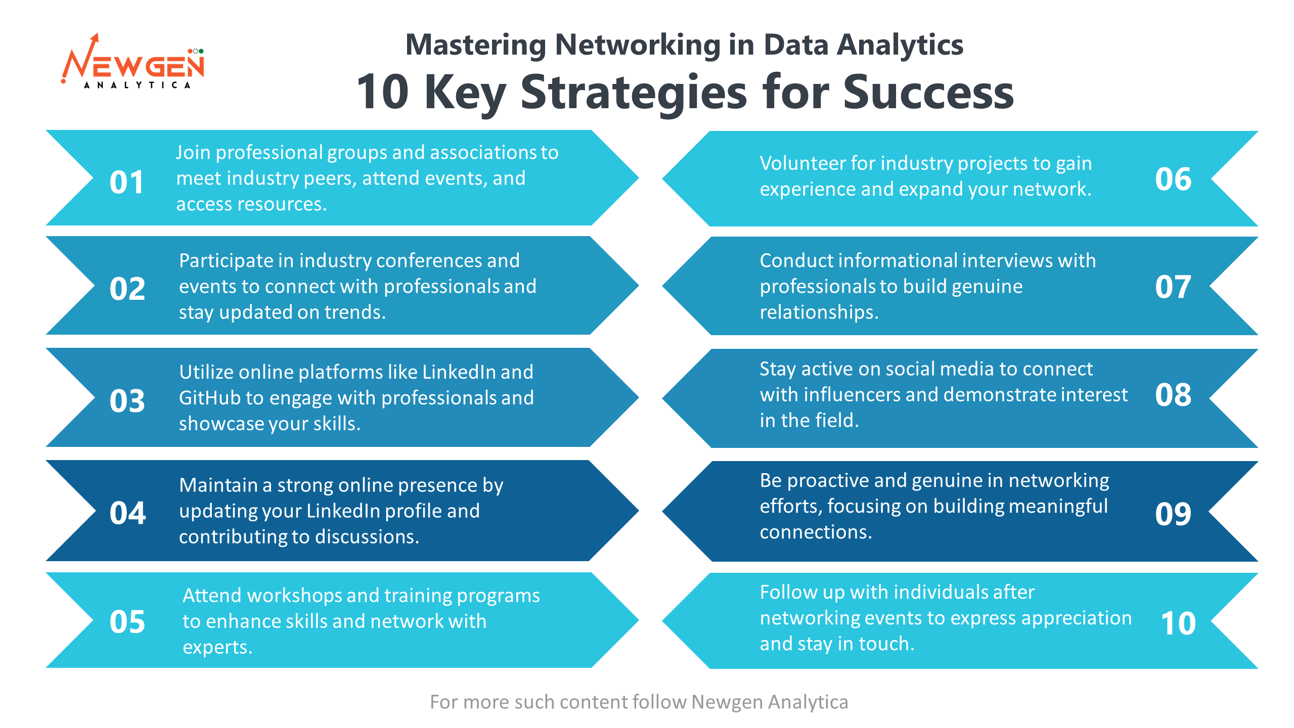
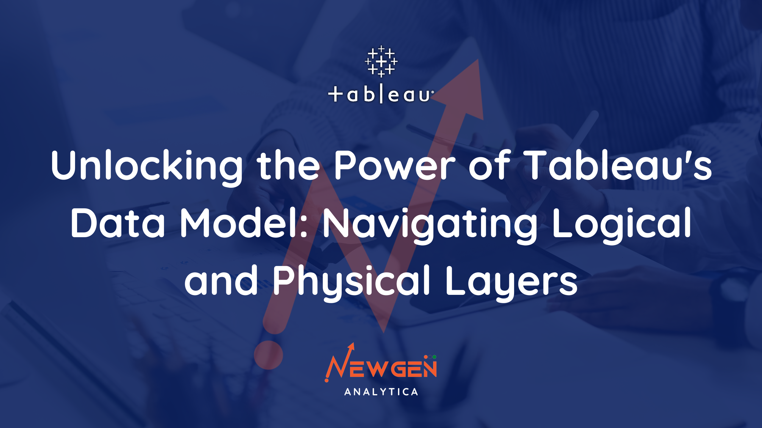
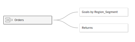
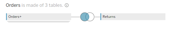


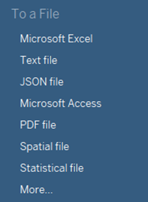

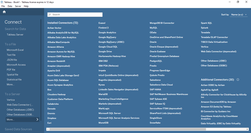
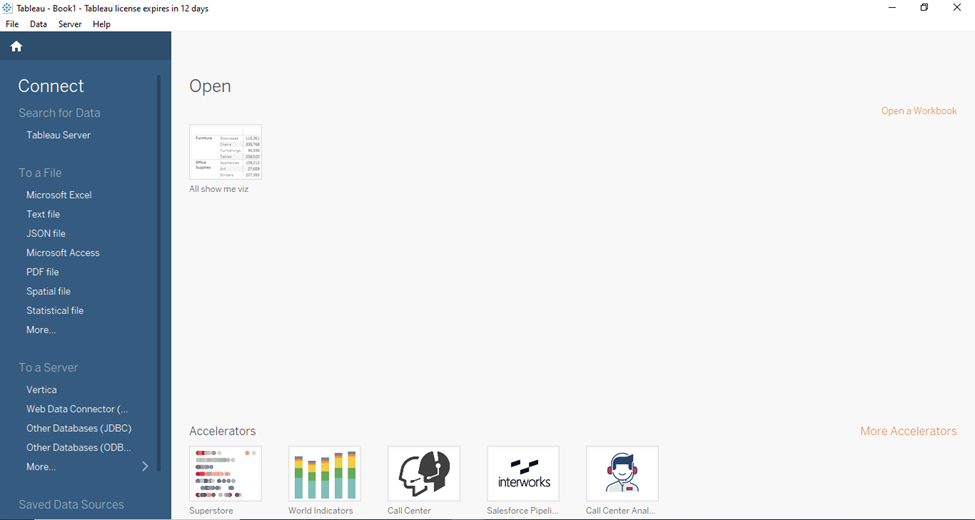
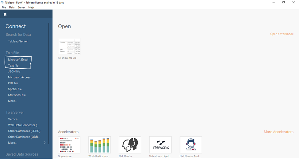
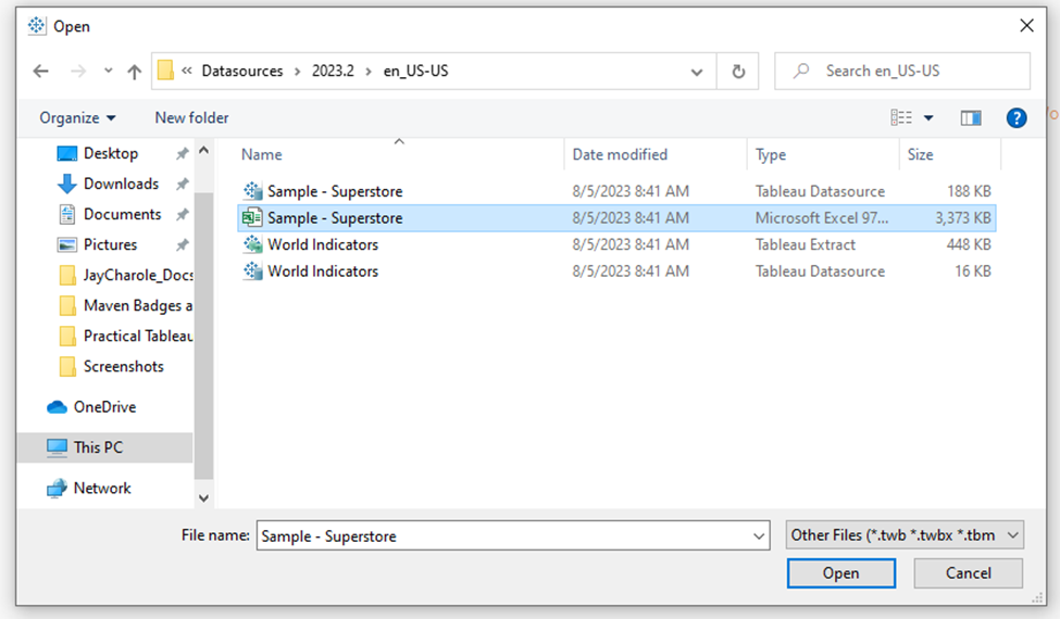
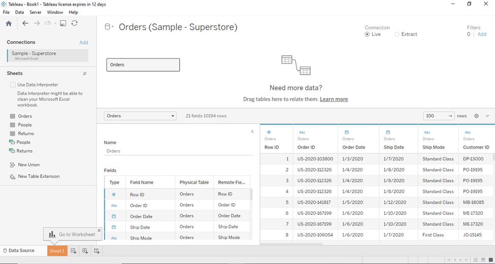
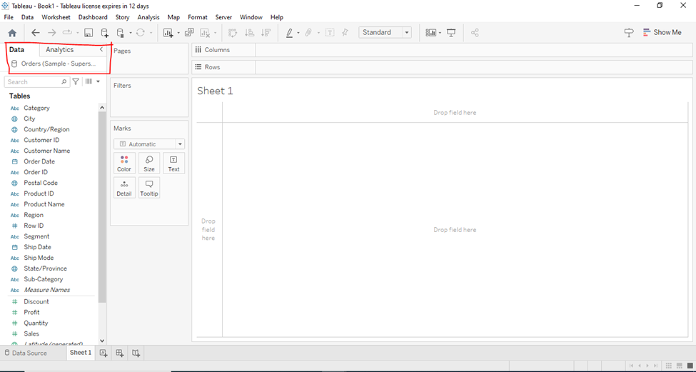
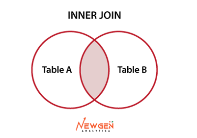
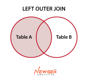
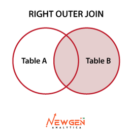


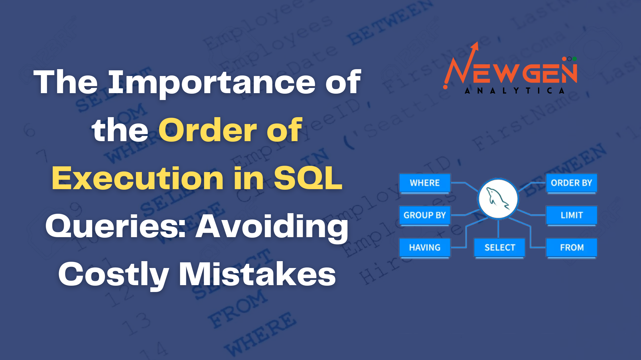
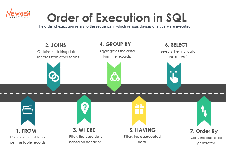
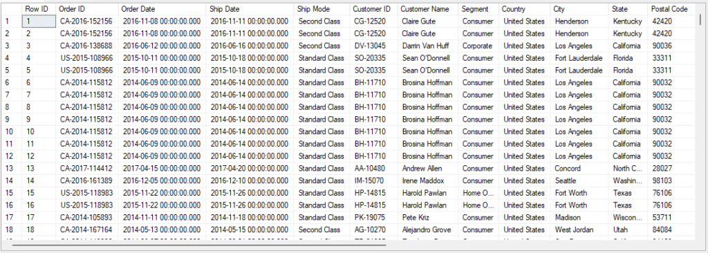
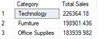

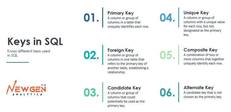
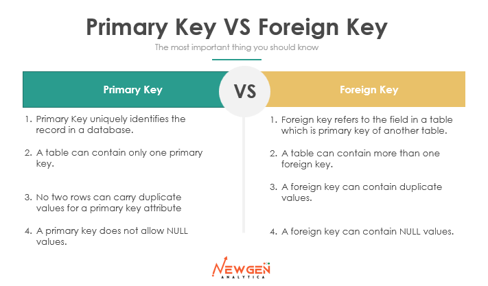
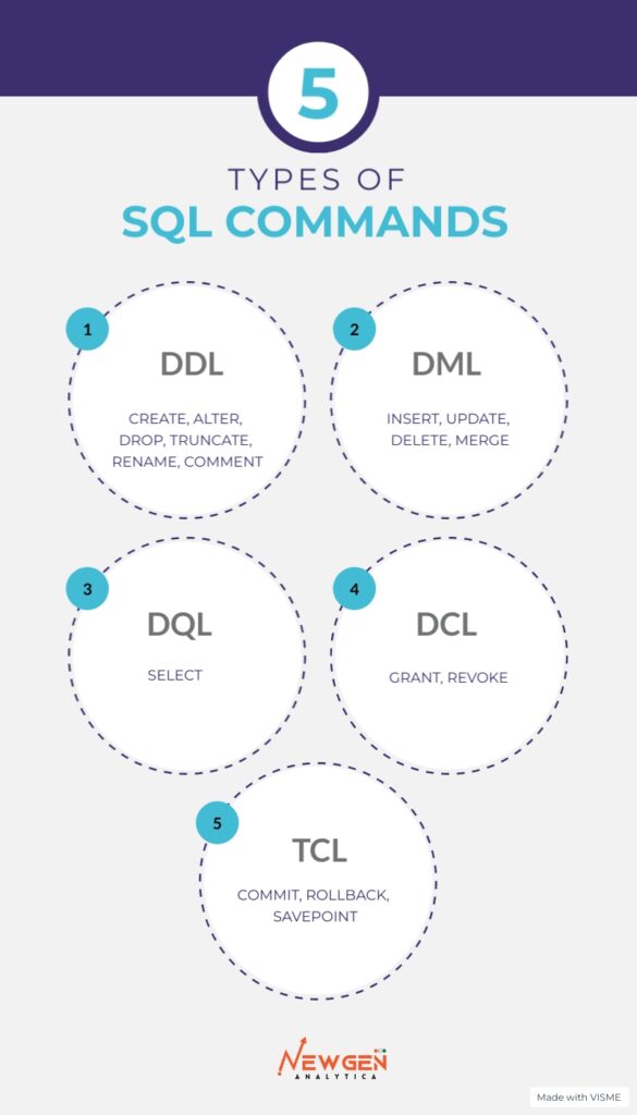

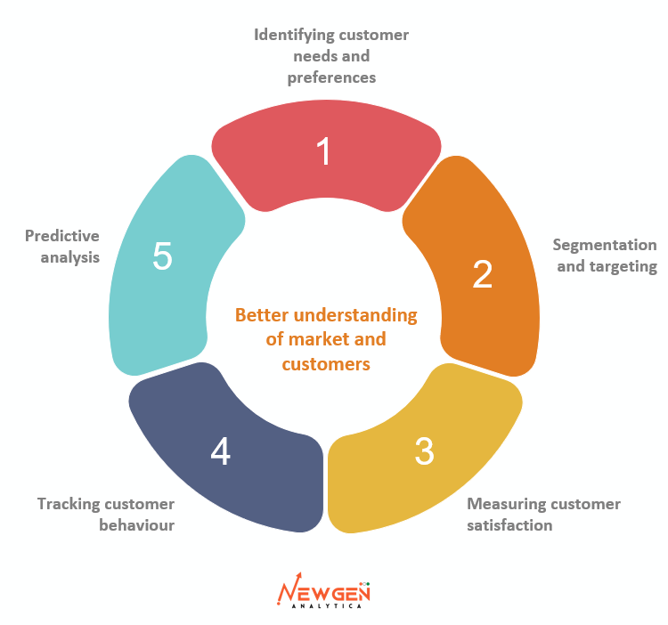
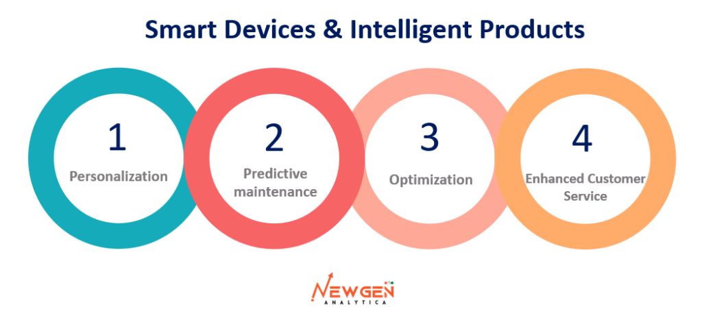

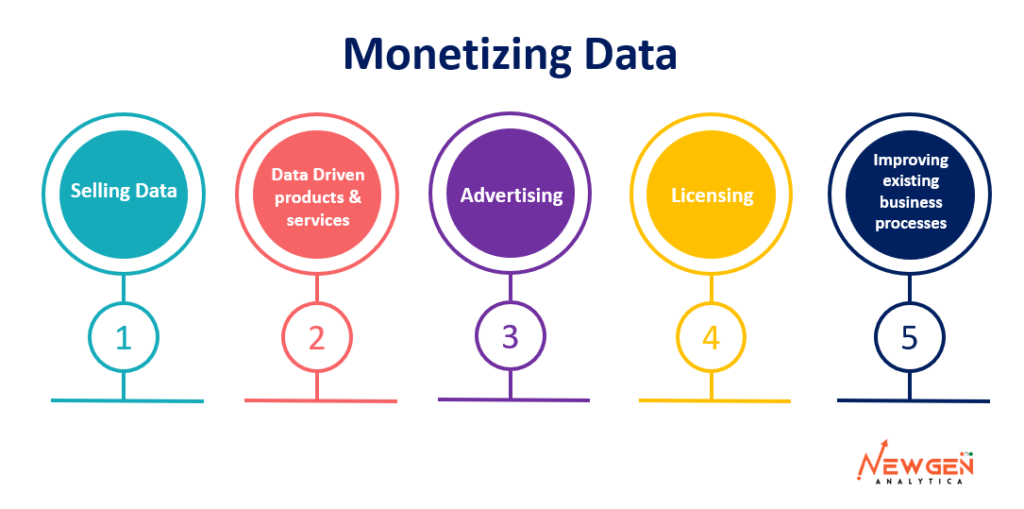

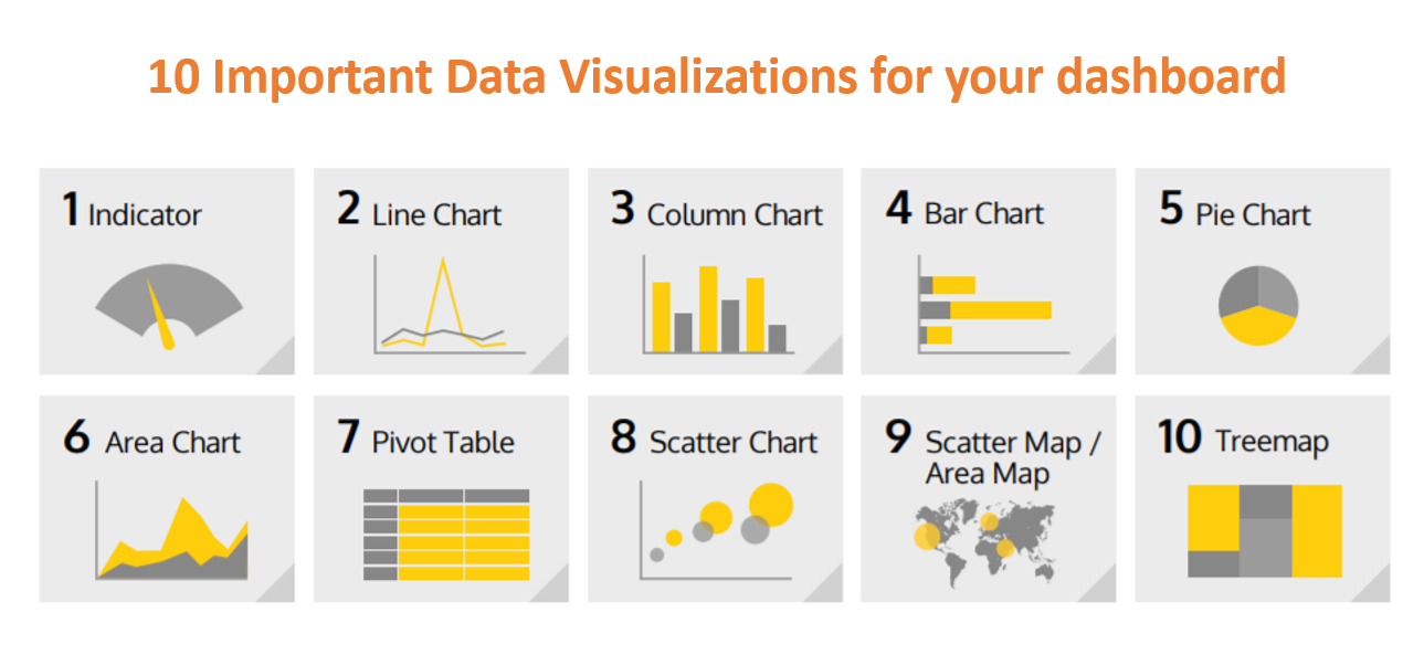


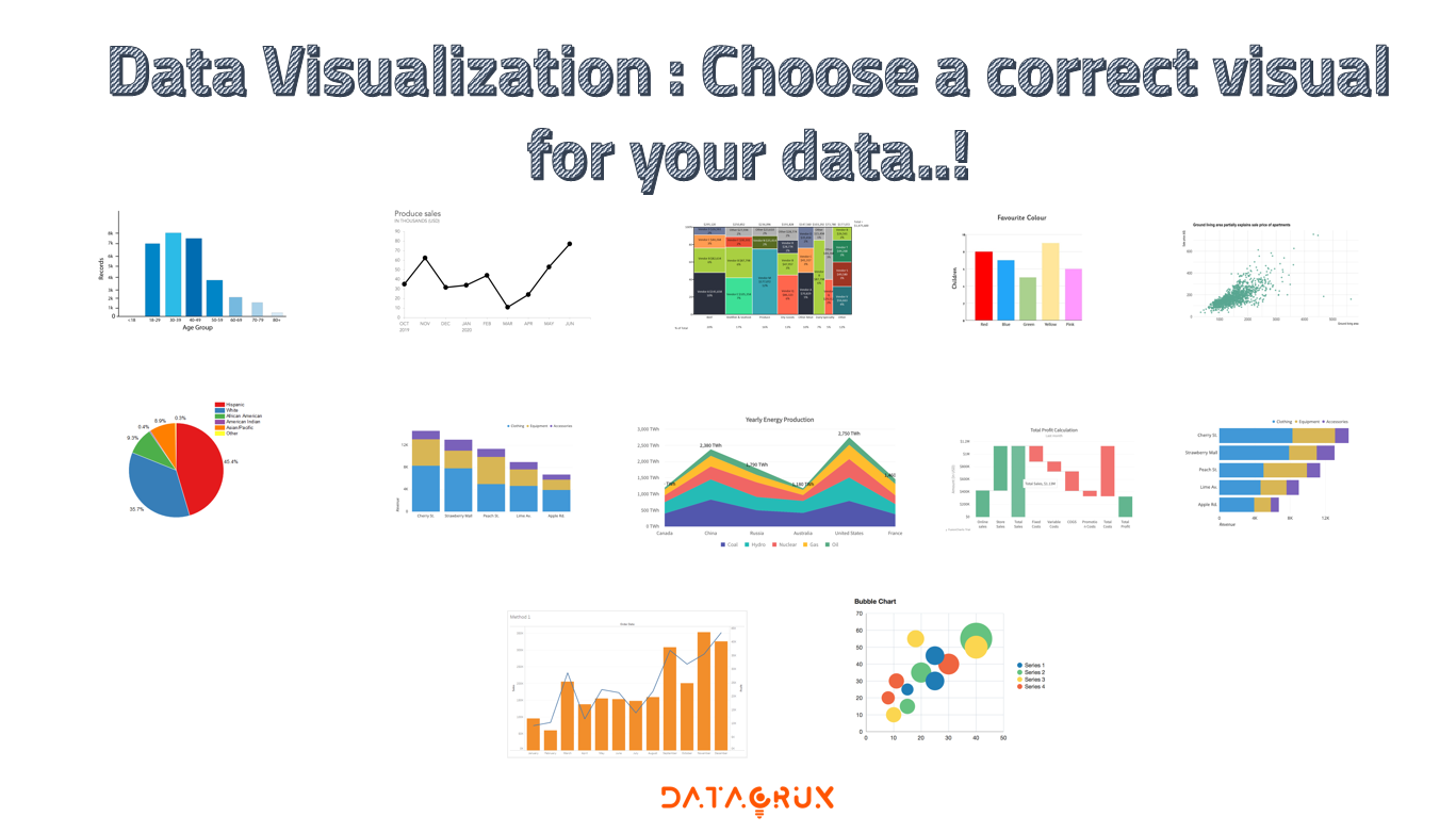


 So for Mumbai you observe the trend that with discount rate unit sales is increasing but not that monotonically. There are some variations above and below.
 For Bengaluru, except that one exception everything is going great and you can draw a straight line through it.
 For Hyderabad, we have very interesting pattern. Up to the discount rate of 11% the sales are increasing and after that the sales are going down.
 For Kolkata, the branch as not at all played with the discount so much. On most of the days the discount rate was only 8% and only one particular day the discount rate was high. There were not variations in the discount rate but the sales are different for different months.


 Why squaring?


 Prices are based on customer activity on a website, competitor’s pricing, and product availability.