Ever wondered about the 7 Pillars of Power BI!

In the previous blog we did the introduction to Power BI and discussed architecture design behind Power BI. In this article we are going to discuss about some of the most important things which are required to start your Power BI journey effectively.

There are 7 steps that you have to remember while working with Power BI. I will call this 7 steps to follow as “The 7 Pillars of Power BI”.

So here is the diagram representing the 7 Pillars of Power BI.

The 7 pillars are as follows:

  1. Extract
  2. Transform
  3. Modeling
  4. Calculations
  5. Visual
  6. Distribution
  7. Automation

Let’s discuss each of them now

Extract: This is the step where we get the information from the data set performed in Power BI Desktop. You can talk to any data source with ha highly simplified Power BI interface. Power BI can connect to any data source to bring meaningful insights to the end-user. It is simple to import any custom file into Power BI. Connecting data from multiple data sources can be achieved by anyone new to Power BI.

Transform: It is the second pillar where we can clean and treat the data. This is performed in Power Query Editor which is the part of Power BI Desktop Environment. After Data Loading, it should undergo pre-processing according to the requirements. This process is called Data shaping or Data Transformation. It involved various steps like renaming tables and columns, changing the data type, modifying rows and columns, appending, merging, etc.

Modeling: Third Pillar where we can create relationships between the data tables and is done using Power BI Desktop. Here we enhance the data to get more accurate insights and analytics. This is achieved by creating relationships and hierarchies between various data tables for better analysis.

Calculations: This is the Fourth Pillar where we can create various measures using DAX language analysis. DAX is also known as “Data Analysis Expressions”. It is achieved by creating several measures and calculated columns. Even M Language is used for various purposes, especially for Data and Time operations.

Visuals: This is the Fifth Pillar where we can create the storytelling and present the information and insights through various visualizations using Power BI. Visualizations is the heart of Power BI. We can play with a variety of visualizations, right from in-built visualizations to custom visualizations. Power BI is the Pechora of visual tools and custom visuals. Business users acquire good analytical insights without writing a single line of code.

Distributions: This is the Sixth Pillar where we share the reports created to end-users, stakeholders, and customers through Power BI cloud platforms. To achieve this distribution Power BI service where you can make changes in the report and share reports with anyone.

Automation: This is the Seventh Pillar where we update the dataset automatically, this is being performed on Power BI cloud platforms. Automating the data and further refreshing the data takes place in this automation process of Power BI, this is achieved using Power BI Service.

So here are the most important 7 pillars or 7 steps you have to keep in mind while performing any Power BI project.

From the next blog, we will start the Power BI Installation and Setup followed by the main concepts of Power BI.

Happy Learning!! 🙌🙌🚀
All About Power BI Architecture Design

In the previous article we had a detailed introduction to what actually Power BI is and how it is used. In this section we are going to discuss a new topic and an important one to kick-start the Power BI journey. Here, we will discuss Power BI Architecture, its components and the Power BI Service architecture. So let’s start.

Power BI Architecture

Power BI architecture consist of 4 major sections that starts right from Data Sourcing to the creation of reports and dashboards. If we observe various technologies and processes are working together to get the desired outcome with correct accuracy. This is the reason Power BI is among the market leader when it is about Reporting and Dash boarding tools.

Power BI Architecture

Sourcing of Data: Power BI can extract data from various data connectors. It can be servers, Excel Sheets, CSV files, other databases and many more. You can even extract live data or a streaming data in Power BI. The extracted data is directly imported in Power BI within few seconds and is compressed up to 1 GB. After sourcing of data you can perform Data Transformation operations.

Transforming the data: As we know the Golden Rule of Data Analytics that before analyzing or visualizing the data we have to clean the data to get the accurate insights. So in this step Data Cleaning and Pre-processing takes place. After transforming data, the data is loaded into data warehouse and further analysis takes place.

Creating Reports or Visualizations: After data transformation process, different data reports and data visualizations are made based on the business requirements. A particular report has various visualizations of the data with different filters, graphs, charts, diagrams, etc.

Creating Dashboards: Planning and arranging all elements of Power BI report makes a Power BI Dashboard. Dashboards are created after publishing the reports in Power BI service.

Components of Power BI Architecture

Various components included in Power BI Architecture are as follows:

1) Power Query: This component provided by Power BI is used to access, search and transform data from various data sources.
2) Power Pivot: It provides tools to model data from internal memory data source for analytics.
3) Power View: These components have various tools to represent data through various visuals which are used for visual analysis.
4) Power Map: It has abilities to represent spatial data in form of maps. The important advantage of Power BI is that we can use maps in different customized ways.
5) Power BI Desktop: Power BI Desktop is the heart of entire Power BI platform. Its development tool for Power View, Power Query, and Power Pivot. You can import various data sources and perform visualization tasks.
6) Power Q&A: Using the Power Q&A option, you can search for your data and find insights by entering queries in natural language format. It can understand your questions asked and answers it with relevant insights in form of various visualizations.
7) Power BI Service: The Power BI Service helps in sharing the workbooks and data views with other users. Even data re-freshing can take place after regular intervals.
8) Power BI Mobile Apps: Business stakeholders can view and interact with the reports and dashboards published on a cloud service through mobile using Power BI Mobile Apps.

Working of Power BI Architecture

The Power BI architecture is mainly divided into two parts:

  1. On-cloud
  2. On-premises

The below diagram is also called as Power BI Data Flow diagram that may help you to clearly understand the flow of data from On-premises to On-cloud server applications.

Power BI Gateway Diagram

On-premises

All the reports published in Power BI Report Server are distributed to the end users only. Power Publisher enables to publish Power BI reports to Power BI Report Server. Report Server and Publisher tools by Power BI helps to create datasets, paginated reports, etc.

On-cloud

In this Data flow diagram, Power BI gateway acts as a bridge in transferring data from on-premises data sources to on-cloud servers. The clouds consist of various stuffs such as datasets, reports, dashboards, embedded, etc.

Power BI Service Architecture

It is mainly based on two clusters they are mainly:

  1. The Front-end Cluster
  2. The Back-end Cluster

The Front-end Cluster

The front-end cluster behaves as a medium between the clients and the on-cloud servers. After the initial connection and authentication the client can interact with various datasets available.

The Back-end Cluster

The back-end cluster manages datasets, visualizations, data connections, reports, and other services in Power BI. These Components are mainly responsible for authorizing, routing, authentication and load balancing.

Here, we have completed the architecture part behind the Power BI and in the next article we will study about some of the “7 Important Rules” that we need to remember to become pro in Power BI.

I hope you liked and understood the write-up. Meet you all soon in the next blog. Stay tuned and Happy Learning !! 🚀🚀👋

DataCrux’s Complete Guide for Linear Regression

Introduction

Let’s start with Machine Learning. So the first Machine Learning Algorithm which we are going to observe is Linear Regression. Linear Regression is one of the important and easiest Machine Learning algorithm. Here we are going to see each and every topic related to Linear Regression in detail. So let’s start our journey for Linear Regression.


The name Linear Regression itself tells us that it belongs to Regression algorithm from Supervised Learning. It has the origin from statistics, where it is used to study the relationship between the input and output numerical variables. Linear Regression is used to show the linear relationship between the independent variable (predictor) i.e. on X-axis and the dependent variable (output) i.e. on y-axis. In other words, (y) can be calculated from a linear combination of the input variable (x).

If there is a single dependent variable it is called as Simple or Univariate Linear Regression. If there are more than one (multiple) dependent variable it is called as Multiple or Multivariate Linear Regression. 

Before getting into Mathematics part of Linear Regression. Let’s understand with an easy example.

Experience in Years02456
Salary2,00,0004,00,0008,00,00010,00,00012,00,000

Can we find out the salary of a person with 3 years of experience?

Yes, we can definetly find out the salary. So if we plot the graph for the above data we get something like this.

Fig 1: After Plotting Graph

Now if we draw a straight line from the data points we can compute the results as below.

If a raise a line from years of experience on x-axis till Salary on y-axis we get the results that the salary for the professional with 3 years of experience is approximately 65,00,000.

from sklearn.linear_model import LinearRegression
#Representing LinearRegression as lr (creating LinearRegression object)
lr = LinearRegression()
#Fit the model using lr.fit()
lr.fit( X_train_lm , y_train_lm 

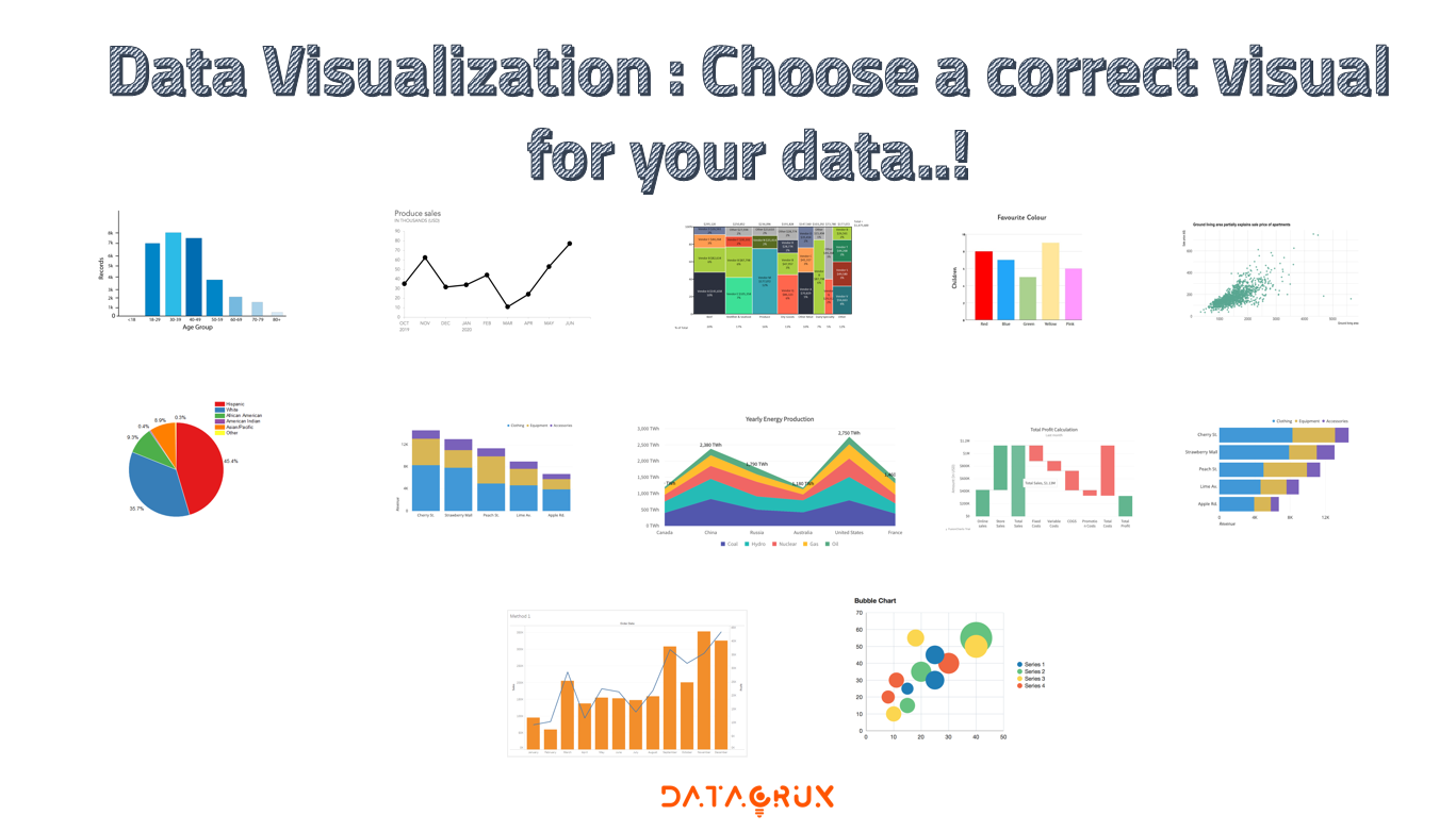
Data Visualization : Choose a correct visual for your data..!

It’s not a doubt that data is really very powerful, when you can actually understand what it’s telling you. It’s not easy to get clear insights by looking at numbers, stats and raw data.

You need data to be presented in a logical, easy to understand manner so that you can get proper information. That’s where the “Data Visualization” comes into picture.

Data Visualization is used plenty number of times in analytics industry and indeed good data visualizations gives a proper impact on your insights as well.

In this article we are going to learn about how data visualization is effective and see much more related stuffs about it.

What is Data Visualization?

Data Visualization allows you to understand your data in a better way which is easy to understand. It is all about representing your data in a visual manner through various types of charts, maps. diagrams, etc. It can help to give proper significance to your data.

How Data Visualization work?

Data is usually in raw format. Just by watching numbers you won’t understand anything. But a proper visual format will help people to extract meaning from that data and can be able to get quick information.

Data Visualizations allows you to expose patterns, trends, and correlations that may otherwise go undetected, too.

Best Practices for Data Visualizations

While determining how you will visualize your data, some of the best practices you have to keep in your mind are –

  • Choose the visual which fits best for your data and it’s purpose.
  • Ensure your visual is easily understandable and viewable.
  • Make proper context arrangement with your visual so that everyone can understand.
  • Keep it as simple and straightforward.
  • Give proper insights through your visuals.

Questions to ask before deciding any visual for your data

Many times we don’t know which visual is to selected for what purpose. So this are some of the questions one can ask before selecting the proper visualization for their data.

Do you want to compare values?

When you want to compare the values of various columns of your data set you can use comparison chart visualizations. The can easily show the high and low trend in the data values.

Some of the visualization chart you can choose are –

  • Column
  • Line
  • Mekko
  • Bar
  • Scatter
  • Pie

Do want to represent the composition of something in the data?

Many visuals can show up how a individual category make up the whole of something. For example, total sales done by sales representative.

Some of the charts favoring this category are –

  • Stacked Bar
  • Stacked Column
  • Area
  • Waterfall
  • Mekko
  • Pie

Do you want to understand how your data is distributed?

Distribution charts can represent the distribution among the data and the range of information in your values.

Some of this charts are –

  • Scatter Plot
  • Line
  • Column
  • Bar

When you want to know the trends in your data set?

If you want to represent the time series data or want to know the information about a specific time period you can use the following charts.

  • Line
  • Dual – Axis Line
  • Column

When you want to better understand the relationship between the value sets?

Relationship charts are suited to show how one variable related to other multiple variables. You can show positive relationship or negative relationship on another variable.

You can use the following charts to find the relationship between variables –

  • Scatter plot
  • Bubble chart
  • Line chart

In the next article we will understand the dive deep into the theoretical part of each of the visualization and then into code.

Happy Learning !

Follow this process of Data Analytics project !!

Introduction

Till now we have learnt about the introduction and saw the importance of Business and Data Analytics. Also we saw how we can select a proper BI tool and various factors of it.

This article marks an inflection point where we will learn how to solve business problems using data analysis. Analytics problem solving involved multiple steps like data cleaning, preparation, modelling, model evaluation etc. The structure used for solving an analytics problem is called as CRISP-DM framework which is known as Cross Industry Standard Process for Data Mining.

As a data analytics professional, you will face many challenges ranging from understanding various business problems to choosing the best technique to solve it. To avoid getting lost, data professionals have developed a robust process to solve virtually any analytics problem in any industry using CRISP-DM framework.

The flow of the framework is shown in below figure –

It involves a series of steps which are quite interesting

  1. Business understanding
  2. Data understanding
  3. Data Preparation
  4. Data Modelling
  5. Model Evaluation
  6. Model Deployment

Lets try to understand each step in a proper manner.

Business Understanding

We now have a framework to solve about various problems, but where do we exactly start? Do we directly go on data? Or do we ask some fundamental questions to understand the problem better?

Imagine you are in going to picnic and your car stop suddenly. You have your toolbox and you want to repair your car. To do so, you need to know first what exactly have gone wrong.

For a data professional, understanding the business is its specific problem is the most important. If you understand the problem clearly you can convert it into a well defined analytics problem. If you understand that business problem, only then you can lay out the brilliant strategy to solve it.

If you don’t understand the business and and jump directly to solve it then your strategies may definitely go wrong.

To understand the business problems, one has to undertake the following steps :

  • Determine your business objectives clearly.
  • Determine the goal of data analysis.

Data Understanding

After business understanding the next important step is data understanding. When you get your hand on the data for the first time, you would want to know the structure of your data (number of files, rows, columns, etc.), understand how are they related to each other and whether something look weird like negative values, outliers, etc. This step is also crucial because when you undertsnad your data properly you can perform further steps more effectively.

Data understanding may include following steps :

  • The type of data sets that are available for analysis.
  • The information you can get from the datasets.
  • Exploring your data and understanding the depth.
  • Performing quality check on the data sets.

Data Preparation

Across various data analytics project, data analysts spend almost 50% to 80% of time on data cleaning and preparation, and therefore data preparation becomes one of the most crucial steps.

Data is vast and are in various files. Collecting all the required data from the files togther and selecting the required columns and rows based on business understanding is a major step in data preparation. After data collection we have to deal with missing values and outliers in the data. Outliers can heavily effect the data and if not treated it can also effect your insights. It is considered as the most important step because the model will be built on the data sets created by in this step.

So some steps which include in data preparation are :

  • Select relevant Data
  • Integrate Data
  • Clean Data
  • Construct Data : Derive new features
  • Format Data

Data Modelling

The Data Modelling is called as “Heart of Data Analysis”. One can think model as a magical box which takes relevant data as input and gives output you are interested in.

In Data Modelling, various Machine Learning and Deep Learning algorithms are used to make data models to answer your question.

We will study about Data Modelling further in our articles.

Model Evaluation and Deployment

In data analytics, evaluation is when you put everything you have done to litmus tests. If the results obtained from model evaluation is not satisfactory and you re-create the whole process. If the model performs well and gives you accurate results then your data modelling process is successful.

Evaluation is necessary to ensure that your model is robust and effective. Once your evaluation is successful you can further deploy your model on various platforms like cloud, local platforms, software’s, etc.

Conclusion

One of the interesting feature of CRISP-DM framework is that the whole process is iterative in nature. This completes the typical life cycle of a data analytics project.

The Necessity of Data Visualization

Before we get to learn about the various nuances involved in data visualization, it is essential to appreciate why it is so important to ‘look’ at the data from the perspective of plots and graphs. To begin with, it is difficult for the human eye to decipher patterns from raw numbers only. Sometimes, even the statistical information summarized from the data may mislead you to wrong conclusions. Therefore, you should visualize the data often to understand how different features are behaving.

Let’s understand this using one of the very beautiful example.

The example we are going to observe is modified version of popular dataset called “Anscombe’s Quartet”. As explained in the linked article (Anscombe’s Quartet), the statistician Frances Anscombe constructed this example to counter the notion that “numerical calculations are exact, but graphs are rough.”

So we have sales data from four different cities of the retail store. We have data for 11 different months, from month of January to November. And for each of the city Mumbai, Bengaluru, Hyderabad and Kolkata, we have for each month what discounting they have used and the corresponding sales.

And we assist the dataset to understand the overall sales from the data.

Can we predict the overall sales and performances just by looking this values? This is rather a difficult task because large amount of data.

So let’s take some help of basic summary statistic to get the a bit idea about the data set.

We can see the average and the standard deviation for various branches. The standard deviation is used to observe the spread of the data.

We observe that the average and standard deviation for all the branches are commonly the same. So we can assume that the summary statistics is same for all the cities.

As you can see clearly, the average discount rate and sales, and their corresponding standard deviations, across each of the branches are exactly the same. Does this imply that all the branches have the same performance? The answer is No!!

Here the visualization comes into picture. With the help of visualization we can analyze the trends in the data.

Here is the visual showing the discount rate for four different cities. The visual shown is a scatter plot. X-axis shows the “Discount rate” and the Y-axis shows the “Unit of Sales”.

So looking at this four graphs we can clearly say that the performance are not at all same.

So for Mumbai you observe the trend that with discount rate unit sales is increasing but not that monotonically. There are some variations above and below.


For Bengaluru, except that one exception everything is going great and you can draw a straight line through it.


For Hyderabad, we have very interesting pattern. Up to the discount rate of 11% the sales are increasing and after that the sales are going down.


For Kolkata, the branch as not at all played with the discount so much. On most of the days the discount rate was only 8% and only one particular day the discount rate was high. There were not variations in the discount rate but the sales are different for different months.



So we observed that instead of getting same summary statistics the trends for each city were totally different. This is the power of data visualization.

Each of the branches had actually employed a different strategy to calculate its discount rate, and the sales numbers were also quite different across all of them. It is difficult to draw this type of insight and understand the difference between each of the branches using raw numbers alone; therefore, you should utilize an appropriate visualization technique to ‘look’ at the data.

Form next article we will dive deep into concepts of Data Visualizations. 🔥🔥🚀🚀

Let’s get the basics of Python done !!

In our previous blog we saw basics ad some theoretical knowledge of Python. In this blog let’s get some more basics clear.

Python Keywords

Keywords are the reserved words in python. We can’t use a keyword as a variable name, function name or any other identifier. Keywords are case sensitive.

# Get all keywords of python 3.6

import keyword

print(keyword.kwlist)

print("\nTotal number of keywords: ", len(keyword.kwlist))

Identifiers

Identifier is the name given to the entities like class, function, variables, etc. in python. It helps differentiating one entity from another.

Rules for writing identifier:

  1. Identifier can be combination of letters in lowercase (a to z) or uppercase (A to Z) or digits (0 to 9) or an underscore (_).
  2. An identifier cannot start with a digit. 1variable is invalid, but variable1 is perfectly fine.
  3. Keywords cannot be used as identifiers.
abc12 = 12;
global = 1

Python Comments

Comments are lines that exists in computer programs that are ignored by compilers and interpreters.

Including comments in programs makes code more readable for humans as it provides some information or explanation about what each part of a program is doing.

In general, it is a good idea to write comments while you are writing or updating a program as it is easy to forget you though process later on, and comments written later may be less useful in the long term.

In python, we use hash(#) symbol to start writing a comment.

#Print Hello, word to console
print("Hello World")

Multi Line Comments

If we have comments that extend multiple lines, one way of doing it is to use hash (#) in the beginning of each line.

#This is long comment
#and it extends
#Multiple lines

Another way of doing this is to use triple quotes, either ”’ or “””

"""This is also a 
perfect example of
multi-line comment"""

Python Indentation

  1. Most of the programming language like C,C++,Java use braces { } to define a block of code. Python uses indentation.
  2. A code block (body of a function, loop, etc.) starts with indentation and ends with the first unintended line. The amount of indentation is up to you, but it must be consistent throughout the block.
  3. Generally four whitespaces are used for indentation and is preferred over tabs.
for i in range(10): 
    print(i)

Indentation can be ignored in line continuation. But it’s a good idea to always indent. It makes the code more readable.

if True:
    print("Machine Learing")
    c = "AAIC"
if True: print("Machine Learing"); c = "AAIX"

Statements

Instructions that a Python interpreter can execute are called statements.

a = 1 #single statement

Multi-Line Statement

In python, end of a statement is marked by a newline character. But we can make a statement extend ove multiple lines with the line continuation character ().

a = 1 + 2 + 3 + \
    4 + 5 + 6 + \
    7 + 8
print (a)


a = 10; b = 20; c =30 #put multiple statements in a single line using ;


#another way is to use paranthesis
a = (1 + 2 + 3 + 
    4 + 5 + 6 +
    7 + 8)
print (a)

So with this we have covered some little basics part of the Python. In the next article we are going to study about Data types and variables.

So stay tuned!!!

Have ever heard about 5 Number Summary ??

Introduction

The main objective of descriptive statistics is to understand the nature of the dataset.  Five number summary is a part of descriptive statistics and consists of five values and all this five values will help us to describe the data.

The five number summary statatics are:

  1. The minimum value (the lowest value)
  2. 20th percentile or Q1
  3. 50th percentile or Q2 or median
  4. 75th percentile or Q3
  5. Maximum value (the highest value)

Understanding the concept

Let us understand the 5 number summary statistic using an example below.

If we have a distribution A data points,

A = {11, 23, 32, 26, 16, 19, 30, 14, 16, 10}

First we will arrange data points in ascending order and then calculate the summary.

A = {10, 11, 14, 16, 16, 19, 23, 26, 30, 32}

Minimum Value

In this we have to find the minimum value in the data set. The data point with the lowest value will be consider as Minimum Value.

Considering the above distribution A the minimum value is 10.

25th percentile (Q1)

The 25th percenile is also known as first or lower quartile. The 25th percentile is the value where 25% of data lies below that value.

50th Percentile (Median Q2)

The 50th percentile is also known as median and is denoted by Q2. The median cuts the data set exactly into two halves. 50% of data lies above the meidan and 50% of data lies below the median.

75th percentile (Q3)

75th percentile is also called as thirst or upper quartile. The 75th percentile is the value where 25% data lies above that value.

Maximum Value

In this we have to find the maximum value in the data set. The data point with the lowest value will be consider as Maximum Value.

Considering the above distribution A the maximum value is 32.

IQR

IQR is known as Inter Quartile Range. The IQR is one of the method to find outliers in the data. When we use IQR the whole dataset is divided into two parts.

IQR = (Q3 – Q1)

= 26 – 14

= 12

Also we should know

[ Lower Bracket . . . . . . . . . .. . . . . .  Higher Bracket]

Lower Bracket = Q1 – 1.5(IQR)

= 14 – 1.5(12)

= 14 – 18

= -4

Higher Bracket = Q3 + 1.5(IQR)

= 26 + 1.5(12)

= 26 + 18

= 44

The data beyond and below this can be treated as outliers.

Visualization

A box plot is one of the most important visualization in statistics. It is a standardized way of representing a particular distribution on basis of 5 Number summary. A box-plot is also known as Whisker plot. It is one of the most efficient way to detect the outlier in the datasets.

The visual shows us the box-plot on the two end we have minimum and maximum. On the box we have Q1, Q2 and Q3.

Outliers

In statistics, an outlier is a data point that differs significantly from other observations. An outlier can occur due to experimental errors. An outlier can be a serious issue in a data set. We will discuss about the outliers in detail in upcoming articles. In box plot the data points beyond particular minimum and maximum value can be considered as outliers.

Python Implementation


Conclusion

So here we have discuss about 5 number summary and how it is calculated. In the next article we will study about one of the most important topic that is Gaussian Distribution followed by Skewness.

Thank you! I hope you liked the article.

Till then stay tuned. Happy Learning !!!! 

Understanding Measures of Dispersion in an easy manner !

Introduction

In the field of statistics for both sample and population data, when you have a whole population you are 100% sure of the measures you are calculating. When you use sample data and compute statistic then a sample statistic is the approximation of population parameter. When you have 10 different samples which give you 10 different measures.

Measures of dispersion

The mean, median and mode are usually not by sufficient measure to reveal the shape of distribution of a data set. We also need a measure that can provide some information about the variation among data set values.

The measures that helps us to know the spread of data set is called are called as “Measures of dispersion”.  The Measures of Central Tendency and Measures of dispersion taken together gives a better picture about the dataset.

Measures of dispersion are called Measures of variability. Variability also called as dispersion or spread refers how spread data is. It helps to compare data set with other data sets. It helps to determine the consistency. Once we get to know the variation of data, we can control the causes behind that particular variation.

Some measures of dispersion are :

  1. Range
  2. Variance
  3. Standard deviation
  4. Interquartile Range (IQR)

Note: In this blog we won’t be discussing IQR, as it has some other application which we will cover in detail

Range

The difference between the smallest and largest observation in sample is called as “Range”. In easy words, range is the difference between the two extreme values in the dataset.

Let say, if X(max) and X(min) are two extreme values then range will be,

Range = X(max) – X(min)

Example: The minimum and maximum BP are 113 and 170. Find range.

Range = X(max) – X(min)

= 170 – 113

= 57

So, range is 57.

Variance

Now let’s consider two different distributions A and B which has data sets as following

A = {2, 2, 4, 4} and B = {1, 1, 5, 5}

If we compute mean for both the distributions,


We can see that we have got the mean as 3 for both the distribution, but if we observe both the distributions there is difference in the data points. When observing distribution A we can say data points are close to each other there is not a large difference. On the other side when we observer distribution B we can observe that data points are far then each other there is a large difference. We can say that the distance is more that means there is more spread and this spread is called “Variance”.

Variance measures the dispersion of set of data points around their mean. Variance in statistics is a measure of how far each value in the data set from the mean.

The formula for variance is different for both Population and Sample
Why squaring?

Dispersion cannot be negative. Dispersion is nothing but the distance hence it cannot be negative. If we don’t square we will get both negative and positive value which won’t cancel out. Instead, squaring amplifies the effect of large distances.

Let us consider first variance for population, it is given by formula

When we computed the mean we saw it was same but when we compute the variance we observed that both the variance are different. The variance of distribution A is 4 and that of distribution B is 1.

The reason behind the large and small value in variance is because of the distance between the data points.

When the distance between the data points is more which means dispersion or spread is more hence we get higher variance. When the distance between the data points is less which means dispersion or spread is less hence we get lower variance.

For sample variance, there is little change in the formula.

Why n-1 ?

As we now we take sample from population data. So sample data should surely make some inference about the population data. There are different inferences using sample data for population data.

Now let us consider that we have a population data of ages and we are plotting it on the graph and it increasing across the x-axis. Also we have the mean at the middle.

So if we randomly select sample in the population data, the sample mean and population mean is almost equal.

If we take a random sample then the distance between the mean of random sample and actual sample is huge. So sample mean <<<<< population mean and sample variance <<<< population variance. Here we are underestimating the true population variance.

Hence we take the n-1 during the calculation of variance using sample data. n-1 makes the distance shorter then that of using n. Therefore to reduce the distance we use ‘n – 1’ instead of ‘n’ while computing sample variance. This ‘n-1’ is called as Bessel’s correction.

Also while discussing further topics we will come across a term Degree of freedom = n – 1.

Importance of Variance

  1. Variance can determine what a typical member of a data set looks like and how similar the points are.
  2. If the variance is high it implies that there are very large dissimilarities among data points in data set.
  3. If the variance is zero it implies that every member of data set is the same.

Standard deviation

As variance is measure of dispersion but sometime the figure obtained while computing variance is pretty large and hard to compare as unit of measurement is square.

Standard deviation (SD) is a very common measure of dispersion. SD also measures how spread out the values in data ste are around the mean.

More accurately it is a measure of average distance between the values of data and mean.

  1. If data values are similar, then the SD will be low (close to zero).
  2. If data values are of high variable, then the SD will be high (far from zero).

  • If SD is small, data has little spread (i.e. majority of points fall near the mean).
  • If SD = 0, there is no spread. This only happens when all data items are of same value.
  • The SD is significantly affected by outliers and skewed distributions.

Coefficient of variation

Standard deviation is the most common measure of variablity for a single data set Whereas the coefficient of variation is used to compare the SD of two or more dataset.

Example


  • If we observe, variance gives answer in square units and so in original units and hence SD is preferred and interpretable.
  • Correlation coefficient does not have unit of measurement. It is universal across data sets and perfect for comparisons.
  • If Correlation coefficient is same we can say that two data sets has same variability.

Python Implementation 

Python code for finding range

import numpy as np
import statistics as st

data = np.array([4,6,9,3,7])
print(f"The range of the dataset is {max(data)-min(data)}")

The Output will give us the value of range i.e. 6

Python code for finding variance

import numpy as np
import statistics as st

data = np.array([3,8,6,10,12,9,11,10,12,7])
var = st.variance(data)

print(f"The variance of the data is {var}")

The Output will give us the value of variance i.e. 8.

Python code for finding Standard deviation

import numpy as np
import statistics as st

data = np.array([3,8,6,10,12,9,11,10,12,7])
sd= st.stdev(data)

print(f"The standard deviation of data points is {sd}")

The Output will give us the value of SD i.e. 2.8284271247461903

Conclusion

So here we have understood about Measures of variability. Measures of Central Tendency and Measures of Variability together are called Univariate Measures of analysis.

Measures which deals with only one variable is called as univariate measures.

In the next section, we are going to discuss about more interesting topic such as 5 number summary statistics and skewness.

Happy Learning !! 


Introduction to SQL and Databases

Introduction

In this group of articles we are going to learn everything about Structured Query Language (SQL) in detail. The articles are bit different as we are not going to repeat everything which we can see in the traditional textbooks or other books, the articles here are going to be 100% practical oriented.

Instead we will provide you with SQL work tools which you will need in your work space. No useless concepts everything is straight to the point and very easy to understand. The topics included in the group of SQL articles are the topics which are used by Data analysts and Data managers in their daily work space. SQL allows this professionals to manipulate large sets of data.

The advantage of learning SQL is that, its syntax is intuitive and used to solve sophisticated tasks quickly.

Why SQL?

Imagine and put yourself in the shoes of the employee or manager who is handling huge amount of data. The professional can be working in various domains like Business Intelligence (BI), Data Science, Database administration or backend web development. This jobs are related to storing large amount of data. Before carrying out any analysis on data first you have to retrieve it. To achieve all this you need SQL.

SQL is known as Structured Query Language. Among different types of programming language SQL is a declarative (non-procedural) programming language. This means while coding you don’t have to focus on how task will be done, but need to focus on what task is to be done.

Using a procedural (imperative) language “HOW”. The examples are C, Java, etc. In this you explicitly need to define the solution of the task.
For example:

  • Please, open the door.
  • Go outside
  • Take the bucket I forgot there.
  • Bring it back to me.

On other hand, in declarative(non-procedural) language “WHAT” this would sound like Fetch the bucket, please. We don’t need to go the process step by step. The algorithm is made in and there is a optimizer which divided the steps into smaller tasks to achieve that task.

It is a programming language specially designed for working with databases. It is used to Create, manipulate and share the Data. Especially data from Relational Database management systems. The way the computer extract data from database is by writing Query.

Query is a piece of code intuiting computer to perform certain operations that can deliver the desired output. The entire process is called as the querying the database. SQL allows you to write queries that the computer can execute and then provide database insights in return.

The good thing about SQL is that it is intuitive and easy to learn language. But be careful it does not means using it is going to be a simple task. Sometimes the business problems involves the processing of large amounts of data. Despite it is relatively simple it has power to perform complex tasks.

Introduction to Databases

Databases plays a very important role in SQL. Writing SQL queries become easier if you understand databases well. Each row in database has certain value and each row makes a record. A record is each entry which exist in a table. A field is a column in a table containing specific information about every record in the table. When data are in the form of rows and columns it means you are dealing with stored tabular data. Relational algebra allows us to retrieve data efficiently.

The smallest unit that can contain a meaningful set of data is called entity. The rows represent the horizontal entity and columns represent the vertical entity. The table is itself an entity but it can also be called as database object.

Different types of Database languages


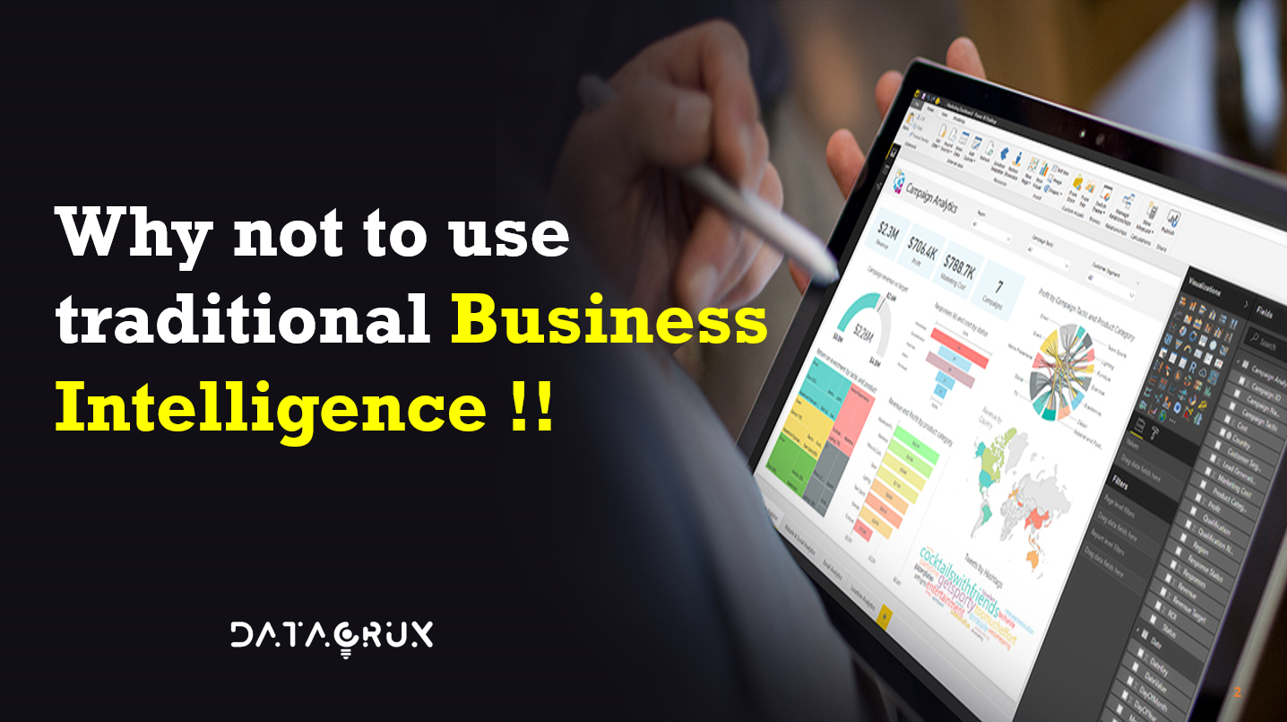
Why not to use Traditional Business Intelligence !!!

Introduction

Business Intelligence (BI) is the process of converting raw material into meaningful information. A set of process, architecture that drives profitable business actions.

BI is the method of collecting, storing and analyzing data from business operations or activities to optimize performance.

It has a direct impact on the organizational strategic and operational business decision. It impacts the revenue and financial model of the business.


What is Data warehouse?

Data warehouse consist of huge storage of data gathered from single or many sources to aid the process of making an informed decision at any level of an enterprise. A typical data warehouse follows an ETL (Extract, Transform, Load) process.

The ETL is the process where we Extract, Transform and Load the data from one source to the destination system.

Extract : The first step in using data warehouse is to extract data from single or multiple sources to load in it’s environment.

Transform : The data which has been extracted, may not come in the desired format or size etc, so there may be the need to transform the incoming data to meet the business requirements and objects.

Load : Once the data is being transformed, its already to be loaded in targeted tables.

A business intelligence tool takes data from a data warehouse to generate the reports and help the end user to make informed decision. By this, we can call data warehouse as a prat of complete business intelligence (BI) process.

Business Intelligence current scenario

  • Microsoft excel is most widely used tool for data analysis.
  • Repetitive and time consuming tasks.
  • Delay in process information.
  • High dependence on IT for data extraction.
  • Sharing information by email.
  • Hard to achieve the right numbers.

Modern Business Intelligence platforms

  • Business areas are asking to become independent from IT for creating reports, in order to gain agility and autonomy.
  • The emergence of Modern BI platforms or Self-Service BI tools are helping.
  • Today the role of IT in BI projects should move towards a strategic partner instead of a producer.

Traditional BI architecture

The below visual is a traditional BI architecture diagram which explains how BI workflow was used to be carried on in the traditional way.

The first step of the architecture is to collect the data from different domain such as customer, sales, production, financial, etc. Once the data is been collected then ETL process is done of the collected data. After the ETL process is performed the data goes to next step where it is been stored into the Data warehouse. When data is stored properly then data model is created on basis of data which is stored in data warehouse. By taking data model into consideration, reports are been created and further shared to various stakeholders. So this is the traditional way of using Business Intelligence.

Conclusion

So as we saw the traditional BI systems has a long workflow and it is time consuming. But modern BI systems are very easy to use with less time consuming and with many features as compared to that of the traditional systems.

As of now we have read about the traditional BI process in the further blog we are going to discuss on Advanced BI techniques and architecture using various tools for data analytics.

Happy Learning! Stay tuned!

Why studying Data analytics important?

Introduction to Data analytics

Data analytics is the science of extracting trends, patterns, and relevant information from raw data to draw conclusions. It has multiple approaches, multiple dimensions, and diverse techniques. It helps in various scientific decision making and effective business operations. It is used for analyzing data, gaining profits, making better use of resources and improving managerial operations.

Data analytics is the process of examining and analyzing raw data sets to:

  • Draw conclusions
  • Derive more information
  • Improve businesses, products, and services

In addition to making business decisions, it is used by data scientists and researchers to verify scientific models and theories.

The given visual shows the data analytics process flow which we will study in the future articles.

Types of Data analytics

According to the visual shown above we can observe that as we are going further in X-axis the Complexity of various types of analytics is increasing and as we are going above in Y-axis the value of the analytics is also increasing. Also the range of information is increasing as we go further in various types of analytics, starting from Descriptive analytics to that of Prescriptive analytics.

There are four main types of analytics based on the workflow and requirements of data analytics:

  • Descriptive analytics
  • Diagnostic analytics
  • Predictive analytics
  • Prescriptive analytics

Descriptive analytics

Descriptive analytics help us to answer the question like what has happened. In descriptive analytics existing data is analyzed to understand what is happened in the past or is happening currently. This analytics is a simplest form of analytics as it deals with data aggregation and mining techniques. The insights gathered by this analytics can be useful for planning various strategies in targeting marketing.

Some of the points of descriptive analytics

Data aggregation is the process of gathering and expressing information in a summarized form. Tools used for data aggregation include MS Excel, MATLAB, SPSS and STATA. Company report is an example of descriptive analytics.

Diagnostic analytics

Diagnostic analytics helps to answer the question about why this things happened. In diagnostic analytics it focuses more on the current events rather than past and to determine which are the factors which are influencing the current trends. In order to explore the data into much deep different techniques like data mining, drill down, data discovery, etc. are used.

Some of the key points of diagnostic analytics are:

They can be used to discover a causal relationship between two or more data sets. Diagnostic analytics is helpful for those concerned with day-to-day operations. For example, it helps identify why a sales representative has sold fewer items than usual.

Predictive analytics

Predictive analytics help answer the question about what will happen in the future. This analytics use the past historical data to another and analyze it and give the insights which can recur in the near future. It uses various statistical models and ML techniques. They can achieve higher level of accuracy. One of the most common example is regression analysis.

Predictive analytics is used in:

  • Predicting future outcomes in terms of probablity of an event to occur.
  • Analyzing sentiments where all opinions posted on social media are collected to predict a person’s sentiments.
  • Identifying target audience for the promotional campaign.
  • Forecasting weather, plan-failure prediction, and various recommendation systems.

A predictive model is built on the preliminary descriptive analytics stage.

Prescriptive analytics

The Prescriptive analytics helps answer questions about what is to be done. By the insights gained form predictive analytics company can make different data driven decisions. Through this company can take various decisions through facts and insights gained. Prescriptive analytics mostly depends on the patterns you get in previous analytics.

Predictive analytics is at the budding stage of implementation and companies have not used its full potentials. Advancements in predictive analytics is paving the way for its development.

The above mentioned types of analytics provide the insights that various organizations and businesses need to make effective and data driven decisions. If the analytics techniques are used properly they provide accurate insights according to company’s need and opportunities.

Benefits of Data analytics:

Benefits in Decision making:

  • Companies use business analytics to enable faster and facts-based decision making.
  • Data-driven organizations make better strategic decisions.
  • Companies enjoy high operational efficiency, improved customer satisfaction, robust profit and revenue level.

Data analytics helps you define your target audience based on

  • Customer age group
  • Customer preferences
  • Location-based purchases
  • Popular brands or products people seek

Benefits in Cost Reduction:

  • Data analytics helps understand shopper behaviors by monitoring their browsing interest.
  • Seller identifies shopping patterns and customer demand.
  • Customer data helps companies minimize failed campaigns and reduce cost associated with them.
  • Data analytics helps in reducing marketing and logistic costs.
  • Marketers use technologies to evaluate customer behaviors and make strategic decisions.
  • Predictive analytics is used for better performance, higher ROI, and faster success.
  • Marketing campaigns use measured activities to plan campaigns.

Let us consider a case study of Amazon to know how it uses various techniques of analytics:

Amazon used data analytics to improve efficiency and reduce cost. Analytics help customer to predict what to buy and anticipate shopping.

Such predictions help increase sales and reduce shipping, inventory, and supply chain costs.

Amazon has more than 200 fulfillment centers worldwide. Supply chain and logistic optimization helps companies reduce costs and improve performance.

Amazon used data analytics for choosing the warehouse closest to the customer and reduces shipping costs by 10-40 percent.

It uses data analytics to attract customers and increase profits by an average of 25 percent annually.

Prices are based on customer activity on a website, competitor’s pricing, and product availability.
Product prices typically change every 10 minutes as data is updated and analyzed.

Amazon typically offers discounts on the best-selling items and earns larger profits on less popular items.


Examples:

Descriptive analytics:

  • Spent $20M in different sales training the previous year.

Diagnostic analytics:

  • Amazon revenue increased in the West Coast during the past one year
  • Increased spending on sales training

Predictive analytics:

  • Purchase factor: price, time, weather and festive seasons.
  • Predicted 10-12 percent increase in revenue.

Prescriptive analytics:

  • Sales training fetched good ROI.
  • Implemented a suitable optimization plan to maximize profit.

Core advantages of Data analytics

  • Data analytics helps in identifying potential opportunities to streamline operations.
  • It identifies potential problems and gives time to take actions.
  • It allows companies to identify operations that yield the best results.
  • It identifies and improves error-prone operational areas.
  • Organizations implement data analytics in product or service development.
  • Data analytics helps in understanding current state of business.
  • It provides valuable insights to predict future outcomes.
  • It helps businesses align new process or products with market needs.
  • Data analytics tools are capable of handling heterogenous data and providing insights.

In the next blog we will understand about different types of data and data analytics process. Still than stay tuned.

Happy Learning !! 🔥🔥

Overview of Measures of Central Tendency

Measure of central tendency

A measure of central tendency is a summary statistics that represents the center point or a typical value of a data set.

These measures indicates where most values in a distribution fall and also known as central location of distribution.

In simple way tendency of data to cluster around a middle value.

Some of the most common measure of central tendency are:

Level of Measurement and Measures of Central tendency

For nominal variables, we can only describe mode (the value that occurs the most).

For ordinal variables, we can describe the mode or median (the middle value). Median is preferred value in case of ordinal variables.

For numerical data, the mean is the preferred measure. The mean is the arithmetic average.

Uses of central tendency

  1. The measure of central tendency can be used as a standard for judging the relative positions of other items in the same set of data (whether a number falls above or below the average and how far away it is from the average).
  2. A measure of central tendency can be used to compare the relative sizes of two different data sets. Let’s say for comparing the averages of two data sets.
  3. It is also used to study measures of dispersion in simple words spread of data.

Link of measure of dispersion

Characteristics of Central tendency

There are certain guidelines for choosing the particular measure of central tendency.

A measure of central tendency is good if it has following properties-

  1. It should be easy to calculate.
  2. Easy to understand.
  3. Based on all the observations.
  4. Should not be affected by extreme values.
  5. Should be close to maximum number of observed values as possible.

Mean

The mean is the arithmetic average for calculating the mean. Mean is central value of finite set of numbers.

Let’s consider you have a data set with n values as follows

Notations:

∑ =This is the Greek letter sigma which means sum up of the numbers.

n = sample size

The mean is the most common measure of central tendency but has a huge downside as it is easily affected by outliers.

Population:

The entire set of objects or individuals or interests or the measurements obtained from all individuals or objects of interests. It can be either finite or infinite.

Sample:

A portion or part of population is known as sample.

In the similar fashion we have different formula of mean for both sample and population


Median

The median is the middle value that splits the data set into half. The method of finding median varies whether your data set has odd or even number of values.

It is a value of the variable that divides a set of data into two equal groups so that half the observations have values smaller than the median, and half the values larger than the median.

  • For  odd number  of values sort the numbers and select the middle values.
  • For  even number  of values sort the numbers take middle two numbers and divide by 2.

The median is the preferred measure of central tendency for ordinal variable.

The median is the measure of choice when a numerical variable has some few unusually high or low values in set of data. If this occurs mean is not a suitable measure of central tendency in majority of cases.

If a frequency distribution for ordinal data is given, the cumulative percent reports the percent of cases that fall in or below each category or a particular value.

The median is the value of the variable below which 50 % of the cases lie.

The median occurs at the value of the variable where the cumulative percent reaches its first 50 % of cases.

Always remember we cant find the median for nominal data.

Mode

The mode is the value which occurs most number of times in a data set.

Mode can also be said as the response category of a variable that is most frequently chosen by the respondents.

In the frequency distribution, the mode is the category that has the largest frequency.

When you observe any bar chart or histogram, the mode is the tallest bar among all others.

The mode is the only measure of central tendency that can be used for all levels of measurement whether it is nominal, ordinal, interval and ratio.

Also when a particular distribution has one mode we say that distribution as uni-modal. If distribution has two modes then it is known as bi-modal. In case there are several modes it is called multi-modal.

Let’s take an example

Given a data set of heights of student in a class. Find the mean, median, mode

Heights (in cm) = {180, 167, 154, 142, 181, 145, 143, 145, 167, 145}

No. of observations = 10

Mean = (180+167+154+142+181+145+143+145+167+145)/10

= 156.9 cm

So, the mean calculated is 156.9 cm


So for finding the median let’s rearrange the data in Ascending order

Rearranged heights = {142,143,145,145,145,154,167,167,180,181}

Number of observations are 10 so n is even

If the number of observations (n) is even:

Find the value of position (n/2)

So (10/2) = 5 i.e. 5th position = 145

Find the value of the position (n/2)+1

So (10/2)+1 = 5+1 = 6 i.e. 6th position = 145

Find the average of two values to get the median

Median = (145+145)/2 = 149.5

So, median is 149.5


For calculating the mode we require frequency table

Highest frequency is of 145 i.e. 3

So Mode = 145


If you observe the difference between the value of mean and median is large they are not close. This is because of the effect of outliers.

Let’s take the above example and change some values and observe

Heights (in cm) = {180, 167, 154, 142, 181, 145, 143, 145, 167, 145}


According to observations,

We can see a significant change in mean whereas median does not have any changes.

This is because the calculation of mean incorporates all values in the data. If you change any value the mean changes.

Unlike the mean, median values does not depend on all the values in the data set,

Consequently, when some of the values are not extreme, the effect on median is smaller. of course, with other types of changes the median can change.

Hence, sometimes we must not use mean because it is particularly susceptible to extreme values or outliers in the data.

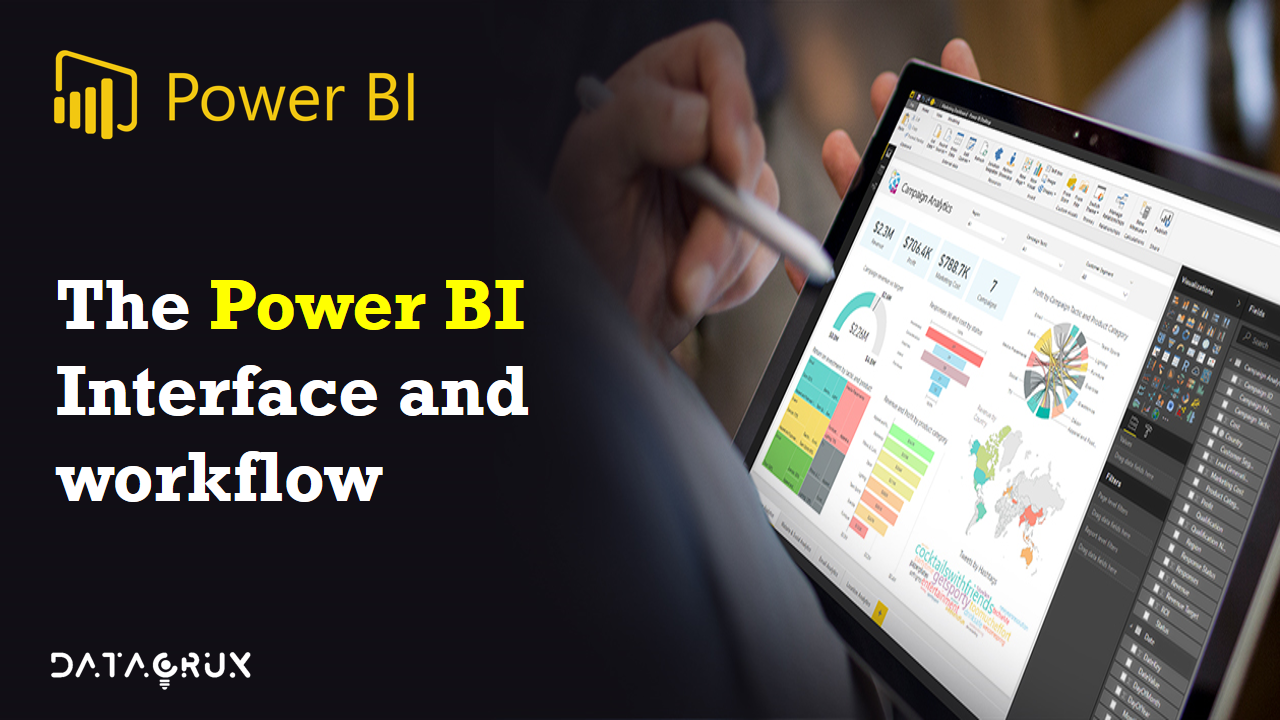
The Power BI interface and Workflow

Let’s talk about the power BI interface and workflow.

So when you open up a power be it desktop file and it looks something like this.

We’re going to dive into each of the specific menus and pains and options here as we move further.

But what’s important to pay attention to now is this set of three icons on the left side of the screen.

These are three or three core views that represent the entire power of the universe. You’ve got  report view, data view and relationships view.

Now when we think about the power BI and broad business intelligence workflow it actually doesn’t really follow this order. We don’t start with the report and then move into data and relationships. We’re going to follow kind of a different process.

Instead we’re going to start with the data view and the query editor. This is where we’re going to connect (data) shape and transform that raw data. Once we have our data we’re going to shift gears into the relationships view that’s where we’re going to actually design our data model and tie those tables together with relationships and from there we’ll move into the third phase which is actually designing interactive reports and visualizations and all that’s going to take place in the Reports tab.

So we will be bouncing around quite a bit between all of these different views. But generally speaking this is how things are going to flow.

So let me show power BI, just want to give you a very quick preview of how these different views and tabs look and feel.

So here we are in power BI desktop as you can see on the left we’ve got our three familiar icons report data and relationships.

Right now I’m in my report view which is basically my canvas for creating dashboards. I can drag visualizations and objects can access my fields and measures here but this is where all of the designing takes place.


Clicking through to the Data tab This is where you can actually see the tables and the raw data and fields that you’re working with. So you can click through to see different previews of your tables. You can also add your calculated columns and measures using data analysis expressions here as well.


And then you’ve got your relationships view which is all about the data model. This is where you can see your tables as objects. Along with the relationships the cardinality the filter flow. Everything about your model.

That’s your a complete over view of the power of the desktop interface and workflow.

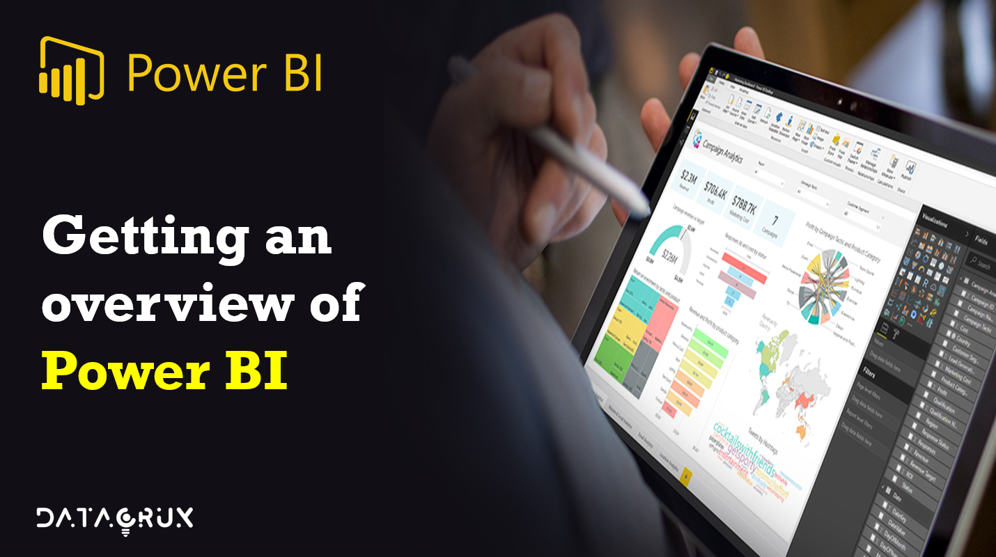
Getting an overview of Power BI

Introduction

Hello guys, here we are with the super series of Power BI articles and the following blog is the first part of the series. The complete series will be divided into various sub-parts where we will discuss the important features and other tutorials related to Power BI.

The blogs are going to be in quite detailed manner which will be enough for you guys to learn Power BI and become a pro in it.

All right the time has come for us to officially meet Power BI by a quick summary. Here Power BI is a standalone Microsoft business intelligence product which includes both desktop and web based applications for loading modeling and visualizing data.

There’s a ton of additional info if you’d like to learn more at powerbi.microsoft.com

Now I want to show you something called the Gartner Magic Quadrant and Gartner’s and market intelligence
research company. They produce these quadrants a few times a year. And what we’re looking at here is the Magic Quadrant for analytics and business intelligence platforms specifically updated February 2021 and the idea is that you have completeness of vision on the x axis and the ability to execute on the Y axis.

And when you break down the players into the four quadrants you end up with niche players challengers, leaders and visionaries and where you want to be is right here in this top right corner where the leaders live.

And that’s exactly where we find Microsoft with power BI leading the charge among some very popular and very powerful other platforms like Tableau, IBM, Qlik, etc.

So really exciting time to be learning power BI because I think it’s only going to get more powerful and more popular from here onwards.

There are hell lots of features in Power BI which make them different from other reporting platforms. Power BI is user-friendly tool which offers awesome drag and drop features and self-service capabilities which make it easy to use and learn.

There are three main components of Power BI platform:
1) Power BI Desktop (A desktop application)
2) Power BI Service (SaaS i.e. Software as a Service)
3) Power BI Mobile (For iOS and Android devices)

One of the plus features of Power Bi is that we can deploy Power BI on both on-premise and on-cloud platforms.

Why Power BI?

As we read what exactly Power BI is, now let’s understand why should we use Power BI?

Power BI is a huge platform where several kinds of services comes under it.
1) One of the important service under Power BI is Power BI Services which is a cloud based service which is used to view and share dashboard with end users or various stakeholders.
2) Power BI Desktop is the heart of Power BI platform which is a reporting interface where all the query editing and reporting part takes place.
3) Also one another useful service is Power BI Embedded that uses Azure cloud platform, and we can use for Data analysis and various ETL process.

Features of Power BI

So what are some of the key benefits that make this such a game changing product.

1)  Connect, transform and analyze millions of rows of data 

You can connect transform and analyze millions even hundreds of millions of rows of data and you can access that data from virtually anywhere whether it’s a database flat files on your desktop cloud services folders of files etc. There’s a huge huge connector library that allows you to access a ton of information and then not only that but you can create fully automated and repeatable ETL procedures to shape and transform and load the data from those different sources.

2) Build relational models to blend data from multiple sources.

We can actually build relational models inside of power BI. to blend the data from each of those multiple sources. And this is a concept that’s getting more and more important in the analytics world by creating relationships between all of those sources were able to analyze holistic performance across our entire data model. And that’s a critical skill set for anyone working in data or analytics or business intelligence it’s that ability to blend information tie sources together and paint that comprehensive view of performance.

3) Define complex calculations using Data Analysis Expressions (DAX)

We can define complex calculations using data analysis expressions or that DAX formula language. So we’ll be doing this to enhance our data sets and enables some really interesting advanced analytics techniques using those powerful and portable expressions.

4) Visualize data with interactive reports & dashboards

Most important one we can visualize or data with interactive reports and dashboards and what we’ll be doing throughout the course is actually building our own custom business intelligence tools using power be best in class visualization and dashboard features.

5) Power BI is the industry leader among BI platforms

And then last but not least, fact is power BI is the industry leader among other Business Intelligence platforms. It’s intuitive it’s powerful and most importantly it’s absolutely free to get started with power BI desktop.

Power BI vs MS Excel

Now last but not least just want to make a quick comparison between power BI and Excel because there is quite a bit of overlap here especially between Power BI and Excel.

So let’s think of this like Venn diagram where you’ve got power Excel tools on the left you’ve got power BI tools on the right. And this area of overlap in the middle with features that both platforms share. So here’s kind of what it looks like.

In summary you’ve got these Excel specific tools on the left like pivot tables, pivot charts, power map, power view and cube functions and then shifting over to the right side you’ve got the report, dashboard, views and power behind that don’t exist in Excel.

Got those custom visualization tools that we’ve been talking about as well as the publishing and collaboration options available through power vs service.

Coming to the intersection part. These two tools are actually built on the exact same engine. Power BI takes the same data shaping modeling and analytics capabilities and then adds these incredible new reporting and visualization and publishing tools on top of them.

So even though they’re called different things in different places you know that data loading tools
will be called either power query or get and transform and excel the data modeling tools will be called Power pivot.

The fact is it’s all the same thing. And the best news of all is that transitioning is incredibly easy. These two platforms play really really nicely together.

Power BI Components

Till now we all know why Power BI is so powerful and why it is used by so many organizations. So now let’s see what are various Power BI components which are used widely are.

1) Power Query: This component provided by Power BI is used to access, search and transform data from various data sources.
2) Power Pivot: It provides tools to model data from internal memory data source for analytics.
3) Power View: These components have various tools to represent data through various visuals which are used for visual analysis.
4) Power Map: It has abilities to represent spatial data in form of maps. The important advantage of Power BI is that we can use maps in different customized ways.
5) Power BI Desktop: Power BI Desktop is the heart of entire Power BI platform. Its development tool for Power View, Power Query, and Power Pivot. You can import various data sources and perform visualization tasks.
6) Power Q&A: Using the Power Q&A option, you can search for your data and find insights by entering queries in natural language format. It can understand your questions asked and answers it with relevant insights in form of various visualizations.
7) Power BI Service: The Power BI Service helps in sharing the workbooks and data views with other users. Even data refreshing can take place after regular intervals.
8) Power BI Mobile Apps: Business stakeholders can view and interact with the reports and dashboards published on a cloud service through mobile using Power BI Mobile Apps.

So lets start exploring Power BI with its architecture in more detail in the coming articles.🔥🔥🔥

Stay tunes!! Happy Learning!! 🙌🙌

What do you know about statistics and data ??

Hello folks,

In the previous article we read about different types of statistics coming to more basics let’s discuss about different types of data.

So there are two types of statistics Descriptive and Inferential.

Similarly, Data is divided into two types shown in the visual below.

Types of Data

In the above visual Data is divided as Numerical and Categorical and Numerical is further divides as Discrete and Continuous

Numerical Data:

Numerical data has meaning which has certain measurement. For example person’s height, weight, student’s marks, blood group or they are count as the numbers for example number of properties a person owns.

Discrete data represents items that can be counted, they have certain possible values that can be listed. The values can either be finite or infinite. For example: Number of children in school, number of books in library, etc.

Continuous data represents measurements and they cannot be counted they are measured using range or intervals on the number line. For example under 18 people staying in Mumbai.

Categorical Data:

Categorical Data contains information about a category. Categorical data represents certain characteristics. Lets take an example, gender of person either male or female, marital status either single or married, Yes or No, types of movies, etc.

Also note that categorical values can take on numerical values (such as male is denoted by “1” and female is denoted by “0”) but these numbers does not have any mathematical meaning.

Level of Measurements

Level of measurement also known as scale of measure is types that give information and describes the nature of data with the particular values that are assigned to a variable.

By observing the above visual we have 4 different types of Level of measurement.

  1. Nominal
  2. Ordinal
  3. Interval
  4. Ratio

Nominal Data

Nominal Data also knows as Qualitative / Categorical data. It us used for labelling different types of classification and does not have a particular quantitative value of order.

For example: Where do you leave? Options are 1- Village     2- City     3- Town

Similarly, What is your gender? Options are 1- Male    2- Female

Nominal scale of measurement are mostly used in research surveys and Questionnaires where only variable label has certain significance. It  is the most fundamental level of measurement.

There can be two ways through which this type of data can be collected either by open ended question to which answers are coded by a label decided by researcher.

The alternative method is to include MCQ’s in which answers will be labelled.

Ordinal Data

Ordinal Scale is defined as a variable measurement scale used for rank of variables but difference between or distance between each variable does not matter.

They are mostly used to convey non-mathematical ideas satisfaction, degree of main, happiness, etc.

Here rank is important but degree does not matter.

Let’s take an example of race, in a race a person can come 1st, 2nd, 3rd, 4th … and so on here irrespective of distance person who comes first is first.

Another example grading system where we get ranks i.e. rank 1, rank 2, rank 3. If you get highest marks you are going to be the topper. If a person who is second is 5 Marks below then so he/she is going to be 2nd only.

Interval Data

Interval Scale is defined as a variable measurement scale use for rank of variables on basis of difference or distance. Here both rank and distance has importance.

For example, rank based on percentage, week days i.e. there are fixed set of intervals after every 24 hours. Another similar example is class periods here there are fixed set of time for all classes for 30 min each period.

Ratio Data

It is a variable measurement scale that not only produces the order of variable but also makes the difference between the known variable along with information about the value of true zero.

For example: What is your weight in Kg?

Options can be Less than 50 kg, 51 – 70 kg, 71 – 90 kg, 91 – 110 kg or more than 110 kg.

Big data a pre-requisite for data industry !

Traditional Decision Making

Traditional decision making process is based on what we think. It also includes past experience and personal instincts and rule of thumb. In traditional decision making process decisions are made on pre-consist guidelines rather than facts.

Challenges of Traditional decision making

  1. Take a long time to arrive at a decision, therefore losing the competitive advantage.
  2. Requires human intervention at various stages.
  3. Lacks systematic linkage among strategy, planning, execution, and reporting.
  4. Provides limited scope of data analytics, that is, it provides only a bird’s eye view.
  5. It obstructs company’s ability to make fully informed decisions.

Big Data Analytics

The solution for traditional decision making is Big data analytics. Let’s see how –

  1. The decision is based on what you know which in turn is based on data analytics.
  2. It provides a comprehensive view of the general picture which may be a results of analyzing data from various sources.
  3. It provides streamlined deciding from top to bottom.
  4. Big data analytics help in analyzing unstructured data.
  5. It helps in faster deciding thus improving the competitive advantage and saving time and energy.

To understand this more easy way let’s consider an example of google self driving car. The self driving car collects lots of data from it’s sensors like camera’s, lidar, radars, etc. According to research the car produces around 1 GB () of data per second so it can be around 2 PB () of data per year assuming the car driver drives around 600 hours per year. This data generated is very important and it’s necessary to be stored. Currently servers are needed to store this data. Most of the data is coming in the real time and car needs to take decision every second using this large amount of data.

What is Big Data?

Big Data refers to extremely large data sets that may be analyzed computationally to reveal patterns, trends and associations, especially relating to human behavior and interactions.

This data sets are so voluminous that traditional database management systems can’t handle them. They can be used to address the business problems we wouldn’t have been able to tackle before.

Big data is growing exponentially because of internet and fast growing technological advancements. In real time, every 60 seconds we have 98,000+ tweets, 695,000 status updates, 11 million instant messages, 698,445 google searches, 168 million+ email sent, 1,820 TB of new data data created, etc.

Different types of data

All this various types of data have gradual increasing  growth rate.

Structured data:- Data which have a defined data model, format, structure. Eg: Database.

Semi-structured data:- Textual data files with an apparent pattern, enabling analysis. Eg: Spreadsheets and XML files.

Quasi-structured data:- Textual data with erratic formats that can be formatted with effort and software tools. Eg: Clickstream data from web browsers.

Unstructured data:- Data that has no inherent structure and is usually stored as different types of files. Eg: Text documents, PDFs, Images, etc.

As we are growing we are creating more amount of unstructured data.

Four V’s of Big Data

Big Data is often described by the 4 V’s, each of which is a hard problem for relational database. Big Data is a collection of data from various sources. Often characterized by what become known as 4 V’s i.e. Volume, Variety, Velocity and Veracity.

Volume:

The ability to ingest, process and store very large datasets. The data can be generated by machine, network, human interaction on various systems, etc.

The data generated can be measured in petabytes or even Exabytes.

Overall amount of information produced everyday is rising exponentially. 2.3 trillion gigabytes of data is generated everyday on internet.

“Can you find the information you are looking for ?”

Variety:

Variety refers to data from different sources and types which may be structured or unstructured. The unstructured data created problems for storage, data mining and analyzing the data.

With the gradual growth in data, even the type of data has been growing fast.

Different variety of data is produced from social media, CRM systems, e-mails and audio, etc. Handling such complex data is challenge to companies. To handle such data analytics tools are used to segregate groups based on the type of data generated.

“Is the picture worth a thousand words? Is your information balanced?”

Velocity:

Velocity is the speed of data generation and frequency of delivery. It is the speed at which the data is coming in and how quickly it is analyzed and utilized.

The data flow is massive and continuous which is valuable to researchers as well as business.

For processing of data with high velocity tools for data processing known as streaming analytics were introduced.

“Is data generation fast enough?”

Veracity:

Veracity refers to the biases, noises and abnormality in data. This is where we need to be able to identify the relevance of the data and ensure data cleansing is done to only store valuable data.

You need to verify that the data is suitable for its intended purpose and usable within the analytic model. The data is to be tested against the set of defined criteria.

Inherent discrepancies in the data collected results in accurate predictions.

“Does it convey a message that can be shared with large audience?”

Common problems of Traditional systems.

  1. Unimaginable size of data.
  2. There are Heterogenous systems means there are different systems.
  3. Traditional systems do not scale up.
  4. Relational databases are costly.
  5. Building single system is complex and not cost effective.

Possible solutions can be either Scaling up or Scaling out.

But, what to choose Scaling up or Scaling out.

Scaling Up:

In this process we increase the configuration of single system, like disc capacity, RAM, data transfer speed, etc.

This is very complex, costly and time consuming process.

Scaling out

In this method we use multiple commodity (economical) machines and distribute the load of storage/processing among them. This process is quick to implement as it focuses on distribution of the load. It is an example of distributed systems.

Instead of having a single system with 10 TB of storage and 80 GB of RAM, we use 40 machines with 256 GB of storage and 2GB of RAM.

When compared Scale out is more effective than Scale Up.

But Scaling Out also has it’s own challenges.

Need of new system

We need new data bases rather than Relational databases which are capable of handling unstructured as well as structured data. To process huge data sets on large clusters (group of nodes in the networks) of computers than a single system.

To manage clusters

Sometimes in the clusters nodes fail frequently. If new node is added than number of nodes keep on changing. We also need to take care of the communication between the nodes.

During analysis, we need to take results from different machines and then merge and aggregate them accordingly.

Common infrastructure

You will need a common infrastructure for all your nodes which are efficient, easy to use and reliable.


Big data technology has to use commodity hardware of data storage and analysis. Furthermore, it has to maintain a copy of the same data across clusters.

Big data technology has to analyze data across different machines and then merge the data.

Solution for Big Data is use of one of the most important tool which is Hadoop.

So this article was actually a detailed introduction to Big Data scenario like what is big data, why it is used, what are the issues faced and what can be the possible solutions. In the coming articles we will study about the Big Data pipeline and architecture and will dive deep in Hadoop.

Stay tuned !

All about Descriptive and Inferential Statistics

So in the previous article we had a brief introduction about Statistics and importance of it in the field of analytics. In this article we will move one foot forward towards understanding the stats.

In this blog we are going to have an overview of types of statistics, Types of data and measurement scale.

Types of Statistics

So basically statistics is divided into 2 major categories i.e. Descriptive and Inferential statistics.

Descriptive statistics:

This is one of the very important part of stats. In this type we deal with numbers that can be numbers, figures or information to describe any certain phenomena. These numbers are known as descriptive statistics.

It helps us to organize and summarize data using numbers and graphs to look for a pattern in the data set.

Some examples of this type of statistics are Measures of central tendency which include mean, median, mode, etc. Also includes Measures of variability that are standard deviation, range, variance, etc.

Example: Reports of production, cricket batting averages, ages, ratings, marks, etc.

Inferential statistics:

To make an inference or draw a conclusion from the population sample data is used. Inferential statistics is a decision, estimate, prediction or generalization about a population based on the sample.

Inferential statistics is used to make interferences from the data whereas descriptive statistics simply describes what’s going on in our data.

Scenario based study:

Suppose a particular college has 1000 students. We are interested to find out how many of the total students prefer eating in canteen and how much prefer eating in mess. A random group of 100 students were selected and hence it becomes our sample data.

So, population size = 1000 college students

sample size = 100 random students selected

So now we can do survey with this 100 student sample and after doing the survey we get the following insights.

So after analyzing the data we get the following visualizations.

Insights rederived:

  1. 72 % of students prefer eating in canteen.
  2. Of the total students who prefer canteen 44.4 % are from 4th year.
  3. Of the total number of students who prefer canteen 72% are from 3rd and 4th year.
  4. 1st year students are more inclined towards eating in mess.

The above statistics give the trends of data among the sample data. In this insights we are using numbers hence this all is included in Descriptive Statistics.

Now, suppose we wanted to open a canteen or mess in the college from the above insights we can assume that –

  1. 3rd year and 4th year students are main target to start the business.
  2. To get more sales you can provide discounts to 1st year and 2nd year students.
  3. Since from the above insights we can conclude that canteen is better option than that of mess to run a business and most of the students in the data are inclined towards canteen than that of mess.

So here we made interferences/assumptions/estimations from the above insights for the whole college on the basis of the sample data. Hence this is a crucial part of Inferential statistics.

So here we have discussed the main difference between descriptive and inferential statistics based on the above scenario.

Everything about print() in python

print() function:

Python print() function is used to print something on the screen. For printing we need to use print() function. Strings are the collection of character inside “double quotes” or ‘single quotes’.

If we observe then print is not a statement it is a function. It is an in-built python function.

sep: It is a key word that is used to seperate string and insert some values or some default space. Let’s see some examples

Rather than using \n or \t, we can also use symbols like comma (,) or plus (+) sign.

To display a variable’s value along with a predefined string, all you need to do is add a comma in between the two. Here the position of the predefined string and the variable does not matter.

Similar to a format argument where your print function acts as a template, you have a percentage (%) sign that you can use to print the values of the variables.

Like format argument, this also has a concept of placeholders. However, unlike the format function where you pass in just the index numbers, in this, you also need to specify the datatype the placeholder should expect.

%d is used as a placeholder for numeric or decimal values. %s is used as a placeholder for strings.

Formatting:

A good way to format objects into your string for print statement is with the string. Here two method are used.

1)Format Method

Syntax:

‘String here { } then also here { }’. format(‘something1’,’something2)

2)f-string (formatted string literals)


Also read:

CODE FOR PRACTICE:

print("Hello World")

print('Hello World')

#type() of print
type(print)

print('Python','tutorial','of','data crux')

print('Python','tutorial','of','data crux',sep='\n') #\n will put each word in a new line

print('Python','tutorial','of','data crux',sep=',')

print('Python','tutorial','of','data crux',sep='\n\n')

print('Python','tutorial','of','data crux',sep='+')

a = 3
b = "Datacux"
print(a,"is an integer while",b,"is a string.")

print("{0} is an integer while {1} is a string.".format(a,b))

print("%d is an integer while %s is a string."%(a,b))

print(f'{a} is an integer while {b} is a string')

TEST YOUR KNOWLEDGE !

0%

What is %s used for?

Correct! Wrong!

%s is always used to represent string. If you use integer with %s then it will perform typecasting.

How many are there in formatting?

Correct! Wrong!

There are two methods of formatting using format() method and formatting string.

Can we use other symbol in seperator sep() as well?

Correct! Wrong!

Yes!!!

print() function quiz

Is Statistics important for Data Science?

Introduction

Statistics is the science of conducting studies to collect, organize, summarize, analyze and draw a conclusion out of the data. It is nothing but learning from data.

The field of math Statistics mainly deals with collective information, interpreting those information from data set and drawing conclusion from the it. It can be used in various fields.

For example, when we observe any cricket matches there are various terms used like batting average, bowling economy, strike rate, etc. Also we can observe many graphs and data visualizations. This things are the part of statistics. Here information is analyzed and various results are shown accordingly.

We can talk about statistics all the time but do we know the science behind it?

Here by using various methods various large cricket organizations compare players, teams and rank them accordingly. So if we learn the science behind it we can create our ranking, compare different thing and debate with hard facts.

Stats is very important in the field of analytics, Data Science, artificial intelligence ai, machine learning models, deep neural networks (deep learning). It is a used to process complex problems in the real world so that data professionals like data analyst and data scientist can analyze data and retrieve meaningful insights from data.

In simple words, stats can be used to derive meaningful insights from data by performing mathematical computations on it.

The field of statistics is divided into two parts Descriptive statistics and Inferential statistics. And data has two types quantitative data and qualitative data and it can be either labelled data or unlabeled data.

Some important terms used

Population: In statistics, a population is the entire pool from which statistical sample is drawn.  For example: Consider all students in a college. All students in the college are considered as population. Population can be contrasted with samples.

Samples: Sample is subset of the population. Sample is derived from population. It is representative of population. It refers to set of observation drawn from population.

It is necessary to use samples for research because it is impractical to study the whole population. For example, we want to know the average heights of boys in college.

So we can’t consider population as there can lots of boys and measuring height and calculating height is not reliable. So for such cases samples are taken. As sample is representative of population. Certain amount of boys are selected as a sample and average is computed.

Variable: A characteristic of each element of population or a sample is called as variable.

Also read: Essential Mathematics to master Data Science

Some of the important topics which we will be discussing in further articles are:

Basics statistics:

  • Terms related to statistics.
  • Random variables
  • Population and sample concept.
  • Measures of central tendency
  • Measures of variability
  • Sampling Techniques
  • Measures of Dispersion
  • Gaussian / Normal Distribution

Intermediate Statistics

  • Standard Normal Distribution
  • z-score
  • Probability Density function (pdf)
  • Cumulative distribution function (cdf)
  • Hypothesis testing
  • Plotting graphs
  • Kernel Density Estimation
  • Central limit theorem
  • Skewness of data
  • Covariance
  • Pearson correlation coefficient
  • Spearman Rank Correlation

Advanced Statistics

  • Q-Q Plot
  • Chebyshev’s inequality
  • Discrete and continuous distribution
  • Bernoulli and Binomial distribution
  • Log Normal Distribution
  • Power Law distribution
  • Box – cox transform
  • Poisson Distribution
  • z-stats
  • t-stats
  • Type 1 and Type 2 error
  • chi-square test
  • Annova testing
  • F-stats
  • A/B testing

Looking at the topics we can interpret that topics are tough but it depends on level of understanding and determination to learn. It’s not any rocket science and can be easily done.

It’s pretty much important that you know statistics because it’s going to be the pre-requisite for you further Data Science journey. So let’s kickstart our journey of statistics here.

The best way to learn anything is to understand it properly and interpret it by implementing it. As we learn from our mistakes so it’s better to keep learning unless you don’t understand it properly.

Before jumping into deep data science I will like to repeat that learning “Statistics” is must.

Let’s go 🚀🚀

Essential mathematics to master Data Science

Introduction

As I say every time “Data Scientist is a professional who uses scientific methods and algorithms and create a meaning from raw data.”

Data Science is much interesting to learn and also most booming field but why people fails in Data Science and they “QUIT”? Ever wondered. One of the most common reasons for quitting Data Science because of lack of knowledge of “FUNDAMENTALS”.

It’s a clear that if you want to excel in certain field one needs have quite knowledge of basics. Programming is one of the important basics of Data Science. But the most vital subject is Math. We can say that Math is the back-end for Data Science and Machine Learning. Because if you don’t know the math behind the algorithm or the way the prediction values you are getting then how you will convey your reports. So Math is one of the most important fundamental of the data science and Machine Learning.

Math in Data Science mainly comprises of Statistics, Probability, Linear Algebra and Differential Calculus. Almost all the techniques of modern data science have some deep mathematical concepts because as I usually say Math is the back-end of the Machine Learning Algorithms. So this is one of the important article in which we are going to study the essential math topics to excel Data Science concepts.

Importance of Mathematics

Always remember applying for the position of Data Scientist doesn’t just require you to know the Tensor flow or some other machine learning frame work, what you require is to know the math behind an algorithm. You required to know how a cost function of a linear regression model is optimized, or what does the decision function for a linear SVM classifier do? and even many more the list
will go on…

Now when we observe the above image it gives us clear message that the math is the foundation on which the overall construction is done. Means for making our core part strong you should have a strong foundation.

Different Mathematics topic distribution

When you see the above representation you can clearly see the distribution of Math’s topics needed for Data Science. Linear Algebra and Statistics + Probability is most important branch covering 35% and 25%. And other branches you need is calculus and Algorithmic Complexity.

Statistics

Statistics in the must to know concept if you want to become a Data Scientist. Because Statistics is the fuel of Data Science process. Many people call Machine Learning as Statistical Learning because of scope of Statistics in the area. Statistics is vast but if done properly you can find it much easy.

Some topics you should know are:

  • Descriptive Statistics, measures of central tendency, variance, standard deviation, covariance, correlation.
  • Basic idea of probability, Conditional probability, Bayes Theorem.
  • Probability Distribution function which includes: Uniform, Normal, Binomial, t-distribution, central limit theorem, etc.
  • Hypothesis testing
  • A/B testing, p values error measurement
  • ANOVA, t-test
  • Least square methods and regression.

You should know the above concepts because you are going to use in your day to day data science activities. During interviews you can
even impress your interviewer easily if you know the concepts of Statistics.

Linear Algebra

Have you every thought how recommendation system works it works through Deep learning concept and Linear Algebra. What is there in Linear Algebra? Basically, Linear Algebra consist of Matrix Algebra. This is one of the important branch of Mathematics which will help you to understand how Machine Learning and Deep Learning algorithms work.

Some topics you should know are:

  • Basic matrix operation: Scalar Multiplication, Transpose, determinant, etc.
  • Matrix multiplication and Inverse of Matrix
  • Different types of Matrix.
  • Linear system of equation
  • Gauss-Jordan elimination Gaussian elimination
  • Vector operations
  • Eigen values, Eigen vectors
  • Diagonalization
  • Projection onto line and plane
  • Singular Value Decomposition (SVD)

SVD concept is used in Dimension reduction and Principal Component Analysis (PCA). Most of the Deep Learning and Neural Network concepts use Linear Algebra in their algorithms.

Calculus

“Ladies and Gentlemen Calculus the rebel of Mathematics here in the house.”😂😂😂 Calculus is the topic most of the people face difficulties and the only reason why people hate Math.

But the truth is Calculus is used in various fields of Machine Learning and this is the reason you should learn Calculus. There are many online resources which we will discuss at the end of the blog.

So some of the essential topics are:

  • Limit and Continuity
  • Mean value theorems
  • L’Hospital Rule
  • Maxima and Minima
  • Product chain rule
  • Differential Equations
  • Beta Gama functions
  • Partial Derivatives
  • Gradient, etc

Have you wondered how logistic regression works. How Gradient Descent finds Minimum Loss function. To understand this concept of calculus is important. Also there are many algorithms who use calculus.

Discrete Mathematics

One of the easiest and coolest branch of Mathematics. Modern Data Science and computational systems has Discrete Math at its core. Many a times Discrete Math is also used in analytics project.

So lets discuss some of the important topics for Discrete Math

  • Set theory: Power set, super sets, Subsets , etc.
  • Venn diagrams
  • Counting functions
  • Positional Logic
  • Basic proofs: Induction and Contradiction
  • Graph Theory
  • Basic Data Structures
  • Recurrence Complexity concepts and many more

When you study any algorithm then you need to understand the time space complexities for this purpose Discrete Math is used also there are many applications where you can find Discrete Math.

Some other topics

Also there are some other topics which you should know because you can encounter them many times. They are—

  • Logarithm and Exponential Functions
  • Rational Numbers
  • Basic geometric theorems
  • Trigonometric identities
  • Real and Complex numbers
  • Sequence and Series
  • Graphing Plotting
  • Cartesian and Polar Co-ordinate System
  • Conic Sections
  • Linear and Integer programming

Conclusion

So here we have discussed the essential topics to excel in Data Science and Machine Learning. There are many topics but this are some of the
important topics that you should know.

But I must say one thing to my readers that do not feel scared or worried by reading this topics. Please! 😉 There are many resources available like plenty of articles even here on Data Crux we are going to major parts of the topics in details. There are also many resources on Internet. YouTube videos are also very useful. Even you can enroll for MOOC’s and learn this stuff.

But one thing is sure if you want to be successful in Data Science you need have that will power and dedication to learn new things. You should have excitement of learning. Data science is indeed tough and vast but if you show your interest here you can do wonders.

Consistency and handwork will make you successful. But I can guarantee you that studying this topics you Data Science understanding level will change. The learning and application of Math will take time and is lengthy process but this will provide you with long term results. And that is the big step towards becoming a successful Data Scientist….. 😉

Mathematics possesses not only truth, but supreme beauty.

– Bertrand Russel